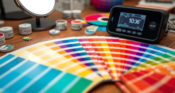

To guarantee your studio images stay color-accurate and consistent over time, focus on proper light positioning and regular calibration. Position your lights at a 45-degree angle to create natural, flattering shadows and avoid flatness. Use adjustable light sources and modifiers for precise control. Most importantly, consistently calibrate your lights and monitor calibrations to maintain true color fidelity. Keep up with these practices, and you’ll improve your studio setup for reliable, color-fast results every time.

Get art and craft supplies delivered free with Prime
- Fast, free delivery on millions of items
- Prime Video, Amazon Music and more included
- Member-only deals all year
Key Takeaways
- Calibrate all lighting equipment regularly to ensure consistent and accurate color reproduction.
- Use color calibration tools like color checkers and spectrometers for precise adjustments.
- Maintain a controlled environment with neutral, consistent ambient lighting to prevent color shifts.
- Position lights at a 45-degree angle to evenly distribute light and reduce harsh shadows or color inconsistencies.
- Consistently monitor and calibrate your monitor to match the camera and lighting setup for true color representation.

Ever wondered how professional photographers achieve perfectly balanced and flattering images? The secret often lies in a simple but effective setup rule that revolves around precise light positioning and meticulous color calibration. When you master these elements, your studio lighting transforms from basic to professional, ensuring your images are not just well-lit but also color-accurate and vibrant over time.
Mastering precise light positioning and color calibration elevates your photography from basic to professional.
Start by paying close attention to light positioning. The way you position your lights significantly influences the mood and depth of your photos. Proper light placement ensures shadows fall in flattering ways and highlights your subject’s best features. For instance, placing your key light at a 45-degree angle to your subject’s face often creates a natural, inviting look. Avoid placing lights directly in front or directly above, which can flatten features or produce unappealing shadows. Use adjustable light sources to fine-tune the angle and distance, ensuring even coverage and avoiding harsh spots or unwanted glare. Remember, the goal is to craft a balanced illumination that enhances your subject’s natural beauty while maintaining a sense of depth and dimension. Additionally, understanding the lighting environment and how it interacts with your calibration process can further enhance color consistency and accuracy. Incorporating light modifiers can also help shape and diffuse light more precisely, leading to better control over shadows and highlights. Recognizing how ambient light interacts with your setup is crucial for maintaining consistent results. Furthermore, considering the surrounding environment helps in controlling reflections and color influences that may otherwise compromise your setup.
Alongside light positioning, color calibration plays a critical role in achieving consistent, color-fast results. Before you begin shooting, calibrate your studio lights and monitor with professional tools. This step guarantees that the colors you see on your screen match what your camera captures and what you ultimately print or display. When your lighting setup is accurately calibrated, colors remain true and vibrant, even after multiple shots or long shoots. This is especially crucial for product photography, portraits, or any work where color fidelity impacts the final image quality. Proper color calibration also prevents color shifts caused by different light sources or environmental factors, helping you maintain professional standards. In addition, regularly reviewing and updating your calibration process ensures ongoing color accuracy over time, especially when changing equipment or lighting conditions. Consistent calibration practices can also extend the lifespan of your equipment by reducing the need for frequent replacements due to color degradation. Regular checks and adjustments are essential to keep your workflow aligned with the latest standards in color management, ensuring reliable and predictable results for every project.
studio lighting calibration tools
As an affiliate, we earn on qualifying purchases.
As an affiliate, we earn on qualifying purchases.
Frequently Asked Questions
How Does the Setup Rule Affect Different Skin Tones?
You’ll find that the setup rule enhances skin tone calibration across various skin tones, ensuring consistent color rendering. By carefully adjusting your studio lighting, you minimize color shifts and maintain color consistency, especially for diverse skin tones. This approach helps you avoid washed-out or overly saturated results, allowing each subject’s natural hues to shine through accurately. Ultimately, it creates more flattering, true-to-life images regardless of skin tone diversity.
Can This Rule Be Applied to Outdoor Studio Lighting?
Yes, you can apply this setup rule to outdoor studio lighting. When working outdoors, you adjust your lighting setup to account for natural sunlight, which can be intense or variable. By using diffusers, reflectors, or modifiers similar to indoor studio lighting, you control color consistency and improve color fastness. This helps guarantee your subject’s skin tones and colors stay vibrant and true, even under changing outdoor lighting conditions.
What Equipment Is Essential for Implementing This Setup?
You need essential equipment like calibrated light meters and consistent light sources to guarantee lighting consistency. Use high-quality, adjustable LED lights for precise control, and incorporate color calibration tools such as gray cards or color checkers. These tools help maintain accurate color rendering, even outdoors. Proper setup and equipment calibration allow you to replicate studio-like lighting conditions, ensuring reliable, vibrant results regardless of environmental changes.
How Often Should Lighting Be Adjusted Using This Rule?
You should adjust your lighting regularly, ideally before every shoot or when you notice shifts in lighting conditions. Maintaining consistent lighting helps guarantee color temperature stays stable, which is essential for color-fast results. Frequent adjustments help preserve lighting consistency, especially if you’re working with natural light or changing studio setups. Always double-check your color temperature and make small tweaks to keep your lighting uniform and prevent color shifts in your images.
Does This Rule Influence Post-Processing Color Accuracy?
Yes, this rule influences post-processing color accuracy by helping you achieve consistent white balance and better color calibration during shooting. When you follow this setup, your images maintain true-to-life colors, reducing the need for extensive adjustments later. This consistency makes it easier to match colors across shots, ensuring your final images are accurate and vibrant without relying heavily on post-processing corrections.
As an affiliate, we earn on qualifying purchases.
Conclusion
Remember, mastering studio lighting is like tuning a musical instrument—you need to find the right balance to make everything harmonize. I once watched a photographer struggle with dull colors until they adjusted their setup, and suddenly, everything came alive, just like a symphony reaching its crescendo. By applying this setup rule, you’ll guarantee your colors stay vibrant and true. Keep experimenting, and soon, your studio will be your personal concert hall of perfect lighting.
spectrometer for color calibration
As an affiliate, we earn on qualifying purchases.
As an affiliate, we earn on qualifying purchases.
adjustable studio lights with modifiers
As an affiliate, we earn on qualifying purchases.
As an affiliate, we earn on qualifying purchases.
Columbus Day / Indigenous Peoples' Day Picks
long weekend sales
As an affiliate, we earn on qualifying purchases.