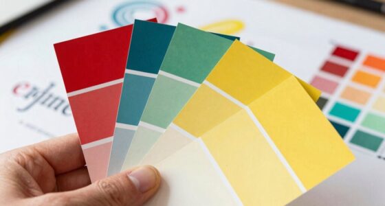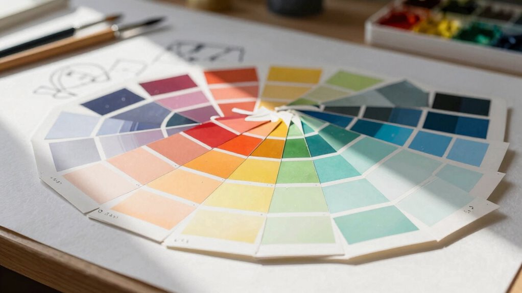

Palette balance is vital because it shapes how your audience perceives and emotionally responds to your design. By thoughtfully arranging colors, you guide their eye smoothly and create a sense of harmony. It helps avoid overwhelming contrasts or mismatched hues that can cause discomfort or miscommunication. When you master palette balance, your designs become more engaging and culturally sensitive. Keep exploring to uncover more ways this subtle skill can elevate your work beyond expectations.

Get art and craft supplies delivered free — and shop member deals
- Fast, free delivery on millions of items
- Access to Prime Big Deal Days deals on October 6–7
- Prime Video, Amazon Music and more included
Key Takeaways
- Proper palette balance guides viewer perception and creates a harmonious visual flow, enhancing overall design effectiveness.
- Balanced color schemes evoke specific emotional responses, strengthening message delivery and audience engagement.
- It prevents visual overload by thoughtfully distributing saturation and brightness, ensuring comfort and clarity.
- Considering cultural influences on color perception avoids miscommunication and makes designs more universally resonant.
- Effective palette balance elevates brand perception by fostering trust, recognition, and emotional connection.
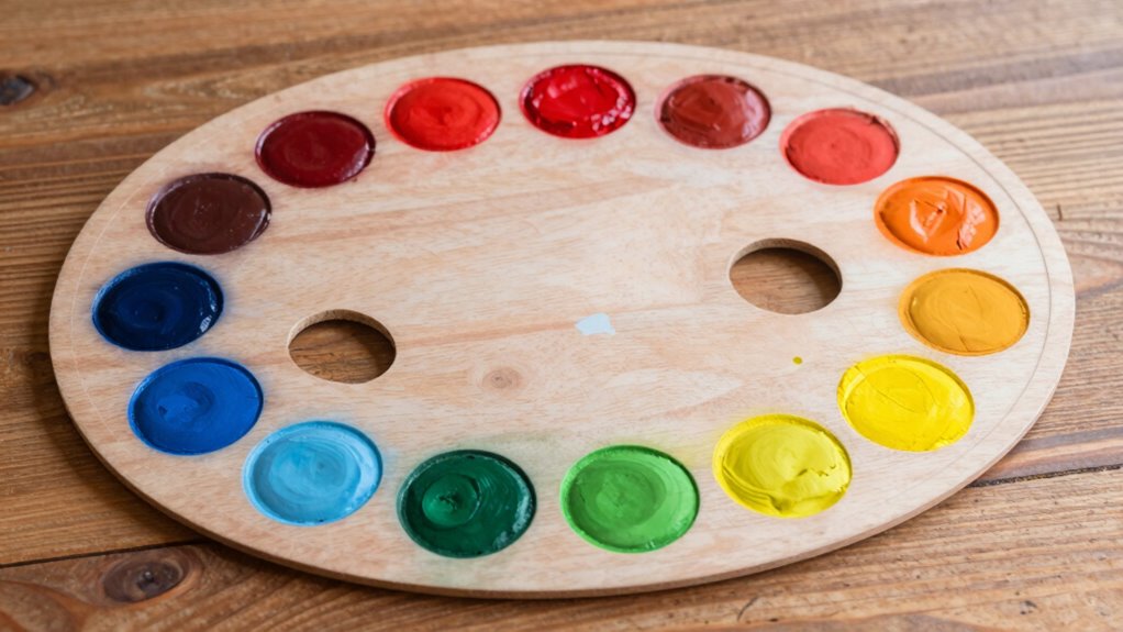
Have you ever wondered why some designs instantly feel harmonious while others fall flat? It all comes down to palette balance, a subtle yet powerful element that guides our perception without us even realizing it. When you pay attention to how colors are arranged and combined, you tap into color psychology—how different hues evoke specific emotions and reactions. For example, a well-balanced palette that includes calming blues and energizing reds can create a sense of stability and excitement simultaneously. But it’s not just about selecting appealing colors; it’s about how those colors interact and support each other across the design. Achieving this harmony requires a keen understanding of cultural influences, which shape how people interpret colors based on their backgrounds and experiences. In some cultures, white symbolizes purity, while in others, it’s associated with mourning. Recognizing these differences helps you craft designs that resonate deeply with diverse audiences, making palette balance more than just an aesthetic choice—it becomes a tool for effective communication. Additionally, understanding cultural influences can help you anticipate how different audiences might interpret your color choices and avoid unintended miscommunications.
When you focus on palette balance, you’re fundamentally creating a visual rhythm that guides the viewer’s eye smoothly across your design. Overloading a composition with too many bright, contrasting colors can overwhelm, causing confusion or discomfort. Conversely, a carefully curated mix of colors, thoughtfully distributed in terms of saturation and brightness, establishes a visual hierarchy that emphasizes what’s most important. This process echoes principles used in Water parks, where the arrangement of visual elements contributes to a cohesive and enjoyable experience for visitors. You might use a dominant color to anchor the design, then introduce accent hues to highlight key elements, ensuring each part of your composition has a purpose. This balance also involves considering the emotional impact of your color choices. For instance, warm tones can invoke comfort and passion, while cooler shades foster calmness and trust. When these are balanced correctly, your design feels cohesive and intentional.
Understanding cultural influences also helps you avoid missteps that could undermine your message. For example, a color palette meant to evoke celebration in one culture might be perceived as inappropriate or even offensive in another. By researching and respecting these nuances, you ensure your design’s palette aligns with its intended audience. Recognizing color symbolism is essential in this process, as it provides insight into the emotional and cultural associations tied to specific hues. Moreover, studying successful market examples can offer valuable lessons on how palette balance enhances brand perception and engagement. Ultimately, palette balance isn’t just about making things look pretty; it’s about creating an experience that feels natural, engaging, and meaningful. When you master this balance, you’re not just designing pretty pictures—you’re communicating on a subconscious level, fostering connection and understanding. It’s why, in the grand scheme of design, palette balance matters more than most realize. It’s the secret ingredient that elevates a good design to something truly memorable and impactful.
As an affiliate, we earn on qualifying purchases.
Frequently Asked Questions
How Do Color Palettes Influence User Emotions?
Color palettes influence your users’ emotions through color harmony and emotional impact. When you choose harmonious colors, they evoke positive feelings like trust and calmness, making users feel comfortable. Conversely, contrasting or unbalanced palettes can trigger confusion or discomfort. By thoughtfully balancing colors, you create an emotional impact that guides user behavior and enhances their overall experience, making your design more effective and memorable.
What Tools Can Help Achieve Perfect Palette Balance?
Think of achieving perfect palette balance as mastering a symphony of color harmony. To do this, you can rely on tool recommendations like Adobe Color, Coolors, and Paletton. These tools help you experiment with complementary, analogous, and triadic schemes, ensuring your colors work together seamlessly. They simplify the process, guiding you to create visually appealing palettes that evoke the right emotions and enhance user experience.
Does Palette Balance Affect Brand Recognition?
Yes, palette balance greatly impacts brand recognition. When you achieve color harmony and maintain visual consistency, your brand becomes more memorable and recognizable. A well-balanced palette ensures that your visuals don’t clash or appear chaotic, making it easier for your audience to connect with your brand identity. This consistency builds trust and strengthens brand recall, proving that palette balance isn’t just about aesthetics but a strategic tool for brand success.
How Often Should Color Palettes Be Updated?
You should update your color palette every 1-2 years to maintain fresh appeal. Research shows that consistent color harmony boosts brand recognition by up to 80%. Regular updates help preserve mood consistency, ensuring your visuals stay aligned with your evolving message. By revisiting your palette periodically, you keep your design relevant, engaging, and emotionally resonant, preventing your brand from feeling outdated or disconnected from your audience.
Can Palette Imbalance Impact Website Conversions?
Yes, palette imbalance can impact your website conversions by confusing visitors or causing visual fatigue. Poor color psychology and weak visual hierarchy distract users, making it harder for them to focus on key actions like signing up or purchasing. When your palette isn’t balanced, it undermines clarity and trust, reducing engagement. Ensuring a harmonious color scheme guides visitors smoothly through your site, boosting conversions and overall user experience.
color psychology reference books
As an affiliate, we earn on qualifying purchases.
As an affiliate, we earn on qualifying purchases.
Conclusion
Remember, balancing your palette isn’t just a small detail—it’s the backbone of a compelling design. When you strike the right harmony, your work becomes more inviting and impactful. Don’t overlook the power of color coordination; it’s the secret sauce that can make or break your project. Keep in mind, a well-balanced palette can turn a good design into a great one, proving that sometimes, the devil really is in the details.
As an affiliate, we earn on qualifying purchases.
cultural color guide for designers
As an affiliate, we earn on qualifying purchases.
As an affiliate, we earn on qualifying purchases.
Halloween Picks
halloween
As an affiliate, we earn on qualifying purchases.