
To build harmonious color palettes using analogous and complementary schemes, start by choosing colors next to each other on the wheel for a soothing, unified look. Then, add a contrasting complementary color to inject vibrancy and focus. Use neutral tones to balance bold contrasts, ensuring your design remains cohesive and eye-catching. Blending these schemes thoughtfully helps evoke desired emotions and guides viewers smoothly through your visuals—exploring further reveals how to refine your color harmony skills.
Key Takeaways
- Combine analogous colors for harmony and seamless visual flow, using subtle variations to deepen or lighten hues.
- Incorporate complementary colors to create vibrant contrast, balancing with neutral tones for a cohesive look.
- Consider cultural symbolism to select colors that evoke the desired emotional response across different audiences.
- Use analogous schemes for calming, unified designs, and add accents with complementary colors to highlight key elements.
- Balance energetic complementary contrasts with soothing analogous palettes to achieve harmony and visual interest.
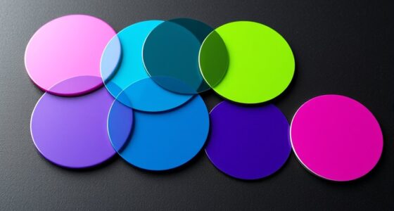
Understanding color palettes is essential for creating visually appealing designs, and two popular schemes are analogous and complementary. When you choose these schemes intentionally, you can evoke specific emotions and communicate messages effectively through your visuals. Color psychology plays a significant role here, as certain colors influence feelings and perceptions. For example, warm tones like reds and oranges often evoke energy and excitement, while cool blues and greens tend to create a calming atmosphere. Recognizing how these colors impact viewers allows you to craft designs that resonate on an emotional level. Additionally, cultural symbolism shapes how colors are perceived across different audiences. In some cultures, white signifies purity and peace, whereas in others, it might be associated with mourning. When you understand these cultural nuances, you can tailor your color choices to respect and connect with diverse groups, making your design more meaningful and appropriate.
Analogous color schemes are composed of colors that sit next to each other on the color wheel, creating harmony and a seamless visual flow. When you use such palettes, you often achieve a sense of unity that’s pleasing to the eye, making your design feel balanced and cohesive. For instance, blending shades of blue, teal, and turquoise can evoke tranquility and trust, which is why they’re popular in branding for health or wellness industries. Because these schemes naturally complement each other, you don’t need to worry about clashing colors, and you can focus on selecting variations that deepen or lighten the primary hues for added interest. This approach also allows you to emphasize certain elements without overwhelming the viewer, as the subtle color transitions guide the eye smoothly across the design. Additionally, understanding traditional tea ceremonies can inspire harmonious color combinations that evoke calm and respect in visual storytelling.
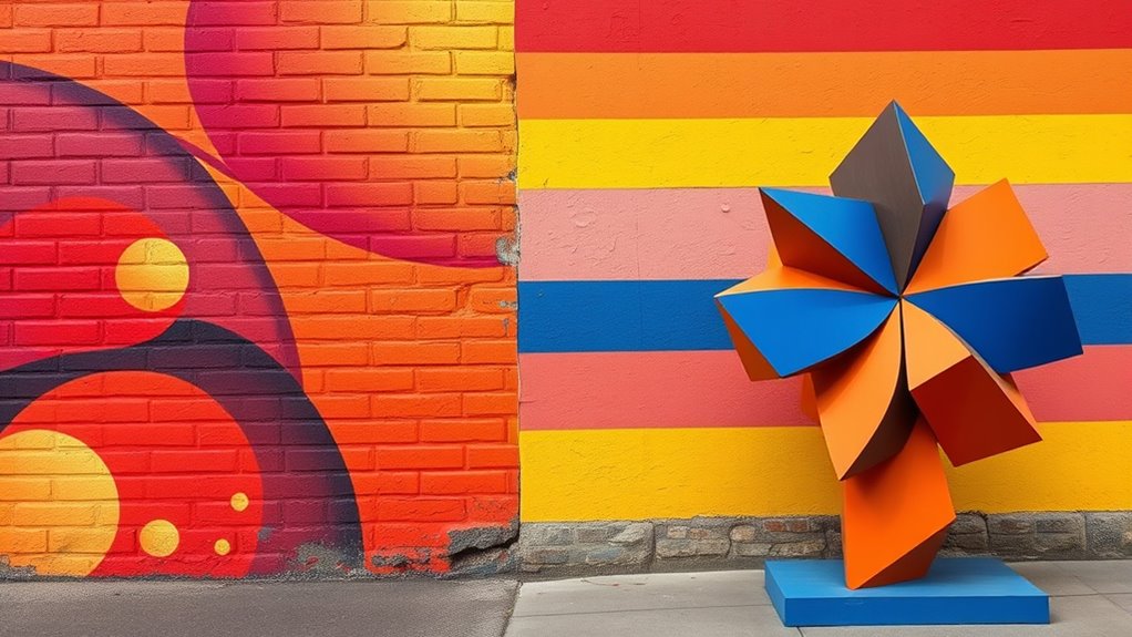
Complementary schemes, on the other hand, involve colors directly opposite each other on the color wheel, such as red and green or blue and orange. When you employ these pairs, you create a dynamic, high-contrast effect that grabs attention immediately. This scheme is excellent for highlighting key information or creating a vibrant, energetic feel. However, because of the stark contrast, you should use complementary colors carefully to avoid visual fatigue. Balancing these colors with neutral backgrounds or muted tones helps maintain harmony and prevents your design from becoming too overwhelming. Understanding how color psychology influences perception here is vital—reds can stimulate appetite or passion, while greens often symbolize growth and health. Recognizing these associations, along with cultural symbolism, helps you choose the right pairs for your specific message and audience.

QOUBAI 36 Set Patriotic Wreath Craft Kit for DIY 4th of July Paper Crafts American Flag Stickers Hanging Ornament for Memorial Independence Day Art Activity Home Decor Supplies
Packing includes: Our patriotic wreath arts crafts stickers kit includes everything needed to create beautiful patriotic crafts: 36...
As an affiliate, we earn on qualifying purchases.
Frequently Asked Questions
How Do I Choose the Right Color Scheme for My Space?
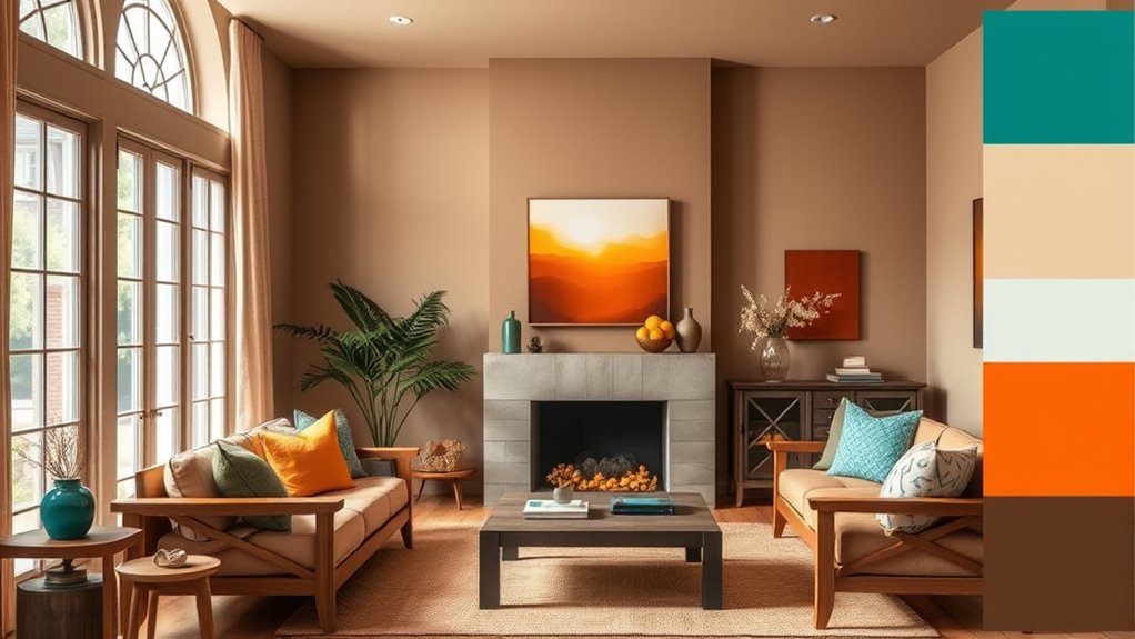
You should choose a color scheme based on the mood you want to create and color psychology principles. For a calming space, opt for cool tones like blues and greens, which promote relaxation. To energize, go for warm hues like reds and oranges. Consider how different colors influence emotions and mood enhancement, and select a scheme that aligns with your desired atmosphere. Trust your intuition and test samples before finalizing your choice.
Can I Combine Multiple Color Schemes in One Design?
Ever wondered if you can mix multiple color schemes in one design? Yes, you can! Combining schemes like analogous and complementary colors adds visual interest and depth. To achieve this, focus on effective color mixing and maintaining visual balance. Use neutral tones to unify different palettes, and make certain the schemes complement each other rather than clash. Wouldn’t your space look more dynamic and personalized with this approach?
What Tools Are Best for Testing Color Harmony?
You should try digital color tools and color harmony apps to test color harmony effectively. These tools let you experiment with different schemes, see real-time adjustments, and visualize how colors work together. Popular options include Adobe Color, Coolors, and Paletton. They help you identify complementary, analogous, and other harmonious schemes, ensuring your palette looks balanced and appealing before you start designing.
How Do Lighting Conditions Affect Color Palette Choices?
Imagine you’re designing a cozy living room, but the lighting impact modifies how colors look. Poor lighting can make warm tones appear dull or cool shades seem harsh, affecting your color perception. You need to test your palette under different lighting conditions to guarantee harmony. Natural daylight enhances true colors, while artificial light may alter them, so always consider lighting impact when choosing your color palette for consistent results.
Are There Cultural Considerations in Color Scheme Selection?
Yes, cultural considerations matter when choosing color schemes. You should consider cultural symbolism and regional color significance because colors can evoke different emotions and meanings across cultures. For example, red symbolizes luck in China but danger in some Western contexts. Being aware of these differences helps you create palettes that resonate positively and avoid unintended misinterpretations, ensuring your design communicates effectively and respectfully across diverse audiences.
Winlyn 36 Sets 4th of July Craft Kits Patriotic Crafts DIY Owl Ornaments Decorations Art Sets Owl Shapes with Red White Blue USA Flag Patriotic Star Stickers for Kids Party Classroom Activities
36 sets patriotic owl decorations DIY owl patriotic craft kits, including 36 pcs 6 owl shape paper cutouts...
As an affiliate, we earn on qualifying purchases.
Conclusion
By mastering analogous and complementary color schemes, you can create stunning, harmonious palettes that captivate your audience. Did you know that using complementary colors can increase visual contrast by up to 70%, making your designs more vibrant and eye-catching? So, experiment with these schemes to enhance your projects, ensuring your colors work together seamlessly. With a little practice, you’ll effortlessly craft balanced and striking color combinations that leave a lasting impression.

Iconikal 48 Pack Patriotic Scratch Art Ornaments - Americana 4x5 Inch Red White & Blue Scratch Off Ornaments with 24 Sticks for Kids & 4th of July Crafts, American Flag, Stars, Stripes, Liberty Bell
Patriotic Scratch Art Fun: 48 ornaments reveal vibrant red, white, and blue colors when scratched, perfect for kids...
As an affiliate, we earn on qualifying purchases.

Lonfliness 24 Sets 4th of July Paper Headbands Craft Kits Patriotic Color Your Own Paper Hat DIY Independence Day Crown Arts Crafts for Memorial Day Party Favor Home USA Patriotic Activity
Package includes: You’ll get 24pcs of patriotic headbands in 6 designs (11.8 x 8.3in/30 x 21cm), 1 sheet...
As an affiliate, we earn on qualifying purchases.