To select and test color palettes effectively, you can use tools like Adobe Color, Coolors, or Paletton that generate harmonious combinations based on color schemes like complementary or triadic. These platforms also allow you to adjust hues and test contrast for accessibility, ensuring your designs are inclusive. Many integrate with popular design software, making it easy to implement your chosen palettes. Keep exploring these tools to create balanced, accessible color schemes that elevate your projects.
Key Takeaways
- Digital platforms like Adobe Color, Coolors, and Paletton generate harmonious color palettes based on rules such as complementary, analogous, triadic, and tetradic schemes.
- These tools feature sliders and input fields to fine-tune hue, saturation, and brightness for customized palette creation.
- Accessibility testing is integrated through contrast ratio evaluations and simulations for color blindness, ensuring inclusive and readable designs.
- Preview features allow users to see how color schemes appear to individuals with various types of color vision deficiencies.
- Export options enable seamless integration of tested, accessible palettes into design software like Adobe Photoshop, Illustrator, and Figma.

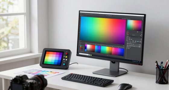
Choosing the right color palette can markedly impact the success of your design, but finding harmonious combinations isn’t always straightforward. To create visually appealing and effective color schemes, you need tools that help you explore color harmony and consider accessibility considerations. Fortunately, many digital tools provide practical solutions to make this process easier and more precise. Harnessing battery technologies and understanding their capabilities can further enhance your design choices by ensuring color schemes are optimized for durability and performance in various applications. Color harmony is essential for creating pleasing palettes that are balanced and engaging. Tools like Adobe Color, Coolors, and Paletton allow you to experiment with different harmony rules, such as complementary, analogous, triadic, or tetradic schemes. These platforms generate palettes based on these principles, guiding you toward combinations that naturally work well together. They often include sliders or input fields so you can fine-tune hues, saturation, and brightness, giving you control over the final look. Using these tools ensures your color choices aren’t random but deliberately crafted for visual coherence. Accessibility considerations are equally crucial, especially if your design aims to serve diverse audiences or meet legal standards. Many color palette tools now incorporate features that evaluate contrast ratios to ensure readability for users with visual impairments, such as color blindness. For example, WebAIM’s Contrast Checker or the accessibility features within Adobe Color can help you verify that your text and background combinations meet WCAG guidelines. These tools alert you if your chosen palette doesn’t provide sufficient contrast, prompting adjustments before you finalize your design. This proactive approach avoids potential issues with readability and ensures your content remains accessible to everyone. Another valuable feature of these tools is their ability to simulate how your palette appears to people with different types of color blindness. By previewing your color schemes through these simulations, you can identify problematic combinations that might otherwise be overlooked. This step is vital for creating inclusive designs that communicate clearly across all user groups. Some tools also offer pre-made accessible palettes, giving you a starting point that already considers contrast and visibility, saving you time and reducing guesswork. In addition to choosing and testing palettes, many tools provide export options compatible with popular design software like Adobe Photoshop, Illustrator, or Figma. This integration streamlines your workflow, allowing you to implement tested, harmonious, and accessible palettes directly into your project. By leveraging these tools, you gain confidence that your design is visually appealing, user-friendly, and compliant with accessibility standards.
color palette generator software
As an affiliate, we earn on qualifying purchases.
As an affiliate, we earn on qualifying purchases.
Frequently Asked Questions
How Do Color Trends Influence Palette Choices Over Time?
Color trends influence your palette choices through trend cycles, which regularly introduce fresh hues and styles. As these cycles evolve, your palette naturally adapts, reflecting current popular shades. This palette evolution keeps your designs modern and appealing. By staying aware of trend cycles, you can strategically select colors that resonate with audiences and guarantee your work stays relevant over time.
What Accessibility Considerations Should Be Prioritized in Color Palette Selection?
You should prioritize contrast accessibility by choosing colors with sufficient color contrast to guarantee readability for all users. Focus on maintaining high contrast between text and background, especially for those with visual impairments. Avoid color combinations that can cause confusion, like red and green. Always test your palette with accessibility tools to confirm it meets contrast standards, making your design inclusive and easy to navigate for everyone.
Can Color Testing Tools Simulate How Palettes Appear Under Different Lighting Conditions?
Think of color testing tools as your personal weather forecast for colors. They often include lighting simulation and display calibration features, helping you see how palettes look under different lighting conditions. This way, you can guarantee your colors stay true whether viewed in daylight, office lighting, or dim rooms. By simulating various environments, you make smarter choices, avoiding surprises and creating designs that look perfect everywhere you go.
How Do Cultural Differences Impact the Perception of Color Palettes?
Cultural differences considerably impact how you perceive color palettes. You might associate red with luck in China or caution in Western countries, influenced by cultural symbolism. Regional preferences shape your choices, as certain colors evoke specific emotions or meanings based on your background. When selecting palettes, consider these cultural nuances to guarantee your design resonates well with your target audience and avoids misinterpretation.
Are There Budget-Friendly Tools for Professional Color Palette Testing?
Like Da Vinci’s mastery of color, you can achieve professional results with budget-friendly tools. Affordable options such as Canva, Coolors, and Adobe Color offer reliable color accuracy for testing palettes without breaking the bank. These tools enable you to experiment, refine, and guarantee your colors work perfectly across different mediums. With a bit of creativity, you don’t need expensive software to create stunning, accurate color schemes that impress.
accessibility contrast checker
As an affiliate, we earn on qualifying purchases.
As an affiliate, we earn on qualifying purchases.
Conclusion
Think of choosing and testing color palettes as exploring a vibrant garden. With the right tools, you become a skilled gardener, carefully selecting and tending each hue to create a stunning landscape. These tools are your compass and watering can, helping you nurture harmony and contrast. Embrace them, and watch your palette bloom beautifully, turning your creative vision into a colorful masterpiece. Your perfect garden awaits—start exploring today!
color blindness simulation tool
As an affiliate, we earn on qualifying purchases.
As an affiliate, we earn on qualifying purchases.

Datacolor ColorReader Pro – Professional Digital Colorimeter & Paint Matching Tool with OLED Screen; Instantly Identify HEX, RGB & Delta E; Standalone Use for Sherwin Williams, Behr & Benjamin Moore
OLED / Standalone: Integrated OLED Display for Standalone Use: Unlike entry-level readers, the ColorReader Pro allows you to…
As an affiliate, we earn on qualifying purchases.
As an affiliate, we earn on qualifying purchases.