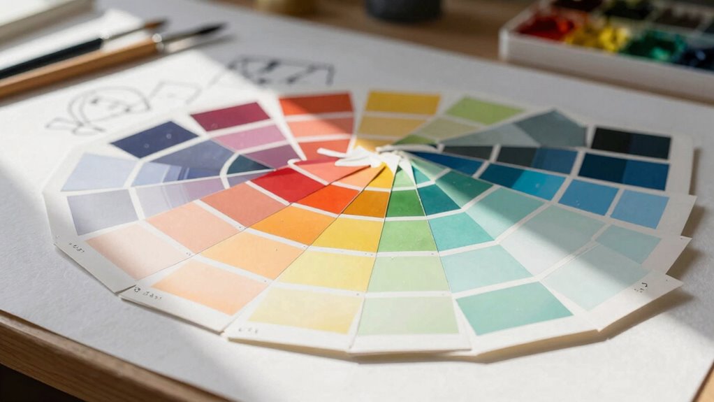
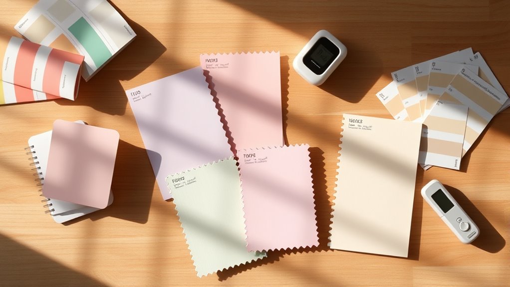
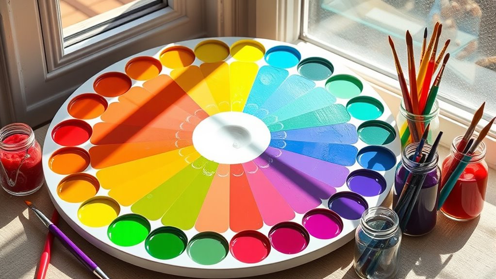
Juggling colors without proper palette balance can undermine your design’s impact, making it crucial to understand why it matters more than most designers think.
Browsing Tag
Color harmony
5 posts
Monochromatic Color Schemes: Achieving Simplicity and Focus
Find out how a monochromatic color scheme can simplify your design while adding depth, focus, and a touch of creativity that keeps your audience engaged.
Understanding Primary, Secondary & Tertiary Colors
I explore how primary, secondary, and tertiary colors interact to enhance your understanding of color harmony and design.
How to Choose a Cohesive Color Palette
Bringing harmony to your design begins with understanding color relationships and choosing a palette that truly resonates; learn how to create cohesive color schemes that stand out.
The Basics of Color Theory
A foundational understanding of color theory unlocks powerful design tools, revealing how color combinations evoke emotion and harmony—discover the secrets behind effective color use.