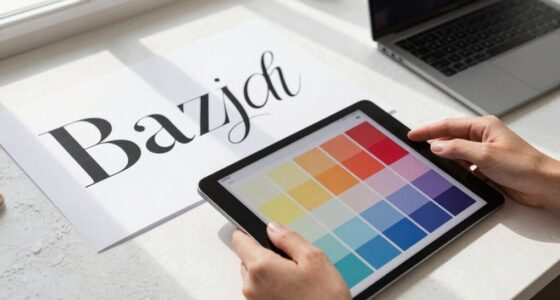

The biggest mistake that weakens a serif revival quickly is neglecting proper font pairing and ignoring the historical context behind the typefaces. When you combine fonts that don’t complement each other or overlook the origins of serif styles, your design can feel disjointed and superficial. This weakens the message and diminishes the timeless appeal of the fonts. If you want to create authentic, impactful designs, understanding these key aspects can make all the difference.

Get art and craft supplies delivered free with Prime
- Fast, free delivery on millions of items
- Prime Video, Amazon Music and more included
- Member-only deals all year
Key Takeaways
- Neglecting proper font pairing and style integration causes a disjointed serif revival.
- Ignoring the historical context of serif fonts leads to superficial and inauthentic designs.
- Jumping into trendy serif choices without strategic planning weakens long-term impact.
- Overlooking visual hierarchy and flow diminishes the coherence of the overall design.
- Failing to understand typeface evolution reduces authenticity and cultural significance of the revival.
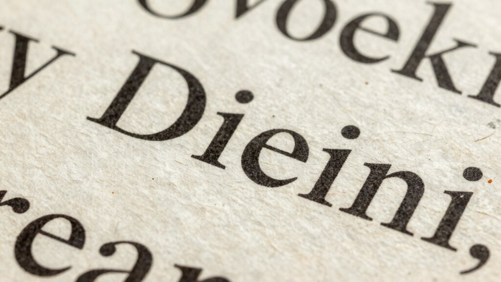
Have you ever wondered why the resurgence of serif fonts isn’t lasting as long as expected? The answer often boils down to a common mistake: neglecting proper font pairing and ignoring the historical context behind these typefaces. When serif fonts reappear in design trends, many jump in without considering how to blend them seamlessly with other styles or understand their roots. This oversight makes the revival feel disjointed or superficial, causing it to fade quickly.
You need to recognize that font pairing isn’t just about choosing two fonts that look good individually; it’s about creating harmony between them. When you incorporate serif fonts into a design, they should complement the overall aesthetic and purpose. Pairing a traditional serif with a modern sans-serif, for example, can create visual interest, but only if done thoughtfully. If you pick fonts without considering how they work together, the message becomes muddled, and the design loses its impact. The mistake is jumping into trendy serif choices without planning the entire visual hierarchy and flow, which weakens the overall effect and hampers longevity.
Understanding the historical context of serif fonts is equally critical. Serif typefaces have a rich history rooted in print and craftsmanship. They originated centuries ago, designed for clarity and readability on printed pages, which gave them a sense of authority and tradition. When you overlook this background, the revival risks feeling inauthentic or superficial. Many designers today adopt serif fonts purely because they’re trendy, without grasping their evolution or cultural significance. This disconnect reduces their effectiveness and causes the trend to burn out quickly, as people sense the lack of genuine purpose behind the design choices.
By not paying attention to how serif fonts have historically been used, you miss out on the chance to leverage their full potential. When you understand their origins, you can select and pair serif fonts more thoughtfully, creating designs that resonate with authenticity and depth. This approach not only enhances your visual message but also helps the trend sustain longer because it’s rooted in genuine appreciation and strategic use, rather than fleeting fashion. Moreover, understanding typographic history enables designers to craft more meaningful and enduring visual narratives. Recognizing the evolution of typefaces can inspire more innovative and respectful applications of classic styles.
Ultimately, the mistake lies in approaching serif revival as a superficial style rather than a meaningful design choice. When you focus on proper font pairing and respect the historical context of serif fonts, you craft visuals that feel both current and timeless. This depth of understanding elevates your work, making the trend less of a passing phase and more of a lasting style. Ignoring these elements, however, ensures the trend will fade fast, leaving behind only fleeting impressions rather than lasting impact.
As an affiliate, we earn on qualifying purchases.
Frequently Asked Questions
How Can Designers Prevent the Serif Revival From Fading Quickly?
To prevent the serif revival from fading quickly, you should focus on effective font pairing and maintaining typographic consistency. Choose complementary fonts that enhance your serif’s style, making your design more cohesive. Consistently apply your chosen typefaces across all elements, ensuring a unified look. By balancing modern and classic serifs and avoiding overuse, you help sustain interest and relevance, giving your design longevity and a fresh yet timeless appeal.
What Are the Key Differences Between Modern and Traditional Serif Styles?
Modern serif styles often feature cleaner lines, minimal ornamentation, and a more streamlined appearance, making them suitable for digital designs. Traditional serifs, on the other hand, emphasize intricate details and historical context, reflecting classic craftsmanship. When font pairing, you should consider these differences to create harmony. Modern styles pair well with sans-serifs for a contemporary look, while traditional ones complement historical or vintage themes, emphasizing their rich heritage.
Which Industries Benefit Most From Serif Font Revivals?
You’ll find industries like publishing, fashion, and luxury brands benefit most from serif font revivals. These industries leverage typography history and cultural influences to evoke tradition, trust, and sophistication, enhancing their brand image. By reviving classic serif styles, you create a sense of elegance and credibility that appeals to your target audience. Using these fonts thoughtfully helps you stand out, connect emotionally, and reinforce your brand’s heritage in a competitive market.
Are There Specific Colors That Enhance Serif Font Longevity?
Bright, high-contrast colors enhance serif font longevity by making the text more readable and eye-catching. Using color psychology, you can select hues that evoke trust, professionalism, or creativity, aligning with your brand message. Employ contrast techniques like pairing dark serif fonts with light backgrounds or vibrant accents to increase visibility. These strategies guarantee your serif fonts stay prominent and memorable, strengthening your branding and communication efforts.
How Does Digital Media Impact Serif Font Trends?
Digital media accelerates serif font trends through digital saturation, making these fonts more visible and widespread. You notice that constant exposure can lead to font fatigue, where viewers become tired of serif styles and seek fresh, modern alternatives. To keep your designs effective, you should balance classic serif elements with contemporary touches, ensuring your fonts stand out without overwhelming your audience or contributing to visual fatigue in digital spaces.
As an affiliate, we earn on qualifying purchases.
Conclusion
If you want your serif revival to thrive, avoid overusing overly decorative fonts that can overwhelm your message. Remember, simplicity often outperforms complexity—about 70% of readers find clean, classic serifs easier to read, boosting engagement. By choosing timeless, legible fonts and balancing style with clarity, you can guarantee your design stands out without losing its strength. Don’t let a small mistake weaken your entire revival; focus on what truly resonates with your audience.
As an affiliate, we earn on qualifying purchases.
As an affiliate, we earn on qualifying purchases.
Fall Picks
fall essentials
As an affiliate, we earn on qualifying purchases.