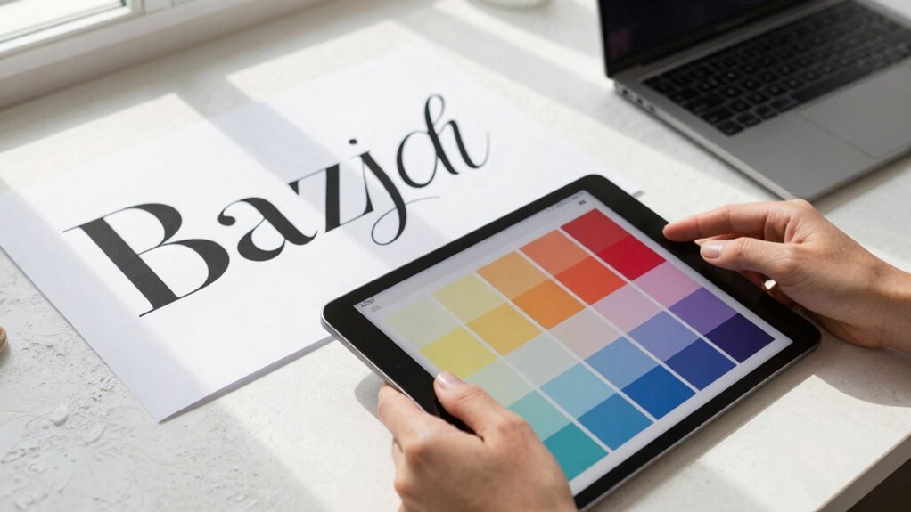

You might think font pairing is just about choosing different fonts, but it’s actually essential for guiding your audience’s understanding and creating visual harmony. Proper pairing establishes a clear hierarchy, making your message easier to follow and more engaging. It also enhances readability and strengthens your brand’s identity. When fonts work well together, your content looks professional and inviting. Keep exploring—there’s more to uncover about how effective font choices can elevate your designs even further.

Get art and craft supplies delivered free with Prime
- Fast, free delivery on millions of items
- Prime Video, Amazon Music and more included
- Member-only deals all year
Key Takeaways
- Proper font pairing creates visual harmony, guiding viewers smoothly through content and enhancing overall user experience.
- Effective typography hierarchy directs attention, improves readability, and clarifies message importance.
- Well-matched fonts establish aesthetic balance, reducing visual noise and making content more inviting.
- Thoughtful font choices reinforce brand identity and support storytelling, building audience trust.
- Mastering font pairing elevates design quality, ensuring clarity, accessibility, and stronger content impact.
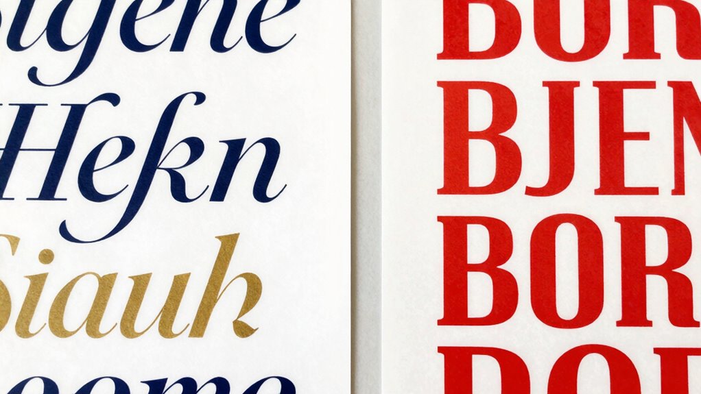
Choosing the right font pairings can greatly impact how your message is received. When you carefully select complementary fonts, you create a visual harmony that guides your audience effortlessly through your content. Effective font pairing isn’t just about aesthetic appeal; it’s about establishing a strong typography hierarchy that clearly communicates your message. By doing so, you help your viewers distinguish headings from body text, emphasize key points, and navigate your content without confusion. The right combination can make your design more engaging and easier to understand, ultimately enhancing your audience’s overall experience.
Choosing the right fonts creates harmony, improves clarity, and guides your audience effortlessly through your message.
You might think that choosing fonts is simply about finding ones that look good together, but it’s much more strategic. When you focus on typography hierarchy, you’re structuring your content in a way that naturally directs attention. For example, pairing a bold, attention-grabbing headline font with a clean, highly readable body font ensures your message flows logically. This hierarchy makes it easier for viewers to recognize what’s most important and follow your narrative seamlessly. Proper font pairing also plays a pivotal role in readability enhancement, which is indispensable for retaining your audience’s interest. If your fonts clash or are difficult to read, viewers may quickly lose patience or misinterpret your message.
Furthermore, selecting fonts that complement each other enhances the overall clarity of your design. When fonts are well-matched, they create a visual rhythm that is pleasing to the eye. This harmony reduces visual noise and makes your content more inviting. Think of it as a conversation—if your words are spoken with a natural flow, your audience is more likely to stay engaged. When you pay attention to font pairing, you’re fundamentally telling a story through your typography, making sure each element supports the next. It’s about balancing contrast and consistency so that your design feels cohesive rather than chaotic. Additionally, considering the visual rhythm created by font choices can significantly improve user experience by making content easier to scan and comprehend. Recognizing the importance of typography hierarchy can transform your design approach and elevate your overall communication. Exploring the use of AI tools can also assist designers in selecting the most effective font combinations faster and more accurately.
A well-considered font pairing can also contribute to establishing a consistent brand identity, which further reinforces your message and builds trust with your audience. Understanding how font contrast influences visual interest can help refine your choices further.
In the end, your choice of font pairing influences not just how your content looks, but how effectively it communicates. Good font pairings foster better readability and help emphasize your message, making your content more accessible and impactful. When you understand the importance of typography hierarchy and prioritize readability enhancement, you elevate your design from ordinary to compelling. It’s a subtle art that can dramatically improve how your audience perceives your work, making font pairing an indispensable skill for every designer.
font pairing guide for designers
As an affiliate, we earn on qualifying purchases.
As an affiliate, we earn on qualifying purchases.
Frequently Asked Questions
How Do Font Pairings Influence User Trust and Credibility?
Font pairings directly influence user trust and credibility by shaping brand perception through font psychology. When you choose complementary fonts, you create a cohesive and professional look that reassures users and builds confidence in your brand. Poor pairings can seem inconsistent or untrustworthy, undermining your message. So, selecting the right fonts enhances your credibility, making your content more appealing and trustworthy in the eyes of your audience.
What Are Common Mistakes to Avoid in Font Pairing?
You should avoid font clash by mixing too many styles or fonts that don’t complement each other. Steer clear of style inconsistency, which can confuse your audience and undermine your message. Don’t pick fonts solely based on looks; consider readability and tone. Using overly decorative fonts for body text or pairing fonts that don’t contrast enough can make your design look unprofessional. Keep it simple, cohesive, and purpose-driven.
Can Font Pairing Impact Website Load Times?
You might think font pairing only affects style, but it can impact your website load times too. Poor font loading habits, like using multiple unoptimized fonts, can slow your site down, making visitors wait and increasing bounce rates. By practicing font optimization—choosing web-friendly fonts and limiting choices—you guarantee your site loads faster. Ironically, pairing fonts thoughtfully not only boosts aesthetics but also keeps your site swift and user-friendly.
How Does Font Pairing Affect Accessibility?
Font pairing greatly impacts accessibility by influencing font contrast and visual hierarchy. When you choose high-contrast fonts, it’s easier for users with visual impairments to read your content. Properly paired fonts establish a clear visual hierarchy, guiding readers smoothly through your information. If you neglect these aspects, your website becomes harder to navigate and less inclusive. Prioritizing accessible font pairing ensures your content reaches and benefits a broader audience.
Are There Tools to Help With Perfect Font Combinations?
You can use tools like Fontjoy, which leverage font pairing algorithms to create typography harmony effortlessly. Imagine designing a website and struggling to find the perfect match—Fontjoy suggests combinations based on visual compatibility, saving you time and ensuring aesthetic consistency. These tools analyze font styles, weights, and proportions, making it easier to select complementary fonts. With such resources, achieving professional-looking font pairings becomes quicker and more intuitive.
As an affiliate, we earn on qualifying purchases.
Conclusion
You might not realize it, but choosing the right font pairings can make or break your design’s effectiveness. Studies show that 90% of first impressions are visual, highlighting how vital font choices are. When you pair fonts thoughtfully, you create a seamless reading experience that captures attention and conveys your message clearly. So, don’t overlook this small detail—your audience will notice the difference, and your designs will stand out even more.
professional font combination books
As an affiliate, we earn on qualifying purchases.
As an affiliate, we earn on qualifying purchases.
As an affiliate, we earn on qualifying purchases.
Columbus Day / Indigenous Peoples' Day Picks
long weekend sales
As an affiliate, we earn on qualifying purchases.