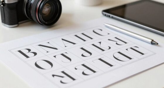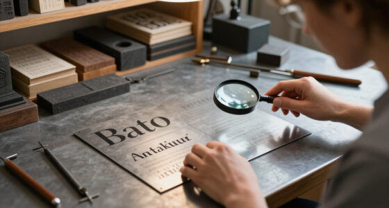
To make display type work effectively in real projects, focus on creating a clear visual hierarchy using size, weight, and placement to guide viewers’ attention. Pair bold headlines with simpler body fonts for balance, and incorporate contrasting materials or textures to add visual interest. Keep your typography consistent and straightforward to guarantee quick comprehension. Mastering these principles helps your message stand out without overwhelming the design, and you’ll discover how to refine your approach further as you explore more.

Get art and craft supplies delivered free with Prime
- Fast, free delivery on millions of items
- Prime Video, Amazon Music and more included
- Member-only deals all year
Key Takeaways
- Use large, bold display type for headlines to immediately draw attention and establish visual hierarchy.
- Pair display fonts with simpler, readable fonts to maintain clarity and balance in design.
- Incorporate contrasting textures or finishes to reinforce hierarchy and add visual interest.
- Maintain consistency in font choices and sizes across the project for a cohesive visual language.
- Prioritize readability and simplicity to ensure message clarity and effective communication.
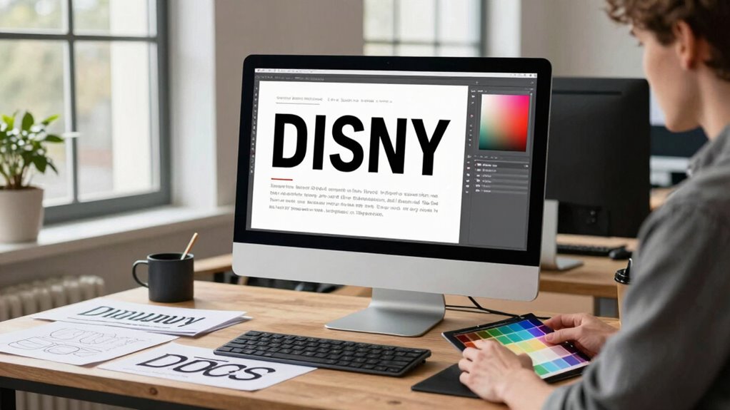
When incorporating display type into real projects, understanding how to make it effective is essential for creating visual hierarchy and capturing attention. Display type, often characterized by bold, large fonts, commands focus and helps convey key messages. To harness its power, you need to master the art of typography hierarchy. This involves using size, weight, and placement to guide viewers’ eyes through your design, emphasizing the most important elements first. You might use a striking headline in a large, bold font to grab attention, followed by smaller, subtler text for supporting information. Proper typography hierarchy ensures your message isn’t lost in clutter or confusion; it creates a clear flow that directs viewers naturally from the most to least critical details. Additionally, understanding the importance of visual hierarchy allows designers to structure content effectively, making sure viewers can quickly grasp the intended message. Incorporating material choices, such as contrasting textures or finishes, can further reinforce the hierarchy and add visual interest. Equally important is font pairing. When working with display type, you want to select fonts that complement each other without competing for attention. A good font pairing balances contrast and harmony. For instance, pairing a serif font with a sans-serif can create visual interest without overwhelming the viewer. The key is to choose fonts with different personalities—perhaps a sturdy display font for headlines and a clean, readable font for body copy—so each plays its role effectively. When pairing fonts, consider their size, weight, and style to develop a cohesive look that reinforces your message rather than distract from it. Avoid mixing too many fonts, as this can clutter the design and diminish clarity. In practice, you’ll find that successful display type application often hinges on simplicity. Keep your typography hierarchy straightforward so that your message is immediately understandable. Use large, bold type for main headlines and more subdued styles for secondary information. When selecting fonts, prioritize readability and ensure that your font pairing enhances, rather than hinders, comprehension. Consistency in your font choices across the project helps establish a unified visual language, making your design more polished and professional. Remember, the goal is to attract attention without overwhelming; your display type should serve as a visual anchor that guides viewers effortlessly through your content. By thoughtfully applying typography hierarchy and smart font pairing, you turn a simple message into a compelling visual story that stands out in any project.
large bold display fonts for headlines
As an affiliate, we earn on qualifying purchases.
As an affiliate, we earn on qualifying purchases.
Frequently Asked Questions
How Do I Choose the Right Display Type for My Brand?
To choose the right display type for your brand, start by understanding your brand personality—whether it’s bold, elegant, playful, or professional. Select a display type that reflects that personality and enhances your visual hierarchy, ensuring key messages stand out. Consider readability and context, testing how different fonts look across platforms. The right display type reinforces your brand identity and guides viewers’ attention effectively.
What Are Common Mistakes to Avoid With Display Typography?
Some believe that ignoring typography hierarchy and color contrast leads to ineffective display typography. You should avoid overusing decorative fonts, which can hinder readability, and neglecting hierarchy may cause confusion. Make sure your typography hierarchy guides viewers smoothly through your message, and use color contrast wisely to highlight key elements. By doing so, you maintain clarity, draw attention effectively, and create visually appealing designs that communicate your brand’s message powerfully.
How Does Display Type Impact User Experience?
Display type substantially impacts user experience by grabbing attention and guiding navigation. When you use effective font pairing and establish a clear visual hierarchy, your design becomes more engaging and easier to scan. You help users quickly identify important information, making their interaction seamless. Poor choices can cause confusion, but strategic display typography enhances clarity and aesthetic appeal, ultimately encouraging users to stay longer and engage more deeply with your content.
Can Display Type Be Used Effectively Across All Devices?
Yes, display type can be used effectively across all devices if you prioritize typography hierarchy and font pairing. Studies show that 94% of first impressions relate to a website’s design, emphasizing the importance of adaptable display fonts. By selecting scalable typography and pairing fonts that complement each other, you guarantee your display type remains clear and impactful, whether on a phone, tablet, or desktop.
How Do I Balance Creativity and Readability in Display Type?
You balance creativity and readability in display type by establishing a clear typography hierarchy, guiding viewers through your message effortlessly. Use bold, larger fonts for emphasis and playful styles sparingly to maintain clarity. Focus on visual storytelling by aligning your type choices with your brand’s personality. Always test your design across devices to guarantee your creative elements enhance readability without overwhelming the viewer, creating an engaging yet accessible experience.
font pairing for typography hierarchy
As an affiliate, we earn on qualifying purchases.
As an affiliate, we earn on qualifying purchases.
Conclusion
By mastering how to make display type work in real projects, you breathe life into your designs, transforming static words into compelling visuals that grab attention and communicate your message effectively. Remember, your typography choices shape perceptions and evoke emotions—it’s your secret weapon in a sea of sameness. Don’t shy away from experimenting and refining; after all, every great project begins with a bold step. Embrace the power of display type, and let your creativity soar beyond the ordinary.
textured finishes for visual interest
As an affiliate, we earn on qualifying purchases.
As an affiliate, we earn on qualifying purchases.
professional typography hierarchy tools
As an affiliate, we earn on qualifying purchases.
As an affiliate, we earn on qualifying purchases.
Halloween Picks
halloween
As an affiliate, we earn on qualifying purchases.