
Understanding font classifications like serif, sans-serif, script, and display helps you choose the right typeface for your design. Serif fonts have small lines at letter ends and convey tradition, while sans-serif fonts are clean, modern, and great for screens. Script fonts mimic handwriting, adding elegance, and display fonts are bold and attention-grabbing. Learning these categories helps craft visually appealing and effective messages—keep exploring to see how each style influences your projects.
Key Takeaways
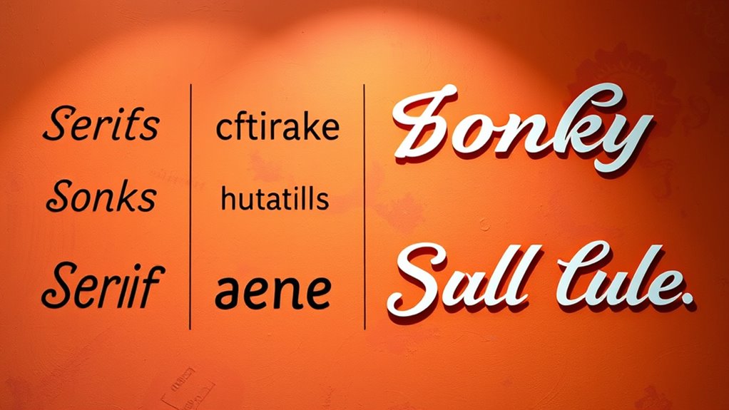
- Serif fonts feature small strokes at letter ends, conveying a traditional and formal appearance, ideal for print materials like books and newspapers.
- Sans-serif fonts lack additional strokes, offering a clean, modern look suitable for digital content and contemporary design projects.
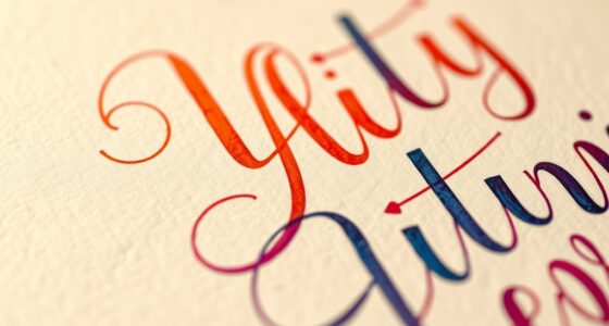
- Script fonts mimic handwriting or calligraphy, providing elegance and personality, often used in invitations and branding.
- Display fonts are bold and expressive, designed to grab attention and evoke strong emotions, typically used for headlines and branding.
- Understanding font classifications aids in effective communication, font pairing, and creating visually appealing, emotionally resonant designs.

Have you ever wondered how fonts are organized or why certain styles evoke specific feelings? Understanding font classifications can help you choose the right typeface for any project. Fonts are generally grouped into categories like serif, sans-serif, script, and display, each with its own distinct characteristics and uses. Knowing these categories isn’t just about aesthetics; it’s also about harnessing the history of typography to communicate effectively. When you learn the basics of font classifications, you gain insight into their origins, which can guide your font pairing tips and overall design choices.
Understanding font categories helps you choose and pair typefaces that communicate effectively and evoke the right emotions.
Serif fonts are characterized by small lines or strokes attached to the ends of the main strokes of letters. These fonts have a long history, dating back to ancient inscriptions carved into stone, making them one of the oldest font classifications. Their classic and formal appearance makes serif fonts ideal for print materials like newspapers, books, and formal invitations. When pairing fonts, you might combine a serif with a sans-serif for contrast—using a serif for headings and a clean sans-serif for body text, creating a balanced and professional look. The history of typography reveals that serif fonts convey tradition, reliability, and respectability, which is why they’re often used in print and branding aiming for a trustworthy image.
Sans-serif fonts, on the other hand, lack the small strokes at the ends of letters. They have a more modern and minimalistic appearance, emerging in the early 20th century as part of the modernist movement in typography. Sans-serif fonts are often used for digital content because of their clean, straightforward look that enhances readability on screens. If you’re designing a website or app, a sans-serif font can help your message appear contemporary and approachable. When considering font pairing tips, pairing a sans-serif with a serif can create visual interest and clarity, making your content more engaging. The history of typography shows that sans-serifs symbolize simplicity and progress, aligning well with contemporary design trends and digital environments.
Script fonts mimic handwriting or calligraphy, offering a sense of elegance, personality, or informality depending on their style. They’re often used for invitations, branding, or decorative headlines. Display fonts are designed to grab attention, often used in headlines, posters, or logos. They tend to be bold, unique, and expressive. Both script and display fonts should be used sparingly because overuse can overwhelm your message. When selecting these styles, you’re tapping into their emotional appeal—scripts evoke sophistication or warmth, while display fonts evoke excitement or creativity. With knowledge of font classifications and their history, you can select the right font to evoke specific feelings and reinforce your message effectively. Mastering font classifications helps you craft designs that are not only visually appealing but also emotionally resonant, making your communication more impactful.

Luxenap 15.8 X 7.9 Inch Linen-Feel Guest Towels, 50 Lettered Hand Towels – Silver Letter 'B', Sans Serif Font, White Paper Dinner Napkins, airlaid, For Restrooms And Tables – Restaurantware
LINEN-LIKE TEXTURE: Impress guests with these linen-feel paper napkins that offer a soft, cloth-like touch, perfect for upscale…
As an affiliate, we earn on qualifying purchases.
As an affiliate, we earn on qualifying purchases.
Frequently Asked Questions
How Do Font Classifications Influence Readability on Digital Screens?
Font classifications greatly impact your font readability and screen legibility. Serif fonts, with their small strokes, can improve readability in printed text but may clutter digital screens. Sans-serif fonts, being cleaner, enhance clarity on screens, making content easier to read quickly. Script and display fonts are typically decorative and can hinder readability if used excessively. Selecting the right classification guarantees your digital content remains clear and accessible to your audience.
Can Font Classifications Impact Brand Perception and Identity?
Boldly, font classifications forge front-facing brand perceptions, shaping how your audience perceives your brand. You can create consistent, compelling visuals that communicate your brand’s core values through carefully chosen fonts. Serif fonts evoke tradition, while sans-serif feels modern. Script and display fonts add flair and personality, amplifying emotional impact. By aligning fonts with your brand identity, you guarantee brand consistency, making your message memorable and meaningful to your audience.
Are There Cultural or Regional Differences in Font Preferences?
Yes, cultural symbolism and regional typography influence your font preferences. Different regions often favor certain styles that resonate with local traditions or history, shaping how your audience perceives your brand. For example, ornate scripts may evoke elegance in one culture, while minimalist sans-serif fonts might feel modern elsewhere. Recognizing these cultural and regional differences helps you select fonts that strengthen your connection with diverse audiences.
How Do Font Classifications Affect Accessibility for Visually Impaired Users?
Think of font classifications as signposts guiding your eyes through a landscape; they directly impact contrast and legibility. Sans-serif fonts often serve as clear, straightforward pathways, enhancing accessibility, while script fonts can become tangled thickets. You should adhere to font accessibility standards, ensuring high contrast and ample spacing. By choosing the right font classification, you make your content more navigable and inclusive for visually impaired users.
Can Combining Different Font Classifications Improve Design Effectiveness?
Yes, combining different font classifications can improve your design’s effectiveness through thoughtful font pairing. By mixing serif, sans-serif, script, or display fonts, you create visual contrast that captures attention and guides readability. To achieve stylistic harmony, choose fonts with complementary styles and maintain consistency. This approach enhances aesthetics, emphasizes key content, and makes your design more engaging, ensuring your message resonates clearly with your audience.

Cricut® Library Fonts Cartridge
Use with all Cricut electronic cutting machines
As an affiliate, we earn on qualifying purchases.
As an affiliate, we earn on qualifying purchases.
Conclusion
Now that you’ve explored the different font classifications, you’re better equipped to choose the right type for your project. Remember, selecting the right font can make all the difference in how your message is received. Don’t just scratch the surface—dive deep and understand the nuances. When you pay attention to details, you’ll find that the right font can turn a good design into a great one. It’s all about hitting the mark.

DZXCYZ 2 Inch Letter Symbol Stencils for Painting on Wood, 65 Pcs Alphabet Drawing Templates with Calligraphy Large Font and Cursive Letters Numbers Signs, Reusable Plastic Art Craft Stencils
【Package Includes】: You will receive 65 pieces painting stencils totally, including 26 uppercase letters, 10 numbers, 26 lowercase…
As an affiliate, we earn on qualifying purchases.
As an affiliate, we earn on qualifying purchases.
bold display font for headlines
As an affiliate, we earn on qualifying purchases.
As an affiliate, we earn on qualifying purchases.