
Variable fonts give you dynamic control over typography, enabling seamless adjustments in weight, width, and style within a single font file. This flexibility allows your designs to adapt smoothly across different screen sizes and devices, creating a more responsive user experience. You can animate, fine-tune, or customize font attributes in real-time, making your projects more engaging and cohesive. Keep exploring to discover how these powerful tools can elevate your typographic creativity.
Key Takeaways
- Variable fonts enable seamless adaptation to different screen sizes and layouts, enhancing responsive typography.
- They utilize axes to control attributes like weight, width, and style, allowing dynamic font variation.
- Font interpolation blends multiple styles into a single file, reducing load times and improving performance.
- Designers can create smooth transitions and animations between font styles for engaging user experiences.
- Variable fonts offer precise, real-time control over typography, ensuring consistency and flexibility across devices.
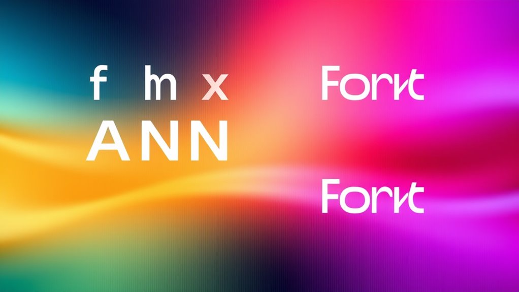
Have you ever wondered how fonts can adapt seamlessly to different designs and sizes? The secret lies in the innovative world of variable fonts, which allow you to create flexible, responsive typography without juggling multiple font files. At the core of this technology is font interpolation, a process that blends different font instances to produce a continuous range of weights, widths, or styles. Instead of switching between distinct static fonts, you can smoothly transition from light to bold or narrow to wide, all within a single font file. This capability is powered by axis design, which defines the parameters, or axes, along which a font can vary. Think of axes as the control sliders for your font’s attributes—weight, width, slant, or other customizable features. By manipulating these axes, designers can craft a font that responds dynamically to user interaction or layout changes, creating a more engaging and adaptable experience.
Variable fonts use axis design and interpolation to create smooth, responsive typography adaptable to any layout or interaction.
When you incorporate axis design into your projects, you access a new level of control over typography. Instead of limiting yourself to predefined styles, you can fine-tune the font’s appearance in real-time, ensuring it fits perfectly within any screen size or design context. For example, on a mobile device, you might reduce the font weight slightly for better readability, while on a desktop, you could increase it for emphasis. This adaptability not only improves user experience but also streamlines your workflow, as you no longer need to load multiple font files or create complex CSS rules to switch styles. Instead, variable fonts enable you to animate or shift between styles smoothly, making your website feel more modern and polished.
The power of font interpolation and axis design extends beyond simple size adjustments. They give you the ability to craft highly nuanced typographic expressions that respond intelligently to the environment. Whether you’re designing a minimalist site that needs subtle variations or a bold, interactive experience, variable fonts provide the flexibility you require. You can experiment with different axes to create custom effects—like shifting the weight as a user scrolls or adjusting width for responsive layouts—without sacrificing performance. This efficiency makes variable fonts an essential tool in responsive typography, ensuring your design remains cohesive and visually appealing at every scale.
In essence, by understanding how font interpolation works along axis design, you gain the power to craft typography that’s as dynamic as your creativity. It’s about making fonts more than just static elements—turning them into adaptable, expressive tools that elevate your entire design. Recognizing font interpolation as a key aspect of this technology allows you to unlock even more potential within your typographic toolkit.
Top picks for "variable font flexibility"
Open Amazon search results for this keyword.
As an affiliate, we earn on qualifying purchases.
Frequently Asked Questions
How Do Variable Fonts Impact Website Load Times?
Variable fonts can improve your website’s load times because they reduce the need for multiple font files. By using font compression, you only load one flexible font file that adapts to different styles and weights. This streamlines performance optimization, leading to faster page loads and a better user experience. You’ll notice quicker rendering, less bandwidth usage, and improved site efficiency, all thanks to the compact, versatile nature of variable fonts.
Are All Browsers Fully Compatible With Variable Fonts?
Browsers bring big barriers, but most modern browsers boast broad support for variable fonts. You’ll find that Chrome, Firefox, Edge, and Safari all showcase solid font support, ensuring your flexible typography functions flawlessly. However, some older browsers might still stumble or stall on variable font support, so it’s wise to double-check compatibility before deploying. Overall, most users will enjoy seamless, smooth, and stylish font experiences across a variety of browsers.
How Can Designers Best Utilize Axes for Creative Flexibility?
You can best utilize axes for creative experimentation by carefully selecting and combining them to achieve unique visual effects while maintaining design consistency. Experiment with varying axis values to explore different styles and weights, ensuring your typography adapts seamlessly across devices. This flexibility allows you to balance innovation with readability, making your designs more engaging and cohesive. Just remember to test your variations for ideal user experience.
What Are Common Challenges When Implementing Variable Fonts?
Imagine trying to steer a ship through unpredictable waters; implementing variable fonts can feel similar. You might face challenges with font performance, as larger files load slower, and maintaining design consistency across different browsers becomes tricky. You need to fine-tune axes carefully, ensuring the typography adapts smoothly without sacrificing speed or uniformity. Staying vigilant helps you navigate these challenges, creating responsive, visually cohesive designs that perform well across platforms.
How Do Variable Fonts Affect Accessibility and Readability?
Variable fonts enhance accessibility and readability by allowing you to customize font legibility to suit diverse users. You can adjust weight, width, and other axes to improve clarity, creating a better user experience. However, if overused or improperly configured, they might cause visual inconsistency or confusion. To maximize benefits, guarantee that font variations maintain clarity and consistency, making your content easier to read for all users.
Conclusion
Think of variable fonts as a versatile river, flowing smoothly through the landscape of design. They adapt effortlessly, guiding your message with grace and precision. Just as a river shapes the land over time, these fonts shape your website’s personality, offering endless possibilities. Embrace their flexibility, and watch your typography evolve seamlessly. With variable fonts, you’re the river’s current—powerful, adaptable, and always moving forward in the flow of responsive design.