
When considering accessibility in typography, focus on using high-contrast colors like black on white to maintain clarity at different sizes. Choose simple, clean fonts that stay legible when scaled down or up, and avoid overly decorative styles for smaller text. Adequate spacing between lines and characters also improves readability. By paying attention to these elements, you guarantee your content is accessible to all users. Keep exploring to discover even more ways to enhance typography for everyone.
Key Takeaways
- Use high contrast between text and background to ensure readability across all sizes.
- Select simple, clear fonts that remain legible when scaled down or enlarged.
- Adjust line spacing and letter spacing appropriately for different font sizes.
- Avoid decorative or condensed fonts for small text to prevent character confusion.
- Test typography at various sizes to maintain accessibility and prevent visual strain.
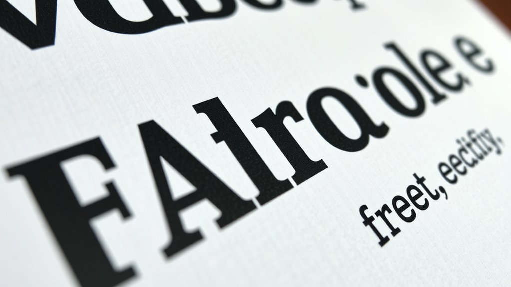
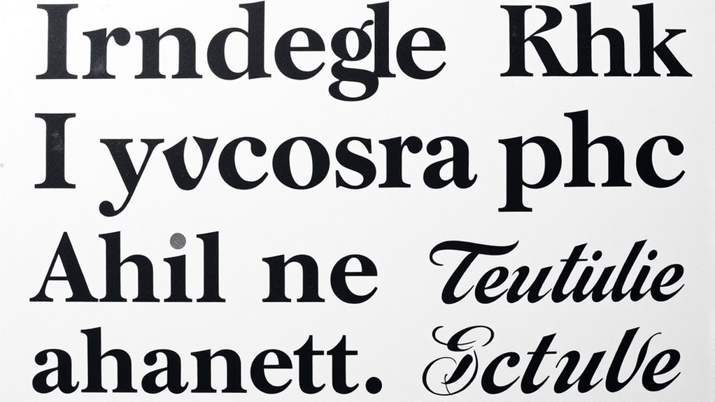
Have you ever struggled to read text on a website or in a printed document? If so, you’re not alone. Poor legibility can make it difficult to access information, especially for users with visual impairments. One key factor in improving readability at different sizes is choosing the right typography. When selecting fonts, you need to consider font contrast, which is how well the text stands out against its background. High contrast between text and background enhances clarity, making it easier to read, even at small sizes. If the contrast is too low, details blur together, forcing your eyes to strain and potentially causing discomfort. For instance, black text on a white background offers excellent contrast, while gray text on a slightly lighter gray background diminishes readability. Consistently evaluating contrast levels ensures your content remains accessible regardless of the size it’s viewed at. Additionally, understanding the importance of best beaches can remind us how crucial clear visual communication is in creating inviting and accessible environments, whether in physical spaces or digital content.
Prioritize high contrast and clear typography to ensure accessible, legible content for all viewers.
Beyond visual contrast, you also need to think about screen reader compatibility. Some fonts work better with assistive technologies, and choosing typefaces that are clear and simple can improve the experience for users relying on screen readers. Fonts with distinct letter shapes prevent confusion between characters like “l” (ell) and “I” (capital i), or “0” (zero) and “O” (capital o). When you pick a font that’s easy to interpret both visually and via screen readers, you help ensure your message reaches a broader audience. Additionally, maintaining consistent font styles and avoiding overly decorative fonts at small sizes helps screen readers accurately interpret your content, reducing misunderstandings or missed information.
Adjusting font size is another critical aspect. As you scale text up or down, it’s essential to select typefaces that remain legible and clear, avoiding fonts that become overly condensed or too ornate at smaller sizes. For larger text, you might opt for more decorative fonts to add style, but for body copy or instructions, simplicity is key. You should also consider line spacing and letter spacing, which become increasingly important at different sizes. Proper spacing prevents characters from blending together, especially when viewed on various screens or printed materials.
In essence, designing for accessibility in typography involves thoughtful font contrast and screen reader compatibility, along with careful size adjustments. When you prioritize these elements, you make your content more inclusive, ensuring everyone can access and understand your message regardless of how or where they’re viewing it. This approach not only improves usability but also demonstrates your commitment to making information available to all users.

EZ2See 2026 Weekly Planner Calendar – Daily Plan Organizer with Large Black Print, Numbers, Borders – High Contrast Appointment Book with Huge Space for Notes, Bold Lines – 8.5" x 11"
Low Vision Design: Designed by someone with low vision specifically for people with low vision to ensure maximum…
As an affiliate, we earn on qualifying purchases.
As an affiliate, we earn on qualifying purchases.
Frequently Asked Questions
How Can I Test Typography Accessibility Across Different Devices?
To test typography accessibility across different devices, you should use responsive typography techniques and font scaling. Preview your design on various screens, adjusting font sizes to guarantee readability. Utilize tools like browser developer modes, device simulators, or accessibility testing software to evaluate legibility. This approach helps you identify issues with font scaling and ensures your typography remains clear and accessible, regardless of device or screen size.
What Are Common Mistakes That Reduce Typographic Accessibility?
Think of your typography like a well-organized bookshelf—mistakes can cause chaos. Common errors include poor font pairing, which muddles clarity, and neglecting typographic hierarchy, making it hard to distinguish important info. Using too many fonts or tiny sizes hampers accessibility. To avoid these pitfalls, choose clear, contrasting fonts and establish a visual order, ensuring your message is easily understood by everyone, regardless of their device or vision.
How Does Color Contrast Impact Readability at Various Sizes?
Color contrast considerably impacts readability at various sizes by affecting your color perception, especially for those with visual impairment. When contrast is high, text remains clear and easy to distinguish, even at smaller sizes. Conversely, low contrast can cause your eyes to strain, making it harder to read. Always guarantee your text and background have sufficient contrast, adapting for different sizes to maximize accessibility for everyone.
Are There Specific Fonts Recommended for Accessibility?
Did you know that sans-serif fonts like Arial and Verdana are often recommended for accessibility? You should choose fonts that promote clear font pairing and establish a strong typographic hierarchy, making content easier to read at various sizes. Stick to simple, high-contrast fonts to improve legibility for all users, especially those with visual impairments. These choices help guarantee your content remains accessible and user-friendly across different devices and sizes.
How Can Users Customize Typography for Better Personal Accessibility?
You can customize typography for better personal accessibility by adjusting font resizing settings on your device or within specific apps. Use user preferences to select larger or more readable fonts, and enable features like zoom or magnification when needed. These adjustments help guarantee text remains legible at different sizes, making reading more comfortable and tailored to your visual needs. Don’t hesitate to explore accessibility options available on your device for ideal reading comfort.

Erchineko Portable Ebook Reader, 6 Inch Eye Friendly Ink Screen, 8GB Storage 128MB RAM, E Reader with Adjustable Font, for Text and Image Formats, for Commuting, Traveling, Home
6 Inch Screen: The ebook reader features a 6 inch screen that clearly displays a variety of content…
As an affiliate, we earn on qualifying purchases.
As an affiliate, we earn on qualifying purchases.
Conclusion
So, next time you design, imagine your font as a superhero—bold, clear, and ready to save the day for every reader. Forget secret codes or tiny text; make your typography accessible, or risk turning your audience into confused villains. Remember, legibility isn’t just a feature; it’s your design’s cape. After all, if your fonts can’t be read at a glance, they’re basically just fancy wallpaper—pretty, but utterly useless.

KJV, Pew Bible, Large Print, Hardcover, Black, Red Letter, Comfort Print: Holy Bible, King James Version
As an affiliate, we earn on qualifying purchases.
As an affiliate, we earn on qualifying purchases.

CSS Precision Handbook: Expert Strategies for Typography, Layout Control, Animations, Frameworks, Integration, and Clean Architecture (Programming Companion)
As an affiliate, we earn on qualifying purchases.
As an affiliate, we earn on qualifying purchases.