
To guarantee your email newsletters look great on all devices, you need a responsive design that adapts to different screen sizes. Focus on creating a clear visual hierarchy, use scalable fonts like ems or rems for readability, and maintain consistent visual elements throughout. Good contrast enhances accessibility and content clarity. By implementing these principles, your messages will stay engaging and easy to navigate, no matter what device your audience uses. Keep exploring to learn how to perfect your approach.
Key Takeaways
- Use flexible layouts like media queries and fluid grids to adapt email structure across devices.
- Incorporate scalable font units such as ems or rems for consistent readability on all screens.
- Prioritize visual hierarchy by placing key messages at the top and emphasizing important elements.
- Ensure high contrast between text and background for improved accessibility and clarity.
- Maintain visual consistency through resizable fonts and cohesive styling for a professional appearance.
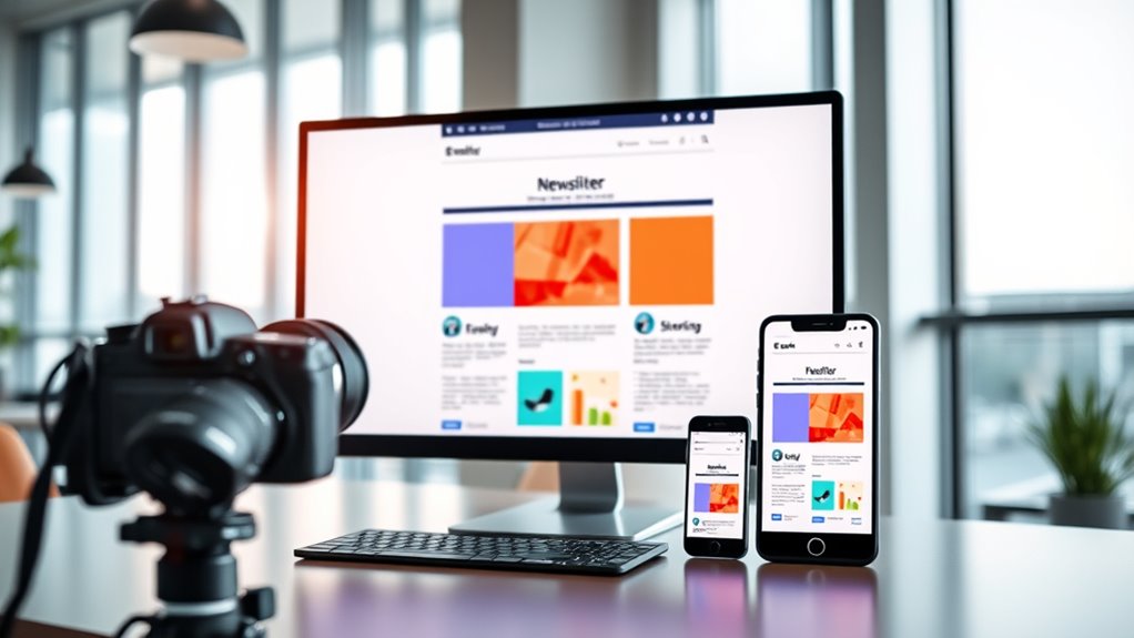
Ever wondered why some email newsletters look perfect on every device while others fall flat? The secret often lies in how well they’re designed to adapt to different screen sizes. Responsive design isn’t just a trend; it’s a necessity for engaging your audience across desktops, tablets, and smartphones. When you prioritize a clear visual hierarchy, you guide your readers’ eyes seamlessly through your content. This means placing the most important information at the top, using size, color, and spacing to emphasize key messages. A strong visual hierarchy ensures your email isn’t just pretty—it’s functional, making it easy for recipients to grasp your main points quickly, no matter what device they’re using.
Another essential aspect is font scalability. Unlike static designs, responsive emails require fonts that can resize smoothly depending on the screen size. If your fonts stay the same size on a tiny phone screen as they do on a large monitor, your message can become unreadable or look awkward. By using scalable font units like ems or rems, you give your text the flexibility to grow or shrink proportionally. This way, your message remains clear and legible, whether someone’s reading on a compact smartphone or a widescreen desktop. Font scalability also helps maintain consistency in your branding, ensuring your fonts look good and are easy to read across all devices. Additionally, understanding the importance of contrast ratio can make your content more accessible and visually appealing for all users.

Responsive Design: An Undead Introduction to Mobile Web Development (Undead Institute)
As an affiliate, we earn on qualifying purchases.
As an affiliate, we earn on qualifying purchases.
Frequently Asked Questions
How Does Responsive Design Impact Email Load Times?
Responsive design can slightly increase your email’s loading speed because it often involves additional images, CSS, and code. However, these elements enhance user experience by ensuring your email looks great on any device. To keep loading times fast, optimize images and streamline code. Ultimately, a well-designed, responsive email improves user engagement without substantially sacrificing loading speed, making it worth the effort for better overall performance.
What Are the Best Tools for Testing Email Responsiveness?
You should use tools like Litmus, Email on Acid, and Mailtrap to test email responsiveness. These platforms let you preview how your emails render across various devices and email clients, ensuring CSS media queries work correctly. They help you identify issues with email client compatibility, so you can optimize your design. With these tools, you’ll catch problems early and deliver a seamless experience to all your subscribers.
Can Responsive Design Improve Email Engagement Rates?
Yes, responsive design can greatly improve your email engagement rates. By focusing on mobile optimization, your emails will display correctly across all devices, making it easier for recipients to read and interact with your content. This enhances user experience, encouraging more clicks and conversions. When your emails look good and function smoothly on smartphones and tablets, you’re more likely to keep your audience engaged and boost overall campaign success.
Are There Any Email Clients That Don’t Support Responsive Features?
Some email clients have limitations that hinder them from fully supporting responsive features. For example, older versions of Outlook and certain non-supporting platforms like some web-based clients may not render responsive designs correctly. You should test your emails across various clients to identify these issues. By understanding these email client limitations, you can optimize your layouts to ensure your message remains effective, even on platforms with limited support.
How Should Images Be Optimized for Responsiveness?
Think of a marketing campaign where your images needed to adapt seamlessly across devices. To optimize images for responsiveness, you should use image scaling techniques, like setting max-width to 100%, ensuring they resize properly on all screens. Additionally, compress the file to reduce load times without sacrificing quality. This approach improves user experience, boosts engagement, and keeps your email visually appealing across desktops and mobiles alike.
email testing tools for responsiveness
As an affiliate, we earn on qualifying purchases.
As an affiliate, we earn on qualifying purchases.
Conclusion
By mastering responsive design, you’ll transform your email newsletters into unstoppable, shape-shifting masterpieces that captivate every screen—big or small. Imagine your messages bouncing effortlessly from desktop giant to tiny mobile device, never losing their punch or clarity. With responsive design, your emails won’t just be read—they’ll explode into your audience’s minds, leaving a lasting impression that’s impossible to ignore. Get it right, and your emails will conquer the digital universe!
scalable font for emails
As an affiliate, we earn on qualifying purchases.
As an affiliate, we earn on qualifying purchases.
email accessibility contrast tools
As an affiliate, we earn on qualifying purchases.
As an affiliate, we earn on qualifying purchases.