To create harmonious font pairings, choose fonts with contrasting characteristics, like pairing a sleek sans-serif with a classic serif, to add visual interest and clarity. Limit yourself to two or three fonts to avoid clutter, using different weights and sizes to establish hierarchy. Make sure the fonts complement each other in style and proportions for a balanced look. If you’re curious about mastering these techniques, you’ll find useful tips that can elevate your design skills.
Key Takeaways
- Combine contrasting fonts, such as a sans-serif with a serif, to create visual interest and clarity.
- Limit your font selections to two or three to maintain balance and prevent clutter.
- Use variations in weight, size, or style to establish clear hierarchy and hierarchy.
- Ensure font styles are compatible in terms of proportions and x-heights for a cohesive look.
- Focus on subtle contrast techniques like color and weight differences for harmony and visual appeal.

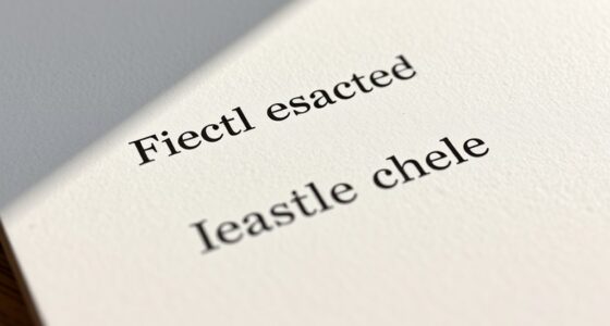
Choosing the right font combinations can considerably enhance your design’s readability and visual appeal. When you’re selecting fonts, it’s essential to understand font pairing strategies that help create harmony and balance within your layout. The goal is to find fonts that complement each other without competing for attention, ensuring your message comes across clearly and attractively. One effective way to achieve this is by applying font contrast techniques, which involve pairing fonts with differing characteristics to add visual interest and hierarchy.
Start by considering the personality and mood you want your design to convey. For instance, pairing a sleek sans-serif font with a classic serif can produce a modern yet professional look, while combining playful handwritten fonts with clean, simple typefaces can inject personality and approachability. When using font contrast techniques, aim for a clear distinction between the fonts’ weights, sizes, or styles to create a visual hierarchy. For example, use a bold font for headings and a lighter one for body text, guiding the viewer’s eye naturally through the content.
Pair sleek sans-serif with classic serif fonts for a modern, professional look that guides the viewer naturally.
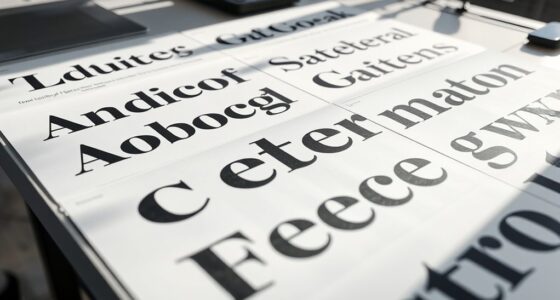
Another key aspect of font pairing strategies is choosing fonts that have compatible x-heights and similar proportions. This ensures that the fonts don’t clash visually and maintain a cohesive appearance. It’s also helpful to limit your number of font choices to two or three, preventing your design from becoming cluttered or chaotic. When you do introduce multiple fonts, make sure they serve different functions—such as one for titles, another for subheadings, and a third for body copy—so each has a distinct role in the overall composition.
Using font contrast techniques thoughtfully can elevate your design’s clarity. Contrast doesn’t always mean opposites; it can be subtle yet effective. For example, pairing a condensed font with a wider one can create visual interest without overwhelming the viewer. Additionally, pay attention to color and weight, as these elements can enhance contrast even further. When the fonts differ markedly in style or weight, you’ll establish a clear hierarchy that guides your audience smoothly through your content.
Furthermore, understanding font pairing strategies can help you develop a cohesive visual identity that resonates with your audience and supports your brand message. Ultimately, mastering font pairing strategies and font contrast techniques requires experimentation and a keen eye for detail. Test different combinations and consider how each font interacts with the others in your design. With practice, you’ll develop an intuitive sense of which pairings work best, making your projects more engaging and professional. Remember, the right fonts can set the tone and elevate your entire design, so choose wisely and trust your judgment.

HBselect Women Maternity Bras 5 Pack Nursing Bras for Breastfeeding
Ultra Comfort & Soft Material: HBselect nursing bras are made of 92% nylon and 8% elastane, ensuring softness,...
As an affiliate, we earn on qualifying purchases.
Frequently Asked Questions
How Do I Choose Fonts for Branding Consistency?
To choose fonts for branding consistency, start by understanding your brand personality and the font psychology behind each style. Pick fonts that reflect your brand’s tone—whether it’s professional, playful, or sophisticated. Use a primary font for your logo and headers, and complementary fonts for body text. Consistent font use across all materials reinforces your brand identity, making it recognizable and trustworthy to your audience.
What Are Common Mistakes in Font Pairing?
You often make the mistake of clashing typefaces, which can confuse your audience and weaken your message. Avoid excessive font variety, as it creates visual chaos and diminishes readability. Focus on selecting 2-3 complementary fonts, balancing contrast and harmony. Keep your design consistent and simple to guarantee your brand looks professional. Remember, less is more when it comes to font pairing for effective branding.
How Many Fonts Should I Combine in a Design?
Think of your design as a symphony — less is often more. You should typically combine two to three fonts to create clear font contrast and establish a strong font hierarchy. Using too many fonts can create chaos, while too few might look dull. Focus on balancing style and readability, ensuring each font plays its part without overpowering the others. Keep it simple and let your message shine.
Can Pairing Fonts Influence User Experience?
Pairing fonts can markedly influence user experience by enhancing clarity through effective typography hierarchy and font contrast. When you choose complementary fonts, you make it easier for users to distinguish headings from body text, guiding their reading flow. Proper font contrast ensures readability, reducing eye strain. By thoughtfully pairing fonts, you create a visually appealing design that keeps users engaged and improves their overall interaction with your content.
Are There Tools to Help With Font Pairing?
Think of font pairing tools as your trusty compass in a sea of typography. Yes, there are tools like typography software and font pairing tools that make finding harmonious font combinations easier. They act like your creative co-pilots, suggesting complementary fonts and helping you avoid visual clashes. With these tools, you can confidently craft designs that look professional and feel cohesive, saving you time and sparking inspiration along the way.
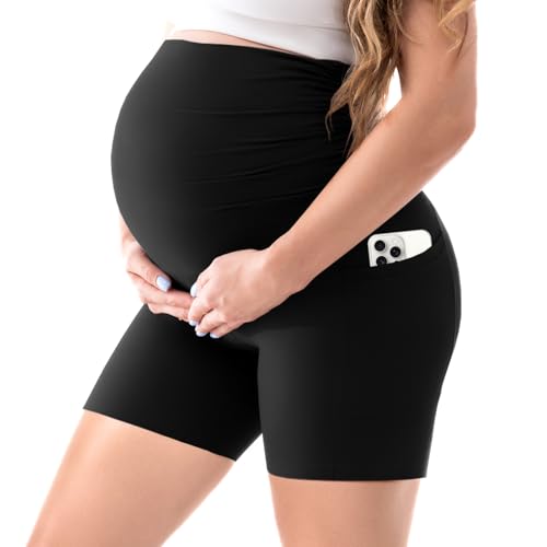
Walifrey Women's Maternity Shorts with Pockets Over The Belly,Pregnancy Yoga Pants Activewear Biker Shorts Casual Black L
Supreme Comfort:Our maternity shorts are crafted from soft fabrics,specifically designed to ensure absolute comfort during your everyday activities...
As an affiliate, we earn on qualifying purchases.
Conclusion
When pairing fonts, trust your instincts and test different combinations. A popular theory suggests that contrasting styles—like serif with sans-serif—create visual interest and balance. While not all rules are absolute, experimenting with these principles helps you find harmonious matches that enhance your message. Remember, the best font pairings feel natural and support your content’s tone. So, go ahead, explore, and enjoy the creative process—your perfect font combo is just a test away.

POSHGLAM Women's Maternity Boyfriend Jeans Over Belly Stretch Comfy Loose Casual Denim Pants with Pockets(Light Blue, Medium)
PREGNANCY COMFORT: Made from premium soft, breathable, and stretchy fabric—Body: 70% Cotton, 28% Polyester, 2% Spandex; Panel: 88%...
As an affiliate, we earn on qualifying purchases.

OUGES Women's Baby Shower Dress Casual Sleeveless Summer Maxi Dresses Pregnancy Maternity Clothes Postpartum Outfits(Floral A,M)
Comfortable and Maternity-Friendly: Specifically designed for expecting mothers, this casual maxi dress prioritizes comfort and adaptability, perfect for...
As an affiliate, we earn on qualifying purchases.