Aiming for harmonious font pairings? Discover essential guidelines to elevate your design by creating balanced, contrasting, and visually appealing combinations.
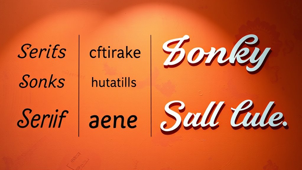
An article exploring font classifications like serif, sans-serif, script, and display, revealing how each style impacts your design choices—discover more.
Find out how a monochromatic color scheme can simplify your design while adding depth, focus, and a touch of creativity that keeps your audience engaged.
Beneath its simple appearance lies the secret to creating balanced, harmonious designs that captivate viewers—discover how the Golden Ratio transforms your composition.
Discover how Gestalt principles influence perception and transform your design approach—uncover the secrets behind creating visually compelling layouts.
Bringing together various color harmony schemes like analogous and complementary, this guide reveals how to craft captivating visuals—discover the secrets inside.
The technique behind creating visually appealing layouts hinges on understanding the golden ratio and its practical calculations to achieve perfect harmony.