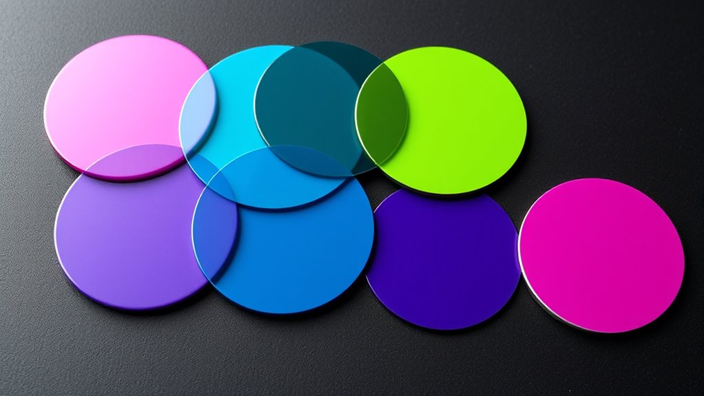
Limited palettes can secretly hinder your artistic growth by restricting depth and emotional expression; discover how to overcome this challenge to elevate your work.
Creating harmonious color palettes with analogous and complementary schemes can transform your design—discover how to master this art and elevate your visuals.
Learning how to use color gradients for depth and dimension can transform your designs—discover the secrets to creating realistic, engaging visuals that truly stand out.
Bringing together various color harmony schemes like analogous and complementary, this guide reveals how to craft captivating visuals—discover the secrets inside.
Preparing to master color selection, understanding HSL, HSV, and Hex codes reveals key differences that can elevate your digital design skills—discover how inside.
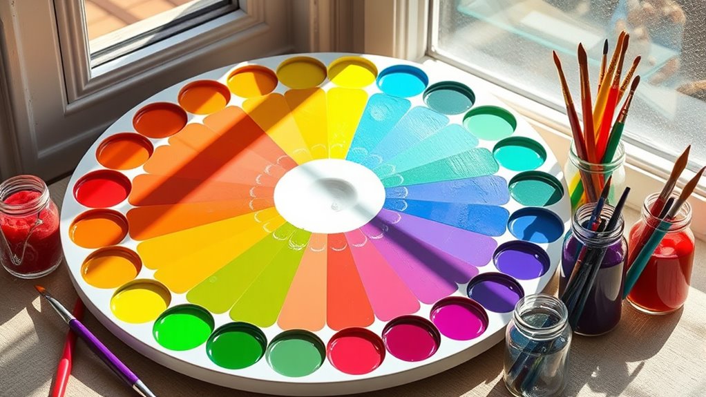
A foundational understanding of color theory unlocks powerful design tools, revealing how color combinations evoke emotion and harmony—discover the secrets behind effective color use.