
Great teams know that effective brochure design combines clear content organization, strategic use of color, and simplicity to communicate your message. You should guide viewers naturally through your information with strong visual hierarchy, highlighting key details like your brand and call to action. Consistent branding and mindful use of whitespace prevent clutter and boost readability. Mastering these principles helps create compelling, memorable brochures that drive results—if you keep exploring, you’ll discover how to make your designs even more impactful.
Key Takeaways
- Effective brochure design prioritizes clear visual hierarchy to guide viewers naturally through essential information.
- Strategic use of color psychology enhances emotional impact and reinforces brand identity.
- Consistency in colors, fonts, and layout builds trust and strengthens brand recognition.
- Adequate whitespace and simplicity improve readability and prevent visual clutter.
- Balancing compelling visuals with core messages ensures clarity and drives audience engagement.

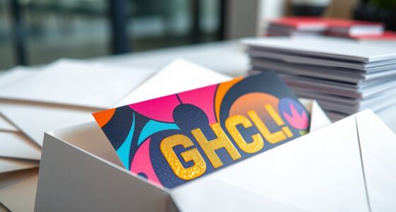
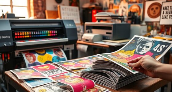
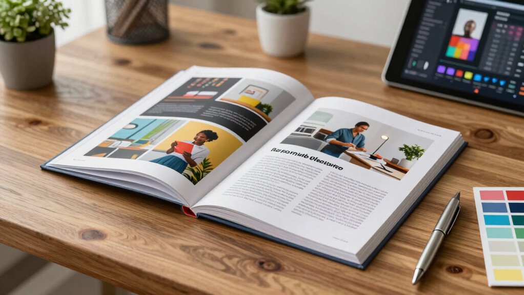
Are you looking to create a brochure that captures attention and communicates your message effectively? If so, understanding the fundamentals of good design is essential. Great teams recognize that a strong visual hierarchy guides viewers through the content seamlessly. When you organize information with clear focal points, larger headlines, and strategic placement, you help readers absorb your message without confusion. Visual hierarchy isn’t just about aesthetics; it’s about making sure the most important details stand out immediately, whether that’s your brand name, a call to action, or a key benefit. By thoughtfully arranging elements, you guarantee your brochure’s flow feels natural and intuitive, keeping viewers engaged from start to finish. Additionally, considering landscaping and outdoor elements can inspire creative design ideas that make your brochure more appealing and memorable. Color psychology plays a pivotal role in this process. The colors you choose evoke specific emotions and perceptions, influencing how your audience interprets your message. For example, blue often communicates trust and professionalism, making it ideal for corporate or financial brochures. Red, on the other hand, grabs attention and incites urgency—perfect for sales or limited-time offers. When your team considers color psychology, you’re intentionally using hues that resonate with your target audience and reinforce your brand identity. This strategic use of color not only makes your brochure visually appealing but also deepens the emotional connection with viewers, increasing the chances they’ll act on your message. Great teams also understand that consistency in design is key. They use a cohesive color palette and maintain uniform font choices to create a polished look. Consistency helps establish brand recognition and builds trust, making sure your brochure feels professional and credible. Furthermore, they pay attention to whitespace—leaving enough empty space around elements—to prevent clutter and enhance readability. This not only emphasizes important content but also makes the brochure easier to scan, which is essential when your audience’s attention span is limited. Finally, effective teams know that simplicity often outperforms complexity. They avoid overcrowding pages with too much information or overly elaborate graphics. Instead, they focus on clean layouts, clear messaging, and compelling visuals that support their core message. By balancing visual hierarchy, color psychology, and simplicity, your brochure becomes a powerful tool that captures attention, communicates effectively, and leaves a lasting impression. When you incorporate these principles into your design process, you’re not just creating a brochure—you’re crafting a strategic piece that resonates and drives results.

Mr. Pen- House Plan, 3 pcs, Interior Design and Furniture Templates
3 Pc Architect Drawing And Interior Design Template Set (Scale: 1/4 Inch = 1 Ft): House Plan Template,…
As an affiliate, we earn on qualifying purchases.
As an affiliate, we earn on qualifying purchases.
Frequently Asked Questions
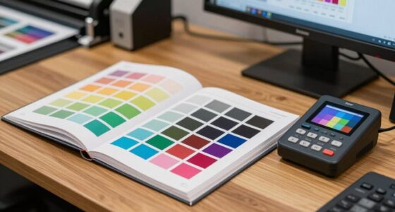
How Do I Choose the Right Color Scheme for My Brochure?
To choose the right color scheme, start with color psychology to evoke the emotions you want your audience to feel. Use complementary palettes to create visual harmony and make your brochure stand out. Think about your brand’s message and target audience, selecting colors that reinforce your identity. Test different options to see which combinations resonate best. Ultimately, a thoughtful color scheme guides viewers effortlessly and leaves a lasting impression.
What Is the Ideal Number of Pages for a Brochure?
The ideal number of pages for a brochure usually ranges from 4 to 8, balancing layout and content hierarchy. You want enough space to showcase your message without overwhelming readers. Keep your layout clean and organized, using a logical flow that guides the reader effortlessly. Too few pages may limit your message, while too many can cause clutter. Focus on concise content and strategic design to make every page impactful.
How Can I Make My Brochure Stand Out Visually?
To make your brochure stand out visually, focus on a creative layout that guides the reader effortlessly through your content. Use engaging visuals like high-quality images and bold graphics to capture attention. Incorporate contrasting colors and clear typography to improve readability. Keep your design balanced and uncluttered, allowing your message to shine. By combining a creative layout with engaging visuals, you’ll create a memorable brochure that effectively communicates your brand’s story.
What Fonts Are Best for Readability in Brochures?
Imagine your brochure’s text as a clear, inviting pathway—easy to follow and pleasing to the eye. Opt for clean, sans-serif fonts like Helvetica or Arial for readability, especially for headlines and body text. Use typography choices like font pairing, combining a bold header font with a simple body font, to create visual hierarchy. This approach guarantees your message stays clear, engaging, and effortlessly accessible to your audience.
How Should I Incorporate Brand Identity Into Brochure Design?
You should incorporate brand identity into your brochure by maintaining brand consistency through consistent colors, fonts, and logos. Use visual storytelling to convey your brand’s message and values effectively, creating a cohesive narrative that resonates with your audience. Incorporate imagery and design elements that reflect your brand’s personality, ensuring every aspect of the brochure aligns with your overall brand identity for a memorable and unified presentation.

Color Psychology Made Simple: A Reference Guide to the Meanings and Uses of Colors for Branding, Marketing, Graphic Design & Art Projects
As an affiliate, we earn on qualifying purchases.
As an affiliate, we earn on qualifying purchases.
Conclusion
You might think designing a brochure is just about pretty pictures and catchy headlines, but great teams know it’s about clarity and connection. Even if you’re worried it’s too complex or time-consuming, remember that a well-crafted brochure communicates your message effortlessly, saving you time in the long run. Focus on your audience’s needs, keep it simple, and trust your team’s creativity. With these principles, your brochure will stand out and truly resonate.

Avery Printable Tri-Fold Brochures with Mailing Seals, 8.5" x 11", Matte White, 100 Blank Brochure Paper for Inkjet Printers (08324)
Easily personalize your own customizable tri-fold brochures, menu cards, event programs and more with templates and designs with…
As an affiliate, we earn on qualifying purchases.
As an affiliate, we earn on qualifying purchases.

Adobe InDesign Made Simple: From 0 to Professional | A Step-by-Step Guide to Designing Books, Brochures, Magazines, and Digital Documents for Designers, Content Creators, and Freelancers
As an affiliate, we earn on qualifying purchases.
As an affiliate, we earn on qualifying purchases.