The hidden problem with shelf impact is that stores often focus on creating visually stunning displays to catch your eye, but this can be misleading. They prioritize bright, large, or bold visuals over genuine product quality or differentiation. This strategy can make you choose products based on their appearance rather than their substance, leading to impulsive decisions. Keep exploring to understand how these tactics influence your choices and what you should watch out for.
Key Takeaways
- Overemphasis on shelf impact can prioritize visual appeal over product quality and substance.
- Bright, large displays may create visual overload, confusing consumers and hindering decision-making.
- Strategic placement and color use can manipulate perceptions, leading to impulsive, less informed choices.
- Visual dominance can distort product perception, making aesthetics seem more important than actual value.
- Focusing solely on shelf impact can exploit consumer psychology, reducing shopping to surface-level judgments.

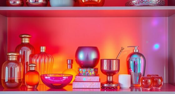
Have you ever wondered why some products catch your eye instantly while others go unnoticed on the shelf? It all comes down to the clever use of visual hierarchy and color psychology. Visual hierarchy guides your eye naturally to certain items first, shaping your perception of what’s important or appealing. Retailers and designers intentionally arrange products in a way that draws your attention to specific areas through size, placement, and contrast. For example, brighter, larger objects typically stand out more, making you more likely to notice them first. This hierarchy isn’t accidental; it’s a strategic design choice meant to influence your shopping behavior.
Strategic product placement and visual cues shape your shopping choices effortlessly.
Color psychology plays a crucial role in this process. Different colors evoke different emotions and associations, which can significantly impact your decision to pick up a product. Warm colors like red and orange tend to create a sense of urgency, excitement, or warmth, making them perfect for highlighting promotional items or new launches. Cooler colors like blue and green often feel calming and trustworthy, ideal for establishing a sense of reliability around more essential or health-related products. When used thoughtfully, these colors can guide your mood and perceptions, subtly steering you toward certain choices without you even realizing it.
However, the hidden problem with shelf impact is that many brands rely heavily on eye-catching visuals and vibrant colors to grab your attention, often at the expense of clarity and communication. This can lead to cluttered, overwhelming displays where multiple products compete for your gaze, making it harder for you to identify what truly matters. Instead of a clear, intuitive hierarchy, you might encounter a chaotic mess that confuses rather than attracts. This overload can cause you to overlook better options or become disengaged altogether. Additionally, this emphasis on visual impact can inadvertently create a visual overload that hampers decision-making. In such environments, the perception of quality may be distorted, as visuals tend to overshadow product substance.
Moreover, the emphasis on visual impact sometimes overshadows the actual quality or benefits of products. You might be drawn to a brightly colored package because it looks appealing, but that doesn’t guarantee it’s the best choice for your needs. Retailers may prioritize shelf impact over meaningful differentiation, leading you to make impulsive decisions based on aesthetics rather than substance. This disconnect reveals a critical flaw in how products are marketed—visual hierarchy and color psychology can be powerful tools, but when misused, they create a deceptive environment that hampers your ability to make informed choices.
Understanding how these visual design principles are applied can help you become a more conscious shopper, allowing you to look beyond the surface and focus on what truly matters rather than being swayed by visual cues alone.

Aredpoook Acrylic Display Risers, 3 Tier Perfume Organizer Stand, Clear Cupcake Stand Holder, Large Shelf Risers for Figures, Dessert Shelves for Party, Display Shelf for Decoration and Organizer
Acrylic Riser Display: This is a unique and elegant acrylic display riser, its simple yet attractive design complements…
As an affiliate, we earn on qualifying purchases.
As an affiliate, we earn on qualifying purchases.
Frequently Asked Questions
How Can Shelf Impact Influence Consumer Purchasing Decisions Long-Term?
Shelf impact directly influences your long-term purchasing decisions through shelf psychology and brand visibility. When a product catches your eye with appealing packaging and strategic placement, it creates a positive association that sticks with you. Over time, this consistent visibility builds brand recognition, making you more likely to choose that brand again. Strong shelf impact fosters brand loyalty by making products memorable and easy to find, shaping your buying habits in the long run.
What Are Common Misconceptions About Shelf Impact Effectiveness?
Many believe that high shelf impact automatically boosts sales, but that’s a misconception. While it enhances brand recognition, excessive visual clutter can overwhelm shoppers and reduce effectiveness. You might think a bold display guarantees attention, but if it’s too crowded or confusing, consumers struggle to find your product. True shelf impact balances eye-catching design with clarity, ensuring your brand stands out without creating visual chaos that hampers long-term purchasing decisions.
How Does Shelf Impact Vary Across Different Product Categories?
Imagine walking down a grocery aisle and noticing how shelf impact shifts with product categories. You see vibrant snack packaging catching your eye, while sleek electronics blend into the background. You realize that product segmentation and visual hierarchy play essential roles here—bright colors and strategic placement work better for snacks, while minimal design suits high-end electronics. You understand that tailoring shelf impact strategies to each category maximizes attraction and influences your buying decisions.
Are There Specific Designs That Consistently Outperform Others in Shelf Impact?
You’ll find that bold, vibrant designs often outperform others on shelves, especially when they leverage color psychology to evoke emotions and attract attention. Consistent brand elements, like specific colors and styles, also boost shelf impact by reinforcing brand recognition. By combining striking visuals with brand consistency, you create a memorable presence that stands out, making your product more likely to catch the shopper’s eye and drive sales.
What Metrics Are Best for Measuring Shelf Impact Success?
You should track sales lift and category dominance to measure shelf impact success. An interesting statistic shows products with strong visual hierarchy and strategic color psychology see up to 30% higher sales. Focus on metrics like visibility, positioning, and consumer engagement. These indicators reveal how well your packaging commands attention, influences buying decisions, and stands out on the shelf. Prioritize these to optimize your shelf impact effectively.

The Color of Hope: People of Color Mental Health Narratives
As an affiliate, we earn on qualifying purchases.
As an affiliate, we earn on qualifying purchases.
Conclusion
You see the shelves, you notice the impact, but you overlook the hidden problem beneath. You focus on the eye-catching display, the bold colors, the strategic placement. Yet, behind the scenes, clutter hides, messages get lost, and clutter undermines your effort. You need to address the unseen, the overlooked, the unnoticed. Only then can you create a shelf that truly captivates, communicates, and converts — a shelf that works as hard as you do.
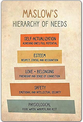
Knowledge Metal Poster Maslow'S Hierarchy Of Needs Tin Signage Bar Cafe Living Room Bathroom Kitchen Garage Home Art Wall Decoration 8inch X 12inch
Funny tin sign-maslow is hierarchy of needs, I hope you like it.
As an affiliate, we earn on qualifying purchases.
As an affiliate, we earn on qualifying purchases.

100 Pack Poly Mailers 10×13, Cute Packaging Envelope Mailers Polymailers Packaging for Small Business, Shipping Bags for Clothing Boutique Supplies with Self Seal Strip (Marble)
Premium & Lightweight Package Bags:Lightweight and water-resistant. Lower the cost of your business and protect your products on…
As an affiliate, we earn on qualifying purchases.
As an affiliate, we earn on qualifying purchases.