
Your poster’s visual hierarchy guides viewers’ eyes and helps communicate your message clearly. By carefully using typography and color contrast, you can highlight important elements and create a natural flow. When these details are overlooked, your poster can become confusing and less effective. Most designers underestimate how powerful good hierarchy can be. Keep going, and you’ll discover how mastering these design tricks can make your posters truly stand out and connect with your audience.
Key Takeaways
- Effective hierarchy guides viewers’ eyes, ensuring the main message is noticed immediately.
- Proper use of typography and color contrast creates a clear visual path for understanding.
- Neglecting hierarchy can cause clutter, reducing the poster’s impact and readability.
- Well-structured hierarchy enhances engagement, making information memorable and easy to scan.
- Many designers underestimate how small details influence overall communication effectiveness.

Have you ever noticed how some posters immediately grab your attention while others fade into the background? That’s no accident. It’s all about how the visual hierarchy guides your eye and communicates the message effectively. When designing a poster, understanding the importance of hierarchy isn’t just a nice-to-have; it’s essential. Two key elements that influence this are typography focus and color contrast. They work together to create a clear, compelling flow that directs viewers effortlessly through the information.
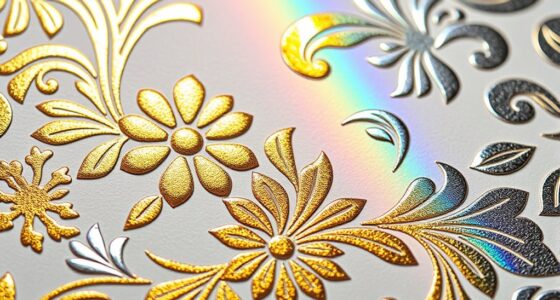
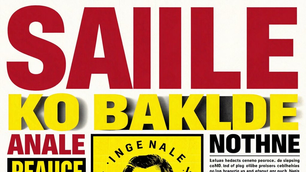
Typography focus plays a fundamental role in establishing hierarchy. When you choose different fonts, sizes, and weights, you’re signaling what’s most important. Think of it as a visual language: a bold headline commands attention first, while smaller, lighter text provides supporting details. You want your primary message to stand out immediately, so selecting a font that’s both eye-catching and readable is crucial. Avoid cluttering your poster with too many font styles, which can confuse instead of clarify. Instead, use contrast within typography—such as a large, bold header paired with a simple, clean body—to create a natural reading order. This focus makes sure viewers don’t miss the main point and can easily scan for additional information. Recognizing how visual hierarchy influences viewer engagement is key to effective design.
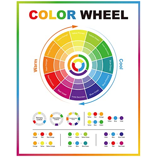
Color contrast is another powerful tool in establishing hierarchy. When you carefully select colors that stand out against each other, you create a visual path that naturally guides the eye. For example, a bright color against a dark background draws instant focus. You can also use contrast to differentiate sections or to highlight specific details, like a call-to-action. Be mindful, though, not to overdo it; too many contrasting colors can cause visual chaos and weaken the hierarchy. Instead, choose a limited palette where key elements have higher contrast, and supporting details are more subdued. This balance ensures that your message remains clear and that viewers’ attention flows smoothly from the most critical information to secondary details.
Ultimately, the power of poster hierarchy lies in how well you combine typography focus and color contrast. When these elements work harmoniously, you create a visual rhythm that pulls viewers in and guides their understanding. Most designers overlook how much these details matter, but neglecting them can make your poster less effective. By paying close attention to how you structure your typography and how you utilize color contrast, you guarantee your message isn’t just seen—it’s understood and remembered. Proper hierarchy isn’t just a design principle; it’s the backbone of communication in every eye-catching poster.

Graphic Design For Everyone: Understand the Building Blocks so You can Do It Yourself
As an affiliate, we earn on qualifying purchases.
As an affiliate, we earn on qualifying purchases.
Frequently Asked Questions
How Does Poster Hierarchy Influence Viewer Decision-Making?
Poster hierarchy guides your viewer’s decision-making by creating a clear visual flow and directing their focus to the most important elements first. When you establish a strong hierarchy, it helps viewers quickly grasp the message without confusion. This focused viewer attention increases engagement and makes it easier for them to understand the key information. Fundamentally, effective poster hierarchy influences how viewers process and prioritize content, leading to better communication.
What Are Common Mistakes in Establishing Poster Hierarchy?
You often make the mistake of neglecting visual balance and color contrast, which can turn your poster into a chaotic mess instead of a clear message. Poorly established hierarchy leads to confusion, making viewers overlook key information. Avoid overusing similar fonts or cluttered layouts, and guarantee your primary message stands out through strategic size, placement, and contrast. Remember, a well-structured hierarchy guides viewers effortlessly, unlike a chaotic design that leaves them overwhelmed.
Can Poster Hierarchy Improve Brand Recognition?
Yes, poster hierarchy can greatly enhance brand recognition. By guiding viewers through your visual storytelling, you guarantee they notice the most important elements first, creating a memorable emotional impact. When you use clear hierarchy, your brand message stands out amidst clutter, making it easier for viewers to associate your visuals with your brand. This strategic approach reinforces recognition and builds a stronger, more lasting connection with your audience.
How Does Digital Media Affect Poster Hierarchy Principles?
They say, “a picture is worth a thousand words.” Digital media shifts poster hierarchy principles by emphasizing visual flow and color contrast, making key messages stand out instantly. You need to craft clear focal points and use contrasting colors to guide viewers’ eyes effectively across screens of different sizes. This guarantees your message remains impactful, even in a fast-paced digital environment where attention spans are shorter.
What Tools Assist in Designing Effective Poster Hierarchies?
You can use tools like Adobe InDesign, Photoshop, or Canva to craft effective poster hierarchies. These tools help you control visual flow by adjusting layout and spacing. They also allow you to experiment with color contrast, ensuring key elements stand out. By leveraging these tools, you guide viewers’ eyes naturally through your poster, making the hierarchy clear and impactful, ultimately enhancing your message’s effectiveness.
Geyee Color Wheel Poster Circle Chart for Artist Color Wheels 16 x 20 Inch Decorative Theory Knowledge Poster for Back to School Art Educational Classroom Bedroom Room Wall Decorations
Color Wheel Poster: there is 1 piece of color wheel poster, which involves the basic knowledge of color…
As an affiliate, we earn on qualifying purchases.
As an affiliate, we earn on qualifying purchases.
Conclusion
Understanding poster hierarchy isn’t just a detail—it’s the backbone of effective design. When you prioritize the most important information, viewers immediately grasp your message. Did you know that viewers spend an average of just 3 seconds scanning a poster? That’s why clear hierarchy guides their eyes effortlessly, ensuring your message sticks. Pay attention to hierarchy, and you’ll create posters that not only look good but also communicate with impact and clarity.
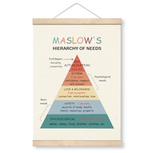
Yxadu Therapy Decorations, Canvas Poster Wood Hanger, Therapy Tools, Psychologist Office Decor, Counseling Room Decor, CBT Poster, Social Worker Office Decor, Maslow's Hierarchy of Needs Poster
Manufacturing: Handmade
As an affiliate, we earn on qualifying purchases.
As an affiliate, we earn on qualifying purchases.

Japanese Layout Design
As an affiliate, we earn on qualifying purchases.
As an affiliate, we earn on qualifying purchases.