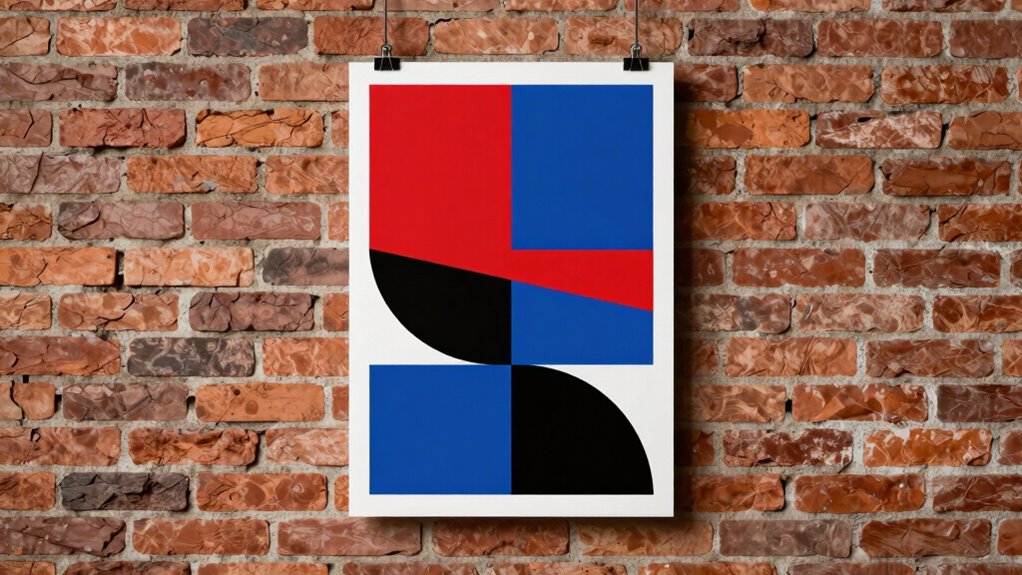

You might think that message and visuals alone make a great poster, but poster composition actually plays a bigger role than most realize. Your layout guides viewers’ eyes smoothly, making sure key points stand out. Balancing typography, colors, and elements creates a cohesive and engaging design that captures attention and communicates clearly. When your composition is well-planned, your audience is more likely to stay focused and understand your message. Keep exploring, and you’ll discover how mastering these principles can elevate your designs.

Get art and craft supplies delivered free with Prime
- Fast, free delivery on millions of items
- Prime Video, Amazon Music and more included
- Member-only deals all year
Key Takeaways
- Effective composition guides viewers’ eyes naturally, ensuring the message is quickly understood and remembered.
- Well-balanced layout enhances visual appeal, making posters more engaging and impactful.
- Proper use of hierarchy emphasizes key information, preventing important messages from being overlooked.
- Cohesive color schemes and rhythm reinforce mood, message, and overall design unity.
- Organized elements improve clarity, enabling quick processing of information and stronger communication.
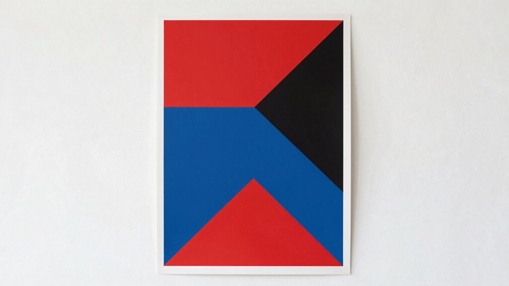
Have you ever wondered why some posters grab your attention instantly while others are easily overlooked? The secret often lies in the poster’s layout. It’s not just about the message or the visuals; it’s about how everything is arranged to create a compelling and cohesive design. When you focus on a strong poster composition, you guide the viewer’s eyes smoothly across the design, guaranteeing your message hits home. A key element here is typography balance—making sure the text is neither overpowering nor too subtle. When you strike the right balance, the words become an integral part of the overall aesthetic rather than a distraction. It’s about choosing font sizes, spacing, and placement that complement the visual flow, so your message is clear and easy to read without overwhelming the viewer.
Color harmony also plays an essential role in effective poster composition. When you select a cohesive color scheme, you create a visual rhythm that draws the eye naturally from one element to the next. Colors shouldn’t clash or compete; instead, they should work together to evoke the right mood and reinforce your message. This harmony in color can make your poster feel unified, polished, and professional. It’s about understanding how warm and cool tones interact, how contrasting shades can create emphasis, and how subtle variations can add depth. Proper color harmony helps you establish a visual hierarchy, guiding viewers’ attention to the most important parts of your poster in a way that feels intuitive and engaging. Additionally, composition principles play a vital role in organizing these elements effectively, ensuring your design communicates clearly and efficiently.
But composition isn’t just about aesthetics; it’s about communication. When you organize elements thoughtfully—considering balance, spacing, and alignment—you guarantee your message isn’t lost or confusing. An intentionally designed layout helps viewers process information quickly and effortlessly. It’s about making sure your visual story flows seamlessly from the headline to the supporting details, all while maintaining visual interest. You might think of your poster as a story that needs a logical flow, and good composition is the narrative’s backbone.
Furthermore, understanding how visual hierarchy influences viewer focus can make your message more impactful by emphasizing key elements. Ultimately, understanding the importance of poster composition means recognizing how every element interacts. When you pay attention to typography balance and color harmony, you create designs that are not only eye-catching but also effective. Your posters become more than just visuals—they become powerful communication tools that can inspire, inform, and persuade. And that’s why poster composition matters more than most designers realize.
As an affiliate, we earn on qualifying purchases.
Frequently Asked Questions
How Does Poster Composition Influence Viewer Emotions?
Your poster composition directly influences the emotional impact it has on viewers, shaping how they feel and react. Thoughtful placement of images, text, and colors creates a visual flow that grabs attention and evokes specific emotions. When you design with viewer engagement in mind, your poster becomes more compelling, encouraging viewers to connect emotionally and remember your message longer. Good composition transforms simple visuals into powerful emotional experiences.
What Are Common Compositional Mistakes to Avoid?
You should avoid poor color balance that overwhelms or distracts viewers, making the poster hard to read or interpret. Also, neglecting element hierarchy can create confusion; guarantee key messages stand out by prioritizing focal points. Don’t clutter the layout, and make sure your colors complement each other. These mistakes dilute your message, reducing the poster’s effectiveness and negatively impacting viewer engagement.
How Can Composition Enhance Message Clarity?
Good composition boosts message clarity by guiding your viewers’ eyes through visual hierarchy and focal points. You can emphasize key information by making it larger, brighter, or strategically placed to catch attention first. Clear focal points help viewers quickly understand the main message. When you organize elements thoughtfully, your poster becomes more engaging and easier to interpret, ensuring your audience grasps your message without confusion or distraction.
Does Cultural Context Affect Poster Composition Effectiveness?
Yes, cultural context affects poster composition effectiveness. When you consider cultural symbolism, you guarantee your visual storytelling resonates with your audience’s values and beliefs. By incorporating familiar symbols and motifs, your poster communicates more clearly and emotionally. This cultural awareness helps you craft compositions that connect deeply, making your message more impactful. Ignoring cultural context risks misinterpretation, reducing the effectiveness of your visual storytelling and overall message delivery.
How Quickly Can a Viewer Interpret a Well-Composed Poster?
You can interpret a well-composed poster in seconds, guided by the rhythm of symbolism. Your eyes naturally follow the visual hierarchy, where color harmony directs attention, making key messages stand out instantly. This seamless flow helps your brain process information quickly, allowing you to grasp the poster’s meaning almost immediately. Effective composition isn’t just aesthetic; it’s a visual language that speaks directly to you in an instant.
As an affiliate, we earn on qualifying purchases.
Conclusion
So, next time you rush through a poster, remember—composition isn’t just a detail; it’s the silent hero that makes or breaks your message. Ironically, the very element many overlook often holds the power to captivate or repel. You might think your idea is enough, but without proper composition, it’s like shouting into the void. Pay attention to how you arrange your visual story—because in the end, good design isn’t just decoration, it’s communication’s backbone.
As an affiliate, we earn on qualifying purchases.
As an affiliate, we earn on qualifying purchases.
Halloween Picks
halloween
As an affiliate, we earn on qualifying purchases.