
The mistake that quickly weakens your editorial cues is neglecting a clear visual hierarchy and inconsistent font use. When you lack structure, your content becomes confusing, making it hard for readers to identify key information. Using multiple fonts or poor contrast lessens impact and leads to clutter. Without a cohesive layout, your cues lose their effectiveness fast. Keep these elements in check, and you’ll maintain clarity—there’s more to guarantee your content stays sharp.

Get art and craft supplies delivered free with Prime
- Fast, free delivery on millions of items
- Prime Video, Amazon Music and more included
- Member-only deals all year
Key Takeaways
- Neglecting a clear visual hierarchy causes cues to become blurry and ineffective quickly.
- Inconsistent font styles undermine content clarity and reader recognition of important cues.
- Poor spacing, alignment, and color choices reduce the prominence of editorial cues.
- Overusing cues without establishing a strong structure leads to visual clutter and confusion.
- Failing to maintain cohesive typography and layout diminishes overall content engagement.
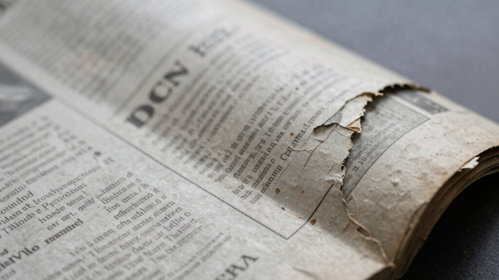
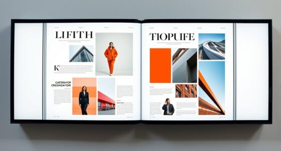
Have you ever noticed how quickly editorial cues can lose their effectiveness? It’s a common problem that many overlook until their content no longer guides readers clearly. The key issue often lies in a failure to establish a strong visual hierarchy. When your layout lacks a clear structure, your audience struggles to differentiate between headings, subheadings, and body text. Without a well-defined visual hierarchy, your editorial cues become blurry, and readers may feel lost or overwhelmed. To avoid this, you need to prioritize creating contrast through size, weight, and placement, so that essential information stands out immediately. This way, your cues serve their purpose—guiding readers effortlessly through your content.
Strong visual hierarchy is key to guiding readers clearly and avoiding overwhelm in your content.
Another critical mistake that diminishes the power of your editorial cues is neglecting font consistency. When you use multiple fonts or inconsistent styles across your document, it confuses your audience rather than helping them navigate the material. Font consistency isn’t just about aesthetics; it’s about reinforcing clarity. When your headings, subheadings, and body text follow a predictable pattern, readers quickly recognize the importance of each section. Switching fonts or styles randomly breaks this pattern, forcing your audience to reorient themselves constantly. Maintaining consistent font choices for similar content types supports a cohesive reading experience and helps your cues remain effective over time.
The problem worsens if you overlook the importance of spacing, alignment, and color, which all contribute to your visual hierarchy. When these elements are inconsistent or poorly considered, your cues can appear disjointed, making it harder for readers to scan and comprehend your material. This inconsistency diminishes the impact of your editorial cues, as they no longer stand out in a purposeful way. Instead, they get lost in the chaos, defeating the entire point of guiding your audience. Additionally, visual hierarchy ensures that your content is organized in a way that naturally directs the reader’s eye, which is crucial for maintaining clarity.
You might think that simply adding more cues, like bold text or larger fonts, will solve the problem, but that approach often backfires if the underlying structure isn’t solid. Instead, focus on establishing a clear, logical visual hierarchy first, and then apply consistent font choices to reinforce that structure. When your cues are both visually prominent and consistent, they work harmoniously to guide your readers efficiently. Ignoring these principles leads to a quick erosion of your cues’ effectiveness, causing your content to become cluttered and difficult to navigate.
In the end, the mistake that weakens editorial cues fastest is neglecting the importance of visual hierarchy and font consistency. When either gets compromised, your content’s clarity deteriorates, and your audience’s engagement drops. To keep your cues sharp and impactful, prioritize a cohesive, well-structured layout that guides the eye naturally, supported by consistent typography choices. That’s the best way to ensure your editorial cues remain powerful and your message gets across clearly.
professional document font consistency
As an affiliate, we earn on qualifying purchases.
As an affiliate, we earn on qualifying purchases.
Frequently Asked Questions
How Quickly Do Editorial Cues Typically Weaken?
Editorial cues can weaken surprisingly fast, often within a few seconds to a minute if visual consistency and tone alignment aren’t maintained. You need to stay vigilant, constantly checking that your visuals match your message and tone. When these cues break down, your audience might get confused or disengaged. So, regularly reinforce your editorial cues to keep your content cohesive and compelling, ensuring your message stays clear and impactful.
What Are Common Examples of Weakening Editorial Cues?
When it comes to weakening editorial cues, common examples include inconsistent font choices and poor visual hierarchy. You might accidentally use different fonts or sizes, making it hard for readers to follow your message. Over time, these inconsistencies drown out important cues, like headings or emphasis, weakening the overall clarity. To keep your cues strong, maintain font consistency and a clear visual hierarchy, guiding your audience smoothly through your content.
Can Weakened Cues Be Effectively Restored?
Yes, weakened cues can often be effectively restored. You can do this by reinforcing visual cues and providing clear context clues. For example, reintroduce visual elements or highlight key information to guide interpretation. Using precise language and consistent formatting helps readers pick up on cues again. By actively strengthening these signals, you improve comprehension and re-establish the connection between your message and your audience.
Does Audience Familiarity Impact Cue Strength Decline?
Yes, audience familiarity impacts cue strength decline. When your audience is more familiar with your content or style, they tend to stay engaged longer, maintaining stronger editorial cues. This familiarity boosts their perception of your credibility, making them more receptive to your messages. Conversely, unfamiliar audiences may quickly lose interest, causing cues to weaken faster. To sustain engagement and credibility, focus on building a consistent, relatable presence.
Are Certain Content Types More Prone to Cue Weakening?
Certain content types, like highly complex articles with dense information, are more prone to cue weakening. For example, a case study on technical subjects may lose clarity quickly if visual design isn’t engaging or straightforward. When content is complex, weak visual cues fail to guide the audience, making it harder to grasp key points. Simplifying visuals and reducing content complexity helps maintain strong editorial cues, keeping your audience engaged and informed.
As an affiliate, we earn on qualifying purchases.
Conclusion
If you ignore this mistake, your editorial cues will crumble faster than a house of cards in a hurricane. You’ll watch your message drown in confusion, your credibility vanish into thin air, and your readers completely tune out—all in the blink of an eye. Don’t let one tiny error turn your brilliant content into an unrecognizable mess. Fix it now, or risk watching your entire communication empire collapse faster than you ever thought possible!
typography and layout guidebooks
As an affiliate, we earn on qualifying purchases.
As an affiliate, we earn on qualifying purchases.
editorial cue highlighting tools
As an affiliate, we earn on qualifying purchases.
As an affiliate, we earn on qualifying purchases.
Evergreen bestsellers Picks
bestsellers
As an affiliate, we earn on qualifying purchases.