
To achieve simplicity and focus with a monochromatic color scheme, select one hue and explore its shades, tints, and tones. Use contrast within the same color to highlight key elements and create visual interest, while maintaining harmony. Playing with brightness and saturation helps direct attention and adds depth without clutter. Mastering how to balance these variations results in clean, sophisticated designs that feel cohesive and intentional. If you explore further, you’ll discover even more ways to refine your monochromatic approach.
Key Takeaways
- Use shades, tints, and tones of a single hue to create a unified, balanced aesthetic.
- Apply principles of color harmony to select variations that maintain visual appeal.
- Incorporate contrast within the same hue to highlight key elements and add depth.
- Choose hue and tone shifts that evoke desired emotional responses and set the mood.
- Balance contrast, texture, and variation to produce a simple, elegant, and focused design.

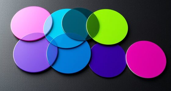
A monochromatic color scheme revolves around using different shades, tints, and tones of a single hue to create a unified and harmonious look. This approach simplifies your palette, making it easier to achieve a balanced and cohesive design. To make the most of this scheme, you should understand the core color harmony principles. These principles guide how colors relate to each other within your monochromatic palette, ensuring that your design remains visually appealing. For example, selecting shades that vary in saturation and brightness can add depth and interest without disrupting the harmony. This way, your design feels intentional and polished, even when working with a limited color range.
When applying a monochromatic scheme, you’ll want to incorporate visual impact techniques that draw the eye and emphasize key elements. One effective method is using contrast within your chosen hue. By pairing lighter tints with darker shades, you create visual focal points that stand out. For instance, if your primary hue is blue, a light pastel blue can highlight areas you want to emphasize, while a deep navy can anchor the overall design. This variation keeps the viewer engaged without overwhelming them with too many colors. Additionally, varying textures and patterns within the same hue can add visual interest. Think of combining smooth surfaces with textured fabrics or matte finishes with gloss, all within your monochromatic palette. This creates a layered effect that maintains harmony while enhancing depth.
Understanding color harmony principles is essential for creating balanced designs that are both simple and striking. You should also consider the emotional and psychological effects of your chosen hue. Different colors evoke different feelings, so selecting the right hue for your purpose is essential. Once you’ve picked your base color, you can experiment with different shades and tones to convey the mood you desire. For example, a monochromatic scheme using green can evoke calmness and growth, while red can evoke energy and passion. As you develop your design, keep in mind that subtle shifts in tone can considerably influence the overall perception. Using color harmony principles, you can balance these shifts to maintain a cohesive look while allowing for visual interest.
Ultimately, mastering monochromatic color schemes involves understanding how to manipulate shades, tints, and tones effectively. By applying color harmony principles and visual impact techniques, you can create designs that are simple yet striking, elegant yet engaging. With careful attention to contrast, texture, and emotional resonance, your monochromatic choices will deliver a focused and compelling visual experience.

Chroma Mural Paint, Assorted Primary Colors, Pints, Set of 6
Mural paint offers lasting results on both outdoor and indoor murals, canvas, and other mediums
As an affiliate, we earn on qualifying purchases.
As an affiliate, we earn on qualifying purchases.
Frequently Asked Questions
Can Monochromatic Schemes Be Effective in Branding?
Yes, monochromatic schemes can be very effective in branding. They create strong color harmony, making your brand look cohesive and memorable. Using a single hue with variations guarantees visual consistency across your marketing materials, which helps build brand recognition. By focusing on simplicity, you make your message clear and appealing. When you choose a monochromatic palette, you establish a clean, professional look that can set your brand apart.
How to Choose the Right Base Color?
You should choose a base color that resonates with your brand’s identity and evokes the right emotions. Start with color selection that aligns with your message, then explore shade variation to add depth without complexity. A versatile, memorable color can set the tone, so pick one that reflects your values and audience’s feelings. Trust your intuition, and test different shades to find the perfect foundation for a cohesive, impactful look.
Are Monochromatic Schemes Suitable for Large Spaces?
Yes, monochromatic schemes work well in large spaces because they create strong color harmony and visual cohesion. By using variations of a single hue, you can make a room feel unified and spacious. This approach simplifies decor choices and emphasizes clean, elegant lines. Just make certain you incorporate different shades, textures, and finishes to add depth, preventing the space from feeling flat or monotonous.
How to Add Variety Within a Monochromatic Palette?
Imagine you’re in a time before color, and you want to add a touch of surprise. To introduce variety within a monochromatic palette, play with different shades, tints, and tones to create subtle color variation. Incorporate textures and patterns to add visual interest without overpowering the simplicity. This approach keeps your space cohesive and elegant while keeping the eye engaged with nuanced depth and contrast.
Can Monochromatic Schemes Evoke Specific Moods?
Yes, monochromatic schemes can evoke specific moods by leveraging emotional impact and color psychology. For example, soft blues create calmness, while bold reds evoke energy and passion. You can manipulate saturation and brightness to influence feelings further. By choosing the right hue, you guide viewers’ emotional response, making your design more powerful and focused. This approach allows you to craft a tailored atmosphere that resonates deeply with your audience.

MUDECOR Framed Canvas Print Wall Art Monochromatic Gradient Abstract Minimalist Gray Illustrations Modern Art Decorative Bohemian Colorful Chic for Living Room, Bedroom, Office – 16"x24"x2 Black
EXCELLENT ART: All artwork stretched to fit on durable and shrink-resistant framed canvas.
As an affiliate, we earn on qualifying purchases.
As an affiliate, we earn on qualifying purchases.
Conclusion
By embracing monochromatic color schemes, you simplify your design, focus your message, and create harmony. You streamline your palette, emphasize your subject, and evoke emotion—all with one color family. You eliminate clutter, enhance cohesion, and build confidence in your choices. So, choose simplicity, seek focus, and craft elegance—let the power of one color speak volumes. With monochromatic schemes, you transform your vision into a unified, impactful masterpiece that captivates and resonates.

Interior Design Color Wheel Helps You Harmonize Your Interior Design Projects.
manufacturer: Color Wheel
As an affiliate, we earn on qualifying purchases.
As an affiliate, we earn on qualifying purchases.

White Ceramic Vase for Flowers, Tall Home Decor Vase with Ribbed Texture, Vases for Centerpieces, Farmhouse Decor, Living Room, Decor Bedroom, Table, and Kitchen Shelf (XL White)
CERAMIC VASE SIZE – 4.52"(L) x 3.34" (W) x 9.64"(H), This ceramic vase for decor is about 9.64"…
As an affiliate, we earn on qualifying purchases.
As an affiliate, we earn on qualifying purchases.