
One common mistake you make when choosing a monitor is overlooking true color accuracy, focusing instead on resolution or size. Many buyers assume factory calibration is enough, but poor calibration or lower-quality panels can cause color shifts that impact your work. Ignoring display technology like OLED or IPS can lead to subpar color reproduction. If you want to avoid costly mistakes and make sure your monitor meets your needs, there’s more to take into account that can make all the difference.
Key Takeaways
- Relying solely on factory calibration without verifying actual color accuracy can lead to inaccuracies.
- Prioritizing high resolution or size over true color fidelity causes compromised display quality.
- Choosing monitors based only on looks or brand reputation, ignoring calibration capabilities, is a common mistake.
- Overlooking the importance of calibration tools or professional calibration can result in inconsistent colors.
- Failing to consider display technology (IPS, OLED) and its impact on color accuracy can hinder professional work.
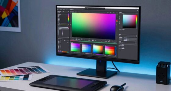
When shopping for a monitor, it’s easy to overlook the importance of color accuracy, but making this mistake can considerably impact your work or creative projects. Many buyers focus on resolution, size, or refresh rates, forgetting that color fidelity plays a vital role, especially if you’re into photography, design, or video editing. Without proper attention to color calibration, even the most advanced display technology can fall short, resulting in inaccurate colors that mislead your work and cause frustration. You might think a monitor with a high resolution or fast response time is enough, but if the colors aren’t true to life, your final output won’t match your creative vision. Recognizing the impact of display technology on color reproduction can help you make more informed choices. Color calibration is key to guaranteeing your monitor displays colors accurately. It involves adjusting your display settings or using calibration tools to align the monitor’s output with a standard color profile. Many people skip this step because it seems complicated or unnecessary, but neglecting it can lead to color shifts or inconsistencies. If you’re working on projects that demand color precision, calibration guarantees what you see on screen matches the final product. Remember, not all display technology is created equal—IPS panels generally offer better color accuracy than TN or VA panels, but even the best display technology needs calibration to reach its full potential. In addition, understanding the display technology behind your monitor can help you select the right type for your specific needs. A proper understanding of color management practices can further enhance your ability to maintain accurate color across different devices and outputs.
Prioritizing color accuracy is crucial for creative work; don’t overlook calibration and display technology.
When you purchase a monitor without considering these factors, you risk buying a product that looks good initially but falls short in real-world use. You might notice colors look off when you compare your work on other devices or professional prints, creating a disconnect that hampers your workflow. It’s also advisable to look for monitors with factory-calibrated color settings or one compatible with calibration hardware. Furthermore, understanding how display technology impacts color reproduction helps you make smarter choices; for example, OLED screens tend to offer richer, more vibrant colors compared to LCDs, but they still require proper calibration.
Ultimately, overlooking color accuracy during your purchase process is a common mistake, but it’s one that can be easily avoided. By prioritizing proper color calibration and understanding the display technology behind your monitor, you guarantee that your work remains consistent and true to your artistic intent. When you take these steps, you’ll find your creative projects look more professional, and your workflow becomes more efficient. Don’t settle for a monitor that just looks good; choose one that delivers accurate, reliable colors for all your creative needs.

Datacolor SpyderExpress – Easy Monitor Calibration for Photo, Design & Content Creation, Supports MacBook M4 mini-LED, Calibrates 3 Displays, Fast 90-Second Setup, Upgradeable Software
QUICK & EASY COLOR CALIBRATOR: Whether you're editing photos, designing graphics, or producing content, SpyderExpress helps you view…
As an affiliate, we earn on qualifying purchases.
As an affiliate, we earn on qualifying purchases.
Frequently Asked Questions
How Often Should I Calibrate My Monitor for Color Accuracy?
You should calibrate your monitor every 4 to 6 weeks to maintain accurate colors. Regular calibration guarantees your display stays true to color calibration techniques, especially if ambient lighting changes. If you upgrade your monitor hardware, recalibrate immediately to optimize color accuracy. Consistent calibration helps prevent color drift, ensuring your work remains precise and true to life, whether you’re editing photos or designing graphics.
Do Different Monitor Brands Have Better Color Accuracy?
Yes, some monitor brands have better color accuracy, especially those known for professional-grade displays. You should consider brand reputation and whether they offer calibration tools to maintain consistent color performance. High-end brands like Eizo and NEC often provide better out-of-the-box accuracy and easier calibration options. However, even the best monitors need regular calibration with proper tools to guarantee your color stays precise over time.
Can Software Calibration Significantly Improve My Monitor’s Colors?
Yes, software calibration can markedly improve your monitor’s colors. Studies show that even factory-calibrated monitors can be off by up to 20% in color accuracy. With proper color calibration and software adjustments, you can fine-tune your display to match professional standards, ensuring more precise colors. Regular calibration helps maintain accuracy over time, so investing in software tools is a smart move for anyone serious about color fidelity.
What Is the Ideal Color Gamut for Professional Editing?
You should aim for a monitor with a wide color gamut, like Adobe RGB or DCI-P3, to guarantee accurate professional editing. A good color space allows for a broader range of colors, giving you more precise control. Also, prioritize high color depth, ideally 10-bit, to prevent banding and achieve smooth gradients. These features help you produce high-quality, color-accurate work essential for professional editing.
How Does Ambient Lighting Affect Monitor Color Perception?
Ambient light can be a double-edged sword, shaping your monitor’s color perception like a painter’s palette. When ambient lighting is too bright, it washes out colors, making them appear dull and less accurate. Conversely, dim lighting helps your monitor shine, revealing true colors. To get the best color accuracy, control your ambient light—use soft, consistent lighting to keep your perception true and your work vibrant.

ASUS ProArt Display PA247CV 24-inch Monitor – IPS, Full HD (1920 x 1080), 100% sRGB, 100% Rec. 709, Color Accuracy ΔE < 2, Calman Verified, USB-C, Compatible with Laptop & Mac Monitor
24-inch Full HD (1920 x 1080) LED backlight display with IPS 178° wide viewing angle panel
As an affiliate, we earn on qualifying purchases.
As an affiliate, we earn on qualifying purchases.
Conclusion
Don’t let a blurry, off-color screen turn your creative dreams into a muddy mess. Picture your ideal workspace—sharp, vibrant, and true to life—where every hue pops and detail shines through. When you choose the right monitor with accurate color calibration, you’re painting your projects with confidence, not frustration. So, invest wisely, and watch your work come alive in brilliant, authentic shades—transforming your screen into a window of endless creative possibilities.

BenQ PD3225U 32 Inch 4K IPS Black UHD Thunderbolt Monitor for MacBook, AQCOLOR, 98% P3, 100% sRGB & Rec.709, DeltaE ≤2, Uniformity, Factory Calibration, USB-C 85W, USB Hub, Daisy Chain, KVM Switch
DEEP BLACK IPS PANEL w 2000:1 CONTRAST RATIO: Enjoy unrivaled depth and contrast with the 2000:1 IPS Black…
As an affiliate, we earn on qualifying purchases.
As an affiliate, we earn on qualifying purchases.
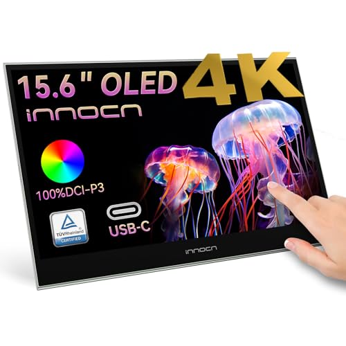
INNOCN 15.6" Portable Monitor OLED Touch Second Screen for Photo Editing with 4K, 100% DCI-P3, 100000:1, 10Bits, USB C External Monitor for Laptop,PC, Phone,Consoles, Brown, PU15 Pre C6
15.6" Portable Monitor – OLED Touch Monitor Second Touch Screen for Photo Editing with 4K, 100% DCI-P3, 100000:1,…
As an affiliate, we earn on qualifying purchases.
As an affiliate, we earn on qualifying purchases.