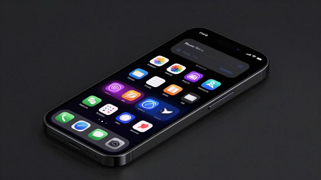

Using dark theme palettes can considerably boost your user experience by making content more readable and reducing eye strain, especially in low-light environments. You’ll notice that strategic contrast guides your focus naturally, making navigation quicker and easier. The thoughtful use of vibrant accents highlights interactive elements, enhancing usability. Plus, dark themes create a visually appealing environment that supports long-term comfort and engagement. Keep exploring to discover even more ways dark palettes improve your digital interactions.

Get art and craft supplies delivered free with Prime
- Fast, free delivery on millions of items
- Prime Video, Amazon Music and more included
- Member-only deals all year
Key Takeaways
- Dark palettes create high contrast, making important elements stand out and guiding user focus effectively.
- Reduced luminance minimizes eye strain, enhancing comfort during prolonged use.
- Thoughtful color choices improve accessibility and readability for diverse user needs.
- Aesthetic appeal combined with functional contrast elevates overall visual engagement.
- Dark themes foster a more inclusive, comfortable environment that encourages longer, more efficient interactions.

Dark theme palettes have become a popular choice for enhancing user experience, especially in low-light environments. They’re not just about aesthetics; they play an essential role in how comfortably and efficiently you can interact with digital interfaces. When you switch to a dark theme, you notice how the colors are carefully chosen to create strong color contrast, which makes important elements stand out without overwhelming your eyes. This contrast isn’t random—it’s designed to guide your focus naturally, reducing distractions and helping you locate buttons, links, or notifications quickly. Good dark themes balance the visual weight of elements so your attention isn’t strained, which is fundamental for long periods of use.
The impact of a dark palette on visual ergonomics is significant. Visual ergonomics refers to how well a design reduces eye strain and supports comfortable viewing. When you’re working late or in dim environments, bright screens can cause fatigue, headaches, or discomfort. Dark themes alleviate this by lowering overall luminance, making the screen easier on your eyes. The key is in how color contrast is optimized—text, icons, and other interface components are rendered in shades that are easily distinguishable against the background. This thoughtful contrast ensures readability without compromising the overall aesthetic. Instead of blinding brightness, dark themes provide a gentle, consistent visual experience that minimizes glare and reduces the cognitive load required to interpret information. Additionally, the strategic use of color contrast within dark themes enhances usability by making navigation intuitive. For example, actionable buttons may be highlighted with vibrant accents, ensuring you can identify interactive elements at a glance. This improves overall efficiency because you don’t need to squint or pause to interpret what’s clickable. It also supports accessibility, allowing users with certain visual impairments to better perceive content. Recognizing how sound vibrations can influence our health and mood highlights the importance of designing interfaces that are easy on the eyes and ears alike, fostering a more comfortable experience. Furthermore, implementing consistent design elements within dark themes can help users develop better familiarity and ease of use over time. Incorporating best practices in accessibility ensures that dark themes cater to a broader range of users, including those with visual disabilities. Moreover, selecting appropriate color schemes plays a critical role in maintaining user comfort over extended periods. By prioritizing visual ergonomics, dark themes foster a more inclusive environment that benefits everyone, whether you’re working on complex tasks or simply browsing.
In essence, dark theme palettes shape stronger user experiences by seamlessly blending aesthetics with function. The careful consideration of color contrast not only elevates visual appeal but also fortifies usability and comfort. When you choose a dark theme, you’re opting for a design that respects your eyes, enhances your focus, and streamlines your interactions. This balanced approach to design creates environments where you can stay engaged longer without discomfort, making your digital experience both more enjoyable and efficient.
As an affiliate, we earn on qualifying purchases.
Frequently Asked Questions
How Do Dark Themes Impact User Focus and Attention?
Dark themes help you focus better by reducing visual distraction, allowing your attention to stay on important content. They lower cognitive load, making it easier for you to process information quickly without feeling overwhelmed by bright screens. This streamlined design minimizes eye strain and enhances concentration, especially in low-light conditions. Overall, dark palettes sharpen your focus and attention, creating a smoother, more engaging user experience.
Are Dark Palettes Suitable for All Types of Content?
Dark palettes aren’t suitable for all content types. You need strong color contrast to guarantee readability, especially with text-heavy content. For visual hierarchy, darker backgrounds can make key elements stand out, but they may cause issues with detailed images or data visualizations. Consider user preferences and content clarity; sometimes, a light theme works better, while other times, dark palettes enhance focus and aesthetic appeal.
How Do Dark Themes Influence App Performance and Battery Life?
Dark themes can improve app performance and battery life because they reduce power consumption on OLED screens. You’ll notice better color contrast, making content easier to read, especially in low-light settings. Plus, darker backgrounds help decrease visual fatigue, allowing you to use apps longer without strain. Overall, dark themes optimize device efficiency while enhancing readability, making your user experience more comfortable and energy-efficient.
What Accessibility Considerations Are Essential for Dark Themes?
Think of dark themes like night goggles—enhancing visual comfort and safety. To guarantee accessibility, you must prioritize proper color contrast, making text easily readable against dark backgrounds. For example, low contrast can strain eyes, especially for users with visual impairments. By testing and adjusting color contrast, you create a more inclusive experience, allowing everyone to navigate your app comfortably and confidently, regardless of their vision needs.
Can Dark Themes Be Effectively Customized for Individual Users?
Yes, dark themes can be effectively customized for individual users through personalization options and color customization. You can adjust contrast, toggle specific colors, or modify brightness levels to suit your preferences. Many platforms offer these features, allowing you to create a tailored experience that reduces eye strain and enhances readability. By leveraging these customization tools, you guarantee the dark theme aligns perfectly with your needs, improving overall usability and comfort.
As an affiliate, we earn on qualifying purchases.
Conclusion
By embracing dark theme palettes, you craft a user experience that’s not only modern but also more comfortable and engaging. You’ll find users stay longer, appreciate less eye strain, and steer your interface with ease—like a well-designed spaceship steering through the cosmos. Remember, in today’s digital age, a thoughtful dark theme isn’t just a trend; it’s your secret weapon—your Excalibur—to stand out and create memorable, accessible experiences that resonate deeply with your audience.
As an affiliate, we earn on qualifying purchases.
As an affiliate, we earn on qualifying purchases.
Fall Picks
fall essentials
As an affiliate, we earn on qualifying purchases.