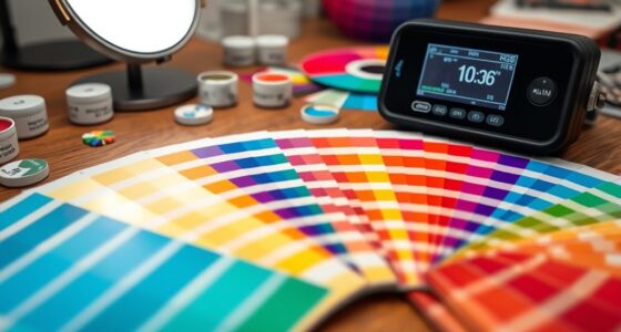

When designing for global audiences, understanding cultural symbolism of colors helps you communicate effectively and respectfully. Colors evoke different emotions and meanings based on regional traditions—like white signifying purity in the West but mourning in parts of Asia, or red symbolizing good fortune in China but warning elsewhere. By considering these associations, you can create visuals that resonate universally. Keep exploring to discover how to navigate these nuances and craft culturally sensitive, impactful designs.
Key Takeaways
- Research and understand regional color meanings to avoid cultural misinterpretations in global designs.
- Use culturally appropriate colors to evoke positive emotions and foster connection with diverse audiences.
- Recognize that colors like white, red, and blue carry different symbolic meanings across cultures.
- Incorporate local cultural symbols and color associations to enhance relevance and respect in visual communication.
- Tailor color palettes thoughtfully to balance creativity with cultural sensitivity, ensuring inclusive and effective messaging.
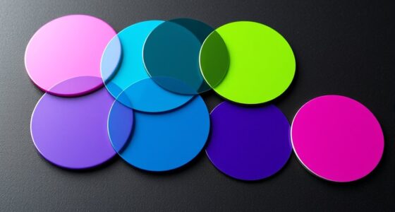
Colors carry powerful cultural meanings that influence how people interpret and respond to their surroundings. When designing for a global audience, understanding these meanings becomes vital, as they shape perceptions and emotional reactions. Your choices in color can evoke specific psychological effects that vary across cultures, making it important to consider regional color associations. For example, in Western cultures, white often symbolizes purity and peace, commonly used in weddings and healthcare branding. Conversely, in some Asian cultures, white is associated with mourning and funerals, which could unintentionally convey somberness or disrespect if used in the wrong context. Recognizing these regional nuances helps you craft designs that resonate positively and avoid unintended misinterpretations.
By tapping into regional color associations, you can influence your audience’s feelings and behaviors more effectively. Red, for instance, sparks excitement and passion in many cultures, but it can also symbolize danger or warning in others. In China, red is linked to good fortune and celebration, making it a popular choice for festive branding. Meanwhile, in South Africa, it might evoke caution or alertness. These differences highlight why understanding the cultural context behind colors guides you to make informed choices that align with your message and audience expectations. When you consider the psychological effects associated with colors, you can evoke the desired emotional response—whether it’s trust, energy, calmness, or urgency. For example, blue tends to inspire calmness and reliability, making it ideal for finance and healthcare industries, but in certain Middle Eastern regions, it might also be linked to spirituality or protection.
Furthermore, incorporating knowledge of creativity and its role in design can lead to more innovative and culturally sensitive color choices, helping your visuals stand out while respecting local traditions. Designing with cultural sensitivity requires you to research and adapt your color palette for each regional audience. You might decide to soften or intensify specific colors depending on local associations or combine culturally relevant hues to create a more inclusive visual language. Remember, colors are not just aesthetic choices—they’re powerful communicators embedded with meaning. When you understand regional color associations and the psychological effects they trigger, you can craft visuals that are compelling, respectful, and culturally aware. This approach ensures your message is universally accessible while honoring local traditions and beliefs. Ultimately, thoughtful use of colors demonstrates your respect for cultural diversity and enhances your ability to connect authentically with audiences around the world.

HOW TO READ A TURKISH CARPET: Art, Symbolism, and Cultural Meaning: Understanding Motifs, Patterns, Colors, and Regional Traditions
As an affiliate, we earn on qualifying purchases.
As an affiliate, we earn on qualifying purchases.
Frequently Asked Questions
How Do Color Meanings Vary Within Different Regions of the Same Country?
You’ll find that regional color interpretations vary within the same country due to local color symbolism. For example, in some areas, white might symbolize purity, while in others, it signifies mourning. Pay attention to local customs and traditions because regional color symbolism influences how people interpret colors. By understanding these nuances, you can design more culturally sensitive visuals that resonate with diverse audiences across different regions.
What Are Common Color Taboos in Specific Religious Communities?
Think of sacred color associations like sacred texts—important and specific. In some religious communities, you’ll want to avoid certain colors due to religious color restrictions. For example, white may symbolize purity in Christianity but signify mourning in parts of Asia. Red can be sacred in Hinduism, while black often symbolizes negativity. Respecting these color taboos shows cultural sensitivity and helps you avoid unintended offense.
How Can Designers Avoid Cultural Misappropriation of Colors?
To avoid cultural insensitivity and color appropriation, you should research each culture’s symbolism and avoid stereotypes. Collaborate with local experts and seek feedback to guarantee your design respects cultural nuances. Be mindful of context, and steer clear of using colors that hold negative or sacred meanings. By approaching your work with respect and awareness, you minimize the risk of cultural misappropriation and create inclusive, thoughtful designs.
Are There Universal Colors That Evoke the Same Feelings Worldwide?
Yes, some colors have universal associations due to cross-cultural color perception. For example, white often signifies purity or peace, and red can evoke excitement or urgency worldwide. However, be cautious because not all colors carry the same meaning everywhere. You should consider cultural context and local preferences when designing to guarantee your message resonates positively across different audiences. This awareness helps you create more inclusive and effective designs.
How Does Cultural History Influence Contemporary Color Symbolism?
Think of cultural history as a tapestry woven with vibrant threads of past experiences. Your understanding of historical color associations shapes how contemporary symbolism evolves, like a river flowing through time. Cultural symbolism evolution is influenced by historical events, traditions, and beliefs that cement certain colors’ meanings. By recognizing these influences, you can craft designs that resonate deeply, respecting cultural nuances and creating connections that feel as natural as a familiar melody.

Piriuuo 4 Pack Mini Nail Art Palette, Nail Polish Mixing Plate Metal Manicure Palettes Tools with Finger Rings Nails Art Tools Makeup Palette for Mixing Nail-Art Foundation Cosmetic
Package Included: You will receive 4 pcs nail art palettes, each palette can hold various colors of nail…
As an affiliate, we earn on qualifying purchases.
As an affiliate, we earn on qualifying purchases.
Conclusion
Understanding the cultural symbolism of colors helps you create designs that resonate globally. By respecting diverse color meanings, you avoid unintended miscommunications and foster stronger connections. Are you ready to embrace these cultural nuances in your next project? Remember, a thoughtful approach to color can turn your design into a universal language, bridging cultures and making your message truly impactful. So, will you use color intentionally to connect with audiences worldwide?
culturally sensitive branding color sets
As an affiliate, we earn on qualifying purchases.
As an affiliate, we earn on qualifying purchases.

Your True Colors: Power Up and Heal with Color Psychology: 10 Year Edition: Inspiration for your brand, app, interior design and personal styling, understand the power of color
As an affiliate, we earn on qualifying purchases.
As an affiliate, we earn on qualifying purchases.