
To approach Gestalt principles smarter, start by understanding how your viewers naturally perceive patterns and organize visual elements into meaningful groups. Use color intentionally to highlight important parts and create focal points, guiding the viewer’s eye effortlessly. Arrange elements to emphasize hierarchy and flow, making your design clear and intuitive. By combining these strategies, you’ll craft visuals that communicate quickly and effectively—if you keep exploring, you’ll find even more ways to optimize your designs.
Key Takeaways
- Integrate color strategically to emphasize relationships and create visual connections.
- Prioritize simplicity by grouping related elements and reducing visual clutter.
- Use size, contrast, and positioning to establish a clear hierarchy and guide viewer flow.
- Apply Gestalt principles intuitively to enhance comprehension and aesthetic balance.
- Continuously test and refine designs based on perceptual cues for maximum clarity.
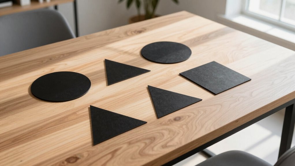
The Gestalt Principles Approach is a powerful way to understand how we perceive visual information by focusing on how our minds organize elements into meaningful patterns. When you view a complex design, your brain doesn’t process every detail separately. Instead, it automatically groups related elements to create a coherent whole. This process, rooted in Gestalt principles, helps you grasp the intended message quickly and effortlessly. One key aspect of this is color perception. Colors aren’t just aesthetic choices; they guide your eye and influence how you interpret the overall composition. Bright or contrasting hues draw attention and establish focal points, making it easier for you to navigate the visual hierarchy. When designers apply color thoughtfully, they direct your focus naturally, emphasizing important content without overwhelming you.
Your perception of a design’s visual hierarchy is deeply affected by how elements are arranged and colored. You intuitively recognize that larger, bolder, or more vividly colored objects seem more significant, helping you prioritize information without conscious effort. This natural sorting mechanism allows you to differentiate between primary and secondary elements effortlessly. When a designer leverages Gestalt principles alongside color perception, they craft layouts that feel intuitive and balanced. For instance, grouping related items using proximity or similarity, combined with contrasting colors, reinforces connections and clarifies relationships between elements. This makes the information more accessible, guiding your eye from one point to the next in a logical flow. Additionally, understanding how visual organization impacts perception can help you create more effective and engaging designs. Recognizing how the mind organizes visual elements can also inspire innovative approaches to layout and composition.
Understanding these principles empowers you to design or analyze visual content more effectively. You learn to recognize how your mind simplifies complex visuals by forming groups, lines, and patterns. This insight helps you create designs that communicate clearly, with a visual hierarchy that aligns with natural perceptual tendencies. When you prioritize clarity, you guarantee that users or viewers can quickly grasp the core message without confusion. Whether you’re designing a website, a poster, or a presentation, applying the Gestalt Principles with an awareness of color perception and visual hierarchy makes your visuals more compelling and easier to understand. Ultimately, this approach unlocks a smarter, more intentional way to craft visuals that resonate with your audience and enhance their experience.

Palette Perfect for Graphic Designers and Illustrators: Colour Combinations, Meanings and Cultural References
As an affiliate, we earn on qualifying purchases.
As an affiliate, we earn on qualifying purchases.
Frequently Asked Questions
How Can Gestalt Principles Improve Modern User Interface Design?
You can improve your modern user interface design by applying Gestalt principles to create intuitive and visually appealing layouts. Using color harmony guides users seamlessly through the interface, while motion dynamics draw attention to key elements and enhance usability. These principles help you organize information clearly, making interactions more natural and engaging. Ultimately, they foster a cohesive experience, ensuring users find your interface both attractive and easy to navigate.
Are Gestalt Principles Applicable to Non-Visual Sensory Experiences?
Yes, Gestalt principles apply to non-visual sensory experiences. You can use auditory grouping to organize sounds, making them easier to interpret, and leverage tactile perception to create cohesive sensations through touch. By understanding how your brain naturally groups similar sounds or textures, you enhance communication, comfort, and usability across sensory modalities. This approach helps design more intuitive experiences that engage your senses beyond just sight.
How Do Cultural Differences Affect Gestalt Perception?
Cultural differences considerably influence your gestalt perception. Cultural perception shapes how you interpret visual and sensory cues, leading to varied perceptions across cultures. Cross-cultural differences mean you might group or organize stimuli differently based on your cultural background, affecting how you recognize patterns, proximity, or continuity. This awareness helps you understand that gestalt principles are not universal but are filtered through cultural perspectives, influencing your perception and interpretation of sensory information.
Can Gestalt Principles Be Integrated With Other Design Theories?
You can definitely integrate Gestalt principles with other design theories, especially by investigating how cross-cultural perception influences visual interpretation. This approach highlights the importance of multisensory integration, ensuring your designs resonate universally. By combining Gestalt’s focus on perception with theories like user-centered or cognitive design, you create more inclusive, effective visuals. This integration enhances understanding across diverse audiences, making your designs both intuitive and culturally sensitive.
What Are Common Misconceptions About Gestalt Principles?
You might think gestalt principles are strict rules, but they’re actually flexible tools for understanding perceptual grouping and visual hierarchy. A common misconception is that they always lead to obvious, perfect designs; however, they guide how viewers naturally organize information. Remember, gestalt principles work best when combined with other design strategies, helping you create visuals that are intuitive, balanced, and easy to interpret.

Design for Developers
As an affiliate, we earn on qualifying purchases.
As an affiliate, we earn on qualifying purchases.
Conclusion
By embracing a more nuanced understanding of Gestalt principles, you open yourself to subtler, more refined design insights. This approach gently guides your intuition, allowing harmony and clarity to naturally emerge without force. When you trust these principles as a delicate framework rather than rigid rules, your work gains a quiet elegance that speaks volumes. Ultimately, it’s about cultivating a sophisticated balance—where simplicity and complexity dance gracefully, inviting viewers into a thoughtfully crafted visual experience.

Gestalt Principles for Creatives: Mastering Visual Harmony Through Perception Principles
As an affiliate, we earn on qualifying purchases.
As an affiliate, we earn on qualifying purchases.

Layout and Composition for Animation
As an affiliate, we earn on qualifying purchases.
As an affiliate, we earn on qualifying purchases.