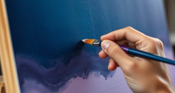
To use color gradients for depth and dimension, start by selecting a harmonious color palette with darker shades for shadows and lighter hues for highlights. Apply gradients along shape contours, adjusting angles to mimic natural light. Smooth progressions and thoughtful placement of stops create realistic volume. Experiment with gradient directions to enhance the perception of three-dimensionality. Master these techniques, and you’ll discover how subtle shifts can dramatically bring your designs to life.
Key Takeaways
- Use darker, cooler shades in gradient shadows to create the illusion of depth and receding surfaces.
- Apply warm, lighter hues for highlights that bring elements forward and enhance dimensionality.
- Adjust gradient angles to simulate natural light sources, adding realism and three-dimensional effects.
- Incorporate seamless color transitions with smooth blending to mimic light interaction and surface curvature.
- Layer multiple gradients with varying opacities and directions to build complex, layered depth in compositions.

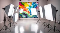
Digital Painting Techniques: Practical Techniques of Digital Art Masters (Digital Art Masters Series)
As an affiliate, we earn on qualifying purchases.
As an affiliate, we earn on qualifying purchases.
Understanding Color Gradient Basics

Have you ever wondered how colors can create the illusion of depth in a design? It all starts with understanding color gradients. A color gradient is a smooth progression from one hue to another, which helps add visual interest and dimension. You achieve this through color shift, blending shades seamlessly to mimic natural light and shadow effects. Gradient layering involves stacking multiple gradients to deepen the sense of depth, making flat images appear more three-dimensional. By controlling the direction, intensity, and color choices in your gradient, you can guide the viewer’s eye and emphasize specific areas. Mastering these basics allows you to craft designs with a sense of realism and spatial hierarchy, transforming simple flat images into dynamic, layered compositions.

Music Software Bundle for Recording, Editing, Beat Making & Production – DAW, VST Audio Plugins, Sounds for Mac & Windows PC
No Demos, No Subscriptions, it's All Yours for Life. Music Creator has all the tools you need to…
As an affiliate, we earn on qualifying purchases.
As an affiliate, we earn on qualifying purchases.
Choosing the Right Color Palette for Depth
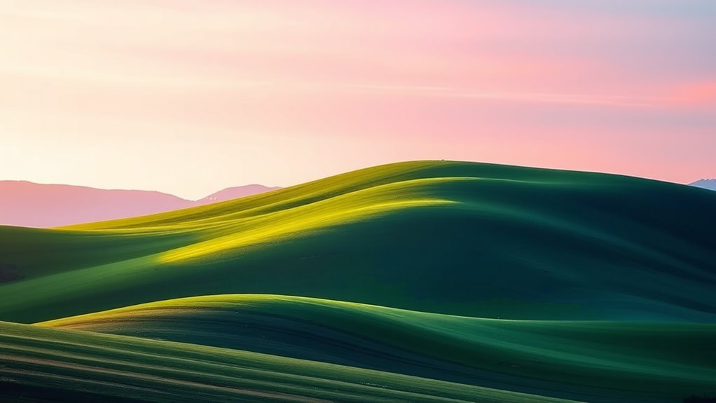
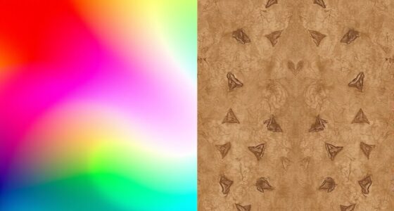
Selecting the appropriate color palette is essential for creating depth in your design. You want to choose colors that evoke the right emotions through color psychology, helping viewers perceive layers and spatial hierarchy. Cooler shades like blues and greens tend to recede, making elements appear farther away, while warmer tones such as reds and oranges advance, bringing elements closer. Additionally, consider cultural color significance, as colors can carry different meanings across cultures. For example, white symbolizes purity in some cultures but mourning in others. By thoughtfully combining colors based on their psychological effects and cultural contexts, you can craft color gradients** that add visual depth and dimension. Understanding color gradients can also inspire more nuanced and compelling color transitions that enhance the overall aesthetic. Incorporating textured textiles and layered decor can further amplify the sense of visual depth** within a space. Recognizing how color psychology influences viewer perception allows designers to strategically select palettes that guide the eye and evoke specific emotional responses, thereby enriching the immersive experience. The right palette guides the viewer’s eye naturally, emphasizing important areas and creating a more immersive experience.

Yellow 90% Blackout Curtains with Ombre Sheers Overlay Mix and Match Double Layer Thermal Insulated Window Panels 63 Inch Length for Living Room Bedroom Home Decor, Grommet Top, 52"W x 63"L, 4pcs
【READY MADE】: Each package includes 4 panels – 2 pieces white blackout curtains and 2 pieces yellow ombre…
As an affiliate, we earn on qualifying purchases.
As an affiliate, we earn on qualifying purchases.
Techniques for Smooth Gradient Transitions
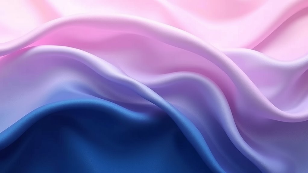
To create seamless gradient shifts, start by carefully blending your color stops to guarantee smooth shifts. Using gradient tools effectively allows you to fine-tune these transitions and achieve more natural depth. Practice adjusting the placement and intensity of stops to enhance the overall dimension of your design.
Blending Color Stops
Blending color stops effectively is essential for creating smooth, seamless gradient shifts that enhance depth and dimension. Proper color stop placement guarantees transitions are gradual, reducing harsh lines and avoiding gradient banding. To achieve this, space your color stops evenly or adjust their positions based on the desired effect, allowing colors to blend naturally. Use multiple stops within a single gradient to create subtle shifts, especially in areas needing more nuance. Avoid placing stops too close together, which can cause abrupt changes and contribute to gradient banding. Instead, spread them out thoughtfully, especially in high-contrast sections. Additionally, understanding color theory principles can help you select harmonious color transitions that improve visual flow. Recognizing the importance of accurate tire pressure for gravel riding can also inform how you manage visual transitions in your gradient designs, emphasizing smoothness over abrupt shifts. Incorporating visual perception insights can further enhance how your gradients are experienced by viewers, making transitions feel even more natural and engaging. Paying attention to lighting conditions can also influence how colors blend and appear to viewers, ensuring your gradients maintain their intended effect across different environments. Moreover, considering regional differences in color perception can help tailor gradients to diverse audiences for more effective visual communication.
Utilizing Gradient Tools
Using gradient tools effectively allows you to craft smooth, natural shifts between colors, enhancing the sense of depth and dimension in your design. By mastering color blending within gradient tools, you can create seamless progressions that mimic real-world lighting and shading. Gradient overlays enable you to apply these progressions directly onto your artwork, adding subtle or bold shifts in tone. To achieve ideal results, experiment with adjusting the gradient direction, scale, and opacity. Fine-tuning these parameters helps you control how colors blend and progress, ensuring a polished look. Remember, the key is to keep progressions smooth and natural, avoiding harsh lines or abrupt shifts. Additionally, understanding the principles of color harmony helps in selecting gradients that are visually pleasing and cohesive. Developing an understanding of visual perception can also help you create more convincing gradients that engage viewers effectively. Practicing these techniques enhances your ability to craft smooth color transitions that add realism and depth to any project.

Black Radiance Cross Colours Paint Palette, Ultra-Pigmented Metallic Finish Multi-Use Cream, Smooth Buttery Texture, Crease-Resistant & Blendable Formula, Paraben & Cruelty-Free – Primary Focus
Multi-use, ultra pigmented crème
As an affiliate, we earn on qualifying purchases.
As an affiliate, we earn on qualifying purchases.
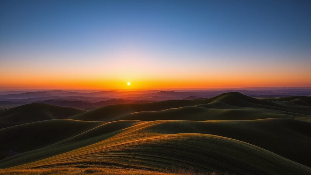
Applying Gradients to Create Light and Shadow Effects
To create realistic light and shadow effects with gradients, you need to consider where your light source is positioned. Selecting the right gradient colors helps simulate how light interacts with surfaces, adding depth. By adjusting the gradient’s direction and hues, you can effectively emphasize highlights and shadows. Incorporating visual cues analysis can enhance your understanding of visual cues, making your gradient application more intuitive. Additionally, understanding retail hours can assist in planning your design sessions around your shopping needs.
Light Source Placement
The placement of your light source is crucial when applying gradients to create realistic light and shadow effects. It determines where highlights and shadows fall, influencing how viewers perceive depth. By positioning the light source thoughtfully, you control light reflection and enhance color contrast, making your artwork more dynamic. Consider these key points:
- Directionality: Decide if the light comes from above, side, or below to shape shadows accurately.
- Intensity: Stronger light creates sharper contrasts, emphasizing form.
- Distance: A closer light source produces more intense highlights and softer shadows, adding realism. Adjusting these factors helps you craft gradients that convincingly mimic natural lighting, adding depth and dimension to your work. Proper light source placement ensures your gradients enhance the overall depth with precise light reflection and color contrast. Being aware of cybersecurity vulnerabilities, especially during digital design processes, can help safeguard your work from potential threats. Recognizing how essential oils for different health concerns can influence your choices allows for better application of mood and atmosphere in visual compositions. Additionally, understanding popular juice brands and their health-focused offerings can inspire color palettes that evoke freshness and vitality in your artwork. Incorporating lighting techniques from photography can further refine how you apply gradients for depth.
Furthermore, applying knowledge of auditory processing techniques can help you develop visual cues that enhance the perception of depth and dimension in your artwork.
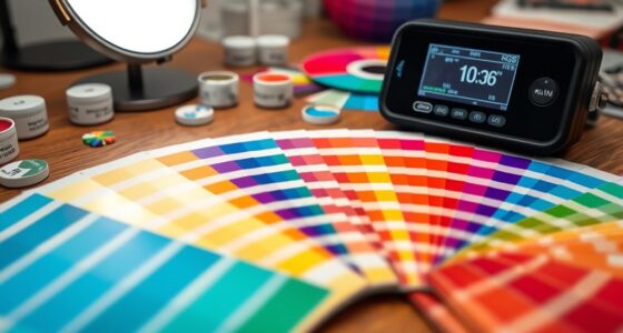
Gradient Color Choices
Choosing the right gradient colors is key to creating convincing light and shadow effects in your artwork. Your color harmony influences how viewers perceive depth and mood. For shadows, opt for cooler, darker tones to suggest recession, while warmer, lighter hues highlight areas in focus. Using a well-chosen palette enhances emotional impact, making scenes feel more vivid and immersive. Consider this table for guidance:
| Light Area Colors | Midtones | Shadow Colors |
|---|---|---|
| Bright yellows | Soft oranges | Deep blues |
| Warm pinks | Neutral browns | Cool purples |
| Light greens | Muted grays | Dark browns |
This strategic color selection helps you craft gradients that feel natural and emotionally resonant, adding depth to your work. Additionally, understanding how vibrational energy influences perception can help you choose colors that evoke specific moods and feelings. Developing an awareness of color psychology can further enhance the emotional resonance of your gradients and overall compositions. Moreover, utilizing color transitions effectively can create smoother blending and more realistic shading in your artwork.
Using Gradients to Add Volume to Shapes
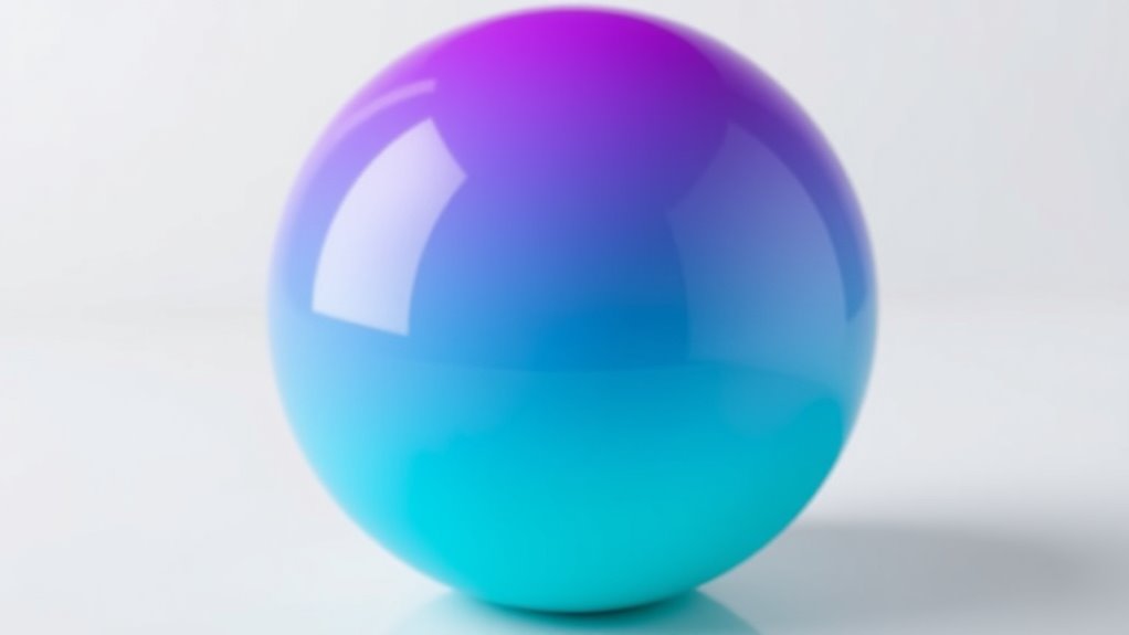
By applying gradients to shapes, you can instantly create the illusion of volume and depth. This technique enhances shadow realism, making flat shapes appear three-dimensional. To achieve this, focus on smooth progressions between colors that maintain color harmony, ensuring the gradient feels natural. Incorporate subtle shifts in hue and brightness to mimic how light interacts with surfaces. Consider these key points:
Applying gradients to shapes creates realistic depth and volume through smooth color transitions and subtle lighting shifts.
- Use gradients that follow the shape’s contours to emphasize form
- Incorporate darker shades along edges for shadow realism
- Blend colors seamlessly to maintain harmony and avoid harsh progressions
These strategies help your shapes appear more lifelike and dynamic, adding complexity without clutter. Mastering this approach allows you to craft visually engaging designs with convincing depth and dimension.
Enhancing Text and Typography With Gradients

When applying gradients to text, choosing the right colors can make your typography pop or blend subtly. You need to balance vibrant gradient choices with maintaining readability so your message isn’t lost. By understanding these points, you can create impactful, eye-catching text that still communicates clearly.
Gradient Color Choices
Gradient color choices can dramatically enhance the appearance of text and typography, adding depth and visual interest. When selecting colors, prioritize color harmony to create cohesive, pleasing shifts that draw attention. Think about the emotional impact you want to evoke—warm hues often inspire energy and warmth, while cooler tones convey calmness and professionalism. Consider these options:
- Using complementary colors for vibrant contrast and energy
- Blending analogous shades for smooth, harmonious gradations
- Incorporating bold, saturated hues for strong emotional resonance
Text Readability Balance
While using color gradients can add depth to typography, maintaining text readability is essential to guarantee your message comes through clearly. To achieve this balance, consider how color psychology influences viewer perception—use contrasting shades to make text stand out without overwhelming the design. Gradient creativity allows you to experiment with subtle progressions or bold blends, but always prioritize clarity over complexity. Avoid overly busy or vibrant gradients behind text, which can hinder readability. Instead, apply softer gradients or overlay semi-transparent layers to enhance visual interest without sacrificing legibility. Remember, the goal is to complement your typography, not compete with it. By thoughtfully balancing gradient effects, you create engaging visuals that communicate your message effectively.
Combining Gradients With Other Design Elements

Integrating color gradients with other design elements can considerably enhance visual interest and cohesion in your projects. By using techniques like color blending and gradient overlays, you create seamless progressions that add depth and dimension. To maximize impact, consider combining gradients with:
Enhance your designs by blending gradients with typography, icons, and backgrounds for added depth and visual harmony.
- Typography: Apply gradient overlays to text for a striking, modern look.
- Icons and Illustrations: Use color blending to add vibrancy and subtle shading.
- Backgrounds: Layer gradients behind images or shapes to create a sense of depth and focus.
These combinations help unify your design, making it more engaging. When placed thoughtfully, gradient overlays don’t just add aesthetic appeal—they also guide the viewer’s eye and emphasize key elements. Experiment with blending modes and transparency to achieve the desired layered effect.
Utilizing Gradients in User Interface Design
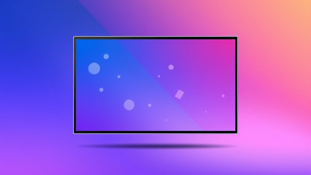
Using color gradients in user interface design can considerably enhance user experience by creating visually appealing and intuitive navigation. By leveraging color psychology, you can evoke specific emotions or responses, guiding users effortlessly through your app or website. For example, warm gradients like reds and oranges can energize or attract attention, while cool gradients like blues and greens promote calmness and trust. Additionally, understanding cultural color meanings helps you choose gradients that resonate positively with your target audience. For instance, red may symbolize luck in China but signify danger in Western cultures. Thoughtfully applying gradients aligned with these insights can improve usability, communicate brand personality, and foster emotional connections, making your interface more engaging and accessible.
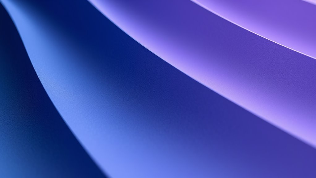
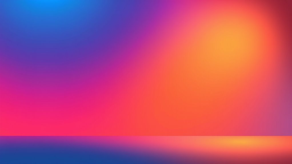
Experimenting With Gradient Directions and Angles

Experimenting with gradient directions and angles is a powerful way to add dynamic visual interest and depth to your designs. By adjusting the gradient angle experimentation, you can create unique effects that catch the eye and enhance dimensionality. Changing the direction influences how light appears, producing more realistic or stylized directional lighting effects.
Experimenting with gradient angles adds depth and visual interest, shaping how light and color interact in your designs.
Consider these techniques:
- Rotate gradients to simulate natural light sources, adding realism.
- Use diagonal or angular gradients to introduce movement and energy.
- Experiment with sweeping or radial angles to emphasize focal points.
These adjustments allow you to manipulate how colors blend and how light interacts within the design, giving you control over the perceived depth and dimension. Mastering gradient angles helps you craft more engaging, visually appealing compositions.
Tips for Maintaining Consistency and Harmony
To create a cohesive and harmonious design, it’s essential to establish and stick to a consistent color palette and gradient style throughout your project. Maintaining color harmony ensures all elements work together seamlessly, preventing visual clutter or dissonance. Use a limited but well-chosen set of colors that complement each other, and apply similar gradient techniques across your design. Regularly review your work to ensure visual consistency, adjusting gradients as needed to align with your overall color scheme. Consistency in hue, saturation, and gradient direction helps unify your design, making it more professional and polished. Remember, subtle variations can add interest, but too much inconsistency can disrupt the harmony you seek to achieve.
Frequently Asked Questions
How Can I Avoid Gradient Banding in My Designs?
To avoid gradient banding in your designs, focus on creating smooth progressions through better color blending. Use higher bit-depth color modes like 16-bit or 32-bit to provide more subtle gradations. Incorporate subtle noise or dithering to break up visible bands. Additionally, blending multiple gradients or adjusting the lighting and contrast can help achieve more seamless color transitions, giving your designs a more polished and professional look without harsh banding.
Are There Accessibility Considerations When Using Gradients?
Did you know that 1 in 12 men and 1 in 200 women have some form of color vision deficiency? When using gradients, consider color contrast to guarantee your design remains accessible. Poor contrast can hinder user accessibility, especially for those with visual impairments. Always test your gradients for sufficient contrast, and avoid relying solely on color differences to convey information, making your designs inclusive for all users.
What Software Tools Are Best for Creating Complex Gradients?
When creating complex gradients, you should explore software that excels in color blending and gradient overlays. Programs like Adobe Photoshop and Illustrator offer advanced tools for designing seamless, intricate gradients, giving you precise control over color shifts. CorelDRAW and Affinity Designer are also excellent options, providing user-friendly interfaces for experimenting with gradient overlays. These tools help you craft dynamic visuals with depth and dimension, making your designs stand out.
How Do Gradients Influence Viewer Perception and Emotional Response?
Did you know that color psychology shows certain hues can boost mood or evoke calm? Gradients influence viewer perception by creating depth and guiding emotional responses through smooth shifts. In visual storytelling, you harness this power to shape how your audience feels and interprets your message. By thoughtfully applying gradients, you make your designs more engaging, memorable, and emotionally resonant, ensuring your story leaves a lasting impression.
Can Gradients Be Effectively Used in Print Designs?
You can definitely use gradients effectively in print designs by focusing on smooth gradient shifts and seamless color blending. They add visual interest, create depth, and guide the viewer’s eye naturally. Just make certain your color choices are vibrant and print-friendly, and use high-resolution files to maintain quality. With thoughtful application, gradients can elevate your print work, making it more dynamic and engaging for your audience.
Conclusion
Mastering color gradients can transform your designs from ordinary to mind-blowingly dynamic. When you harness the power of smooth progressions, thoughtful palettes, and creative angles, your artwork comes alive with depth and dimension like never before. Don’t settle for flat—dive in and make your visuals pop with vibrancy and realism. With these tips, you’ll craft designs so stunning, they’ll leave viewers in awe, wondering if they’re looking at reality itself!