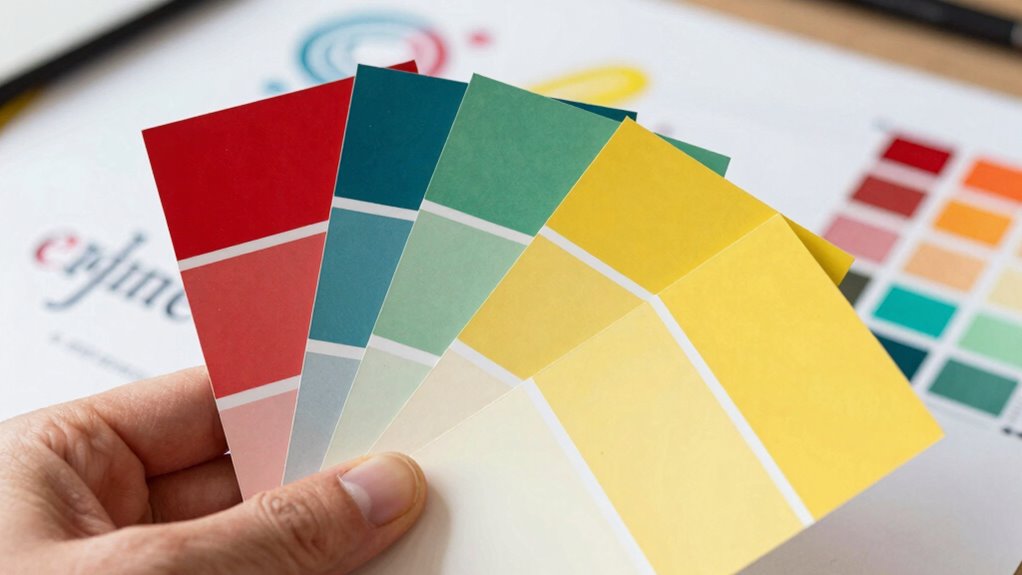

The overlooked rule behind better brand color systems is consistency. When you use your brand colors uniformly across all touchpoints, you create a seamless visual experience that strengthens recognition and builds trust. Proper color management reinforces your brand’s personality and emotional impact, making your message more memorable. Disregarding this rule causes confusion and weakens your brand’s identity. Stick to consistent colors, and you’ll unleash the true power of your visual brand. Keep exploring, and you’ll discover how to master this essential aspect.

Get art and craft supplies delivered free — and shop member deals
- Fast, free delivery on millions of items
- Access to Prime Big Deal Days deals on October 6–7
- Prime Video, Amazon Music and more included
Key Takeaways
- Consistently applying a core color palette ensures visual cohesion across all brand touchpoints.
- Prioritize emotional resonance by selecting colors aligned with the brand’s personality and message.
- Use standardized color codes (Pantone, CMYK, RGB) to maintain accuracy across media.
- Limit the number of primary brand colors to strengthen recognition and prevent visual clutter.
- Regularly review and update color usage to reinforce brand identity and adapt to evolving contexts.

When designing a brand’s color system, many focus on choosing appealing palettes or matching industry trends. However, the overlooked rule that can truly elevate your brand is maintaining color consistency. Consistency isn’t just about repeating colors; it’s about creating a unified visual language across all touchpoints. When you guarantee that your colors stay uniform, your audience begins to associate specific hues with your brand, making it instantly recognizable and building trust over time. Inconsistent use of colors can confuse your audience, dilute your brand identity, and weaken the emotional connection you aim to establish.
Color consistency creates a unified brand identity, increasing recognition and fostering trust with your audience.
The power of color is rooted in its emotional impact. Different shades evoke different feelings—blue often communicates trust and dependability, while red can generate excitement or urgency. When you manage your color system with consistency, you control how these emotions are conveyed. A single, well-maintained palette helps reinforce your brand’s personality and message, making your communications more compelling. For instance, if your brand is about calmness and reliability, sticking with a specific shade of blue across all platforms ensures that your audience consistently feels that sense of reassurance. Any variation can diminish that emotional resonance and weaken your branding efforts. Additionally, color psychology plays a significant role in how your audience perceives and responds to your visuals.
Think about how your brand appears on your website, social media, packaging, and advertising. Without a cohesive color approach, these elements might look disjointed, sending mixed signals to your audience. When your colors are consistently applied, it creates a seamless experience that enhances recognition and memorability. People are naturally drawn to familiar visual cues, and consistent colors serve as these cues. This recognition fosters emotional attachment, making your audience more likely to remember and trust your brand. Furthermore, understanding color harmony can help you select shades that work well together, strengthening your overall visual identity. Incorporating brand guidelines that specify your color palette ensures that your visual identity remains intact across different platforms and teams. Additionally, color consistency plays a crucial role in establishing a professional and polished appearance, which can influence customer perceptions significantly.
Moreover, maintaining color consistency simplifies your branding process. When you have a clear color system, your team, designers, and partners know exactly which shades to use, reducing guesswork and errors. It also aligns with the importance of brand recognition in content and design. It ensures that no matter who creates your materials, the visual identity remains intact. This consistency also streamlines your brand’s evolution, allowing you to update or expand your visual language over time without losing continuity.
In essence, the overlooked rule behind better brand color systems is recognizing that color consistency amplifies emotional impact. It’s a strategic choice that shapes perceptions, builds recognition, and deepens emotional bonds with your audience. When you prioritize consistency, you’re not just choosing colors—you’re crafting a powerful, cohesive story that resonates clearly and strongly across every touchpoint.
As an affiliate, we earn on qualifying purchases.
Frequently Asked Questions
How Does Cultural Perception Influence Brand Color Choices?
Cultural perception heavily influences your brand color choices because cultural symbolism and regional significance shape how people interpret colors. You need to take into account what certain hues represent in different cultures—for example, red symbolizes luck in China but danger in Western countries. By understanding these nuances, you can select colors that resonate positively with your target audience, avoiding misinterpretations and strengthening your brand’s emotional connection across diverse markets.
Can Color Theory Alone Guarantee a Successful Brand Identity?
Think of color theory as the GPS for your brand’s journey; it guides you but doesn’t guarantee arrival. Color psychology influences emotions, but without visual consistency, your brand risks confusion. A successful brand identity combines solid color choices with strategic messaging and design. So, while color theory is essential, it’s the harmony of all elements that truly drives brand success, not just colors alone.
What Role Do Competitors’ Colors Play in Branding Decisions?
In competitive landscapes, your choice of colors must consider competitors’ palettes to stand out effectively. Color psychology plays a crucial role, as certain hues evoke specific emotions and perceptions. By analyzing competitors’ colors, you can select shades that differentiate your brand while aligning with your target audience’s expectations. This strategic approach helps you create a memorable, impactful brand identity that captures attention and fosters brand loyalty.
How Often Should a Brand Revisit Its Color System?
You should revisit your brand color system every 2-3 years, just like updating a wardrobe. While consistency builds recognition, color fatigue can set in if your palette stays static too long. Revitalizing your colors keeps your brand vibrant and relevant, preventing dullness from setting in. Regular reviews ensure your colors stay aligned with your evolving identity, striking a balance between familiarity and freshness that resonates with your audience.
Are There Digital Tools to Optimize Brand Color Selections?
Yes, digital tools can help you optimize your brand color palette effectively. Tools like Adobe Color, Coolors, and Colormind let you experiment with shades, generate harmonious palettes, and guarantee consistency across platforms. They offer real-time previews and accessibility checks, making it easier for you to select the best colors. Using these digital tools streamlines your process, assures your brand’s colors are visually appealing, and maintains a cohesive identity.
As an affiliate, we earn on qualifying purchases.
Conclusion
Remember, your brand’s colors are more than just visuals—they’re the compass guiding your audience’s perception. When you embrace the overlooked rule, you’re planting a seed that grows into trust and recognition. Think of your color system as a lighthouse, shining steadily through the fog of competition. By aligning this subtle yet powerful rule, you reveal a beacon that draws people in, making your brand unforgettable amidst the vast ocean of choices.
As an affiliate, we earn on qualifying purchases.
color consistency management software
As an affiliate, we earn on qualifying purchases.
As an affiliate, we earn on qualifying purchases.
Fall Picks
fall essentials
As an affiliate, we earn on qualifying purchases.