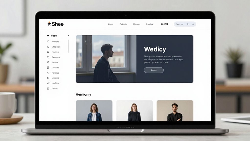

The overlooked rule behind better site navigation is establishing a strong visual hierarchy. You need to guide users’ eyes naturally toward the most important elements using size, color, and placement. Proper hierarchy makes your site easier to scan, understand, and use, reducing frustration and boosting trust. When your design clearly prioritizes content, visitors find what they need faster and feel more confident exploring. Keep going, and you’ll uncover even more ways to enhance your site’s flow and engagement.
Key Takeaways
- Prioritize visual hierarchy to guide users naturally through content.
- Use size, contrast, and placement to emphasize essential navigation elements.
- Organize content logically to reduce confusion and enhance flow.
- Consistently apply hierarchy principles across all pages for familiarity.
- Test and refine layout to ensure users easily find key information.
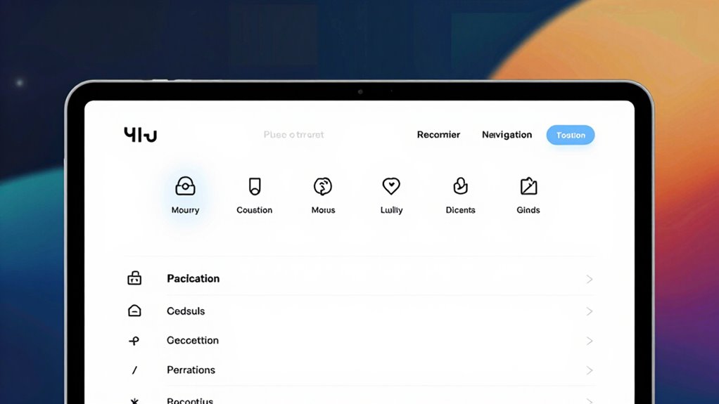
Have you ever wondered why some websites feel intuitive while others leave you searching for what you need? The secret often lies in the way the site guides your eye and thoughts—what designers call visual hierarchy. When done right, it improves your user experience by making navigation feel natural and effortless. You don’t have to think twice about where to click or what to look at first. Instead, your eyes are directed smoothly, and your brain processes information without confusion. This simple principle can transform a confusing jumble of links into a seamless journey.
Effective visual hierarchy guides your eyes effortlessly, transforming chaos into a seamless online experience.
Visual hierarchy isn’t just about making things look pretty; it’s about structuring content so that the most important elements stand out. As a visitor, you’re naturally drawn to larger, bolder visuals or contrasting colors first. Smart placement of menus, headers, and call-to-action buttons helps you identify what’s essential right away. When these elements are prioritized correctly, it creates a clear path through the site, reducing frustration and increasing engagement. You don’t have to hunt around or guess where to go next. Instead, the design subtly guides you, making your experience smoother and more satisfying.
Focusing on visual hierarchy also impacts how you perceive the overall user experience. A well-organized site feels professional, trustworthy, and easy to navigate. When key information is emphasized, you can quickly find what you need without scrolling endlessly or clicking multiple times. This efficiency not only saves your time but also builds confidence in the website. If the visual cues are misleading or poorly arranged, you might feel lost or overwhelmed—an experience that discourages further exploration. On the flip side, a clear visual hierarchy invites you to stay longer, explore more, and return in the future. Understanding visual hierarchy as a fundamental design principle helps create websites that are both functional and engaging. Additionally, applying design principles thoughtfully ensures a balanced and user-centric layout that enhances overall satisfaction, especially when considering how content structure influences user flow.
As an affiliate, we earn on qualifying purchases.
Frequently Asked Questions
How Does Intuitive Design Impact User Retention?
Intuitive design considerably boosts user retention by reducing cognitive load and enhancing visual hierarchy. When your site is easy to understand and navigate, users quickly find what they want without frustration. Clear visual cues guide their attention, making interactions seamless. As a result, visitors stay longer, engage more, and are more likely to return, because your site feels natural and effortless to use, creating a positive, memorable experience.
What Are Common Navigation Mistakes to Avoid?
You should avoid cluttered navigation hierarchies that confuse users and neglecting clear visual cues, which guide visitors effortlessly. Don’t overload menus or hide important links; keep your structure simple and logical. Missing visual cues like icons or highlighting active pages can leave users lost. By maintaining a clear navigation hierarchy and using visual cues effectively, you enhance user experience, making it easier for visitors to find what they need and stay engaged.
How Can Mobile Navigation Be Optimized Effectively?
You can optimize mobile navigation by prioritizing mobile responsiveness and intuitive touch gestures. Studies show that 57% of users abandon sites if they’re not mobile-friendly. Make menus simple, with clear icons and easy-to-press buttons. Incorporate touch gestures like swiping and tapping for seamless interaction. Test your site on various devices regularly, ensuring navigation remains smooth and accessible, so users stay engaged and find what they need effortlessly.
What Role Does User Feedback Play in Navigation Improvements?
User feedback plays a vital role in navigation improvements because it helps you identify specific pain points and areas for enhancement. By conducting user surveys, you gather valuable insights directly from visitors, and through feedback analysis, you can pinpoint patterns and prioritize changes. This iterative process guarantees your site navigation evolves to better meet user needs, increasing satisfaction and engagement. Listening to your users truly makes your navigation more intuitive and effective.
How Often Should Site Navigation Be Reviewed and Updated?
Think of your site navigation as a garden that needs regular tending. You should review and update it every few months, especially after content audits reveal outdated links or new pages. Incorporate competitor analysis to see what’s working elsewhere, ensuring your navigation stays fresh and user-friendly. This proactive approach keeps visitors engaged, helping your site grow vibrant and efficient, much like a well-maintained garden flourishing through timely care.
navigation menu design templates
As an affiliate, we earn on qualifying purchases.
As an affiliate, we earn on qualifying purchases.
Conclusion
Remember, the secret to better site navigation isn’t just about flashy menus or clever labels—it’s about making your visitors feel like they’re on a well-marked trail. When you prioritize clarity and simplicity, you turn chaos into clarity, guiding users effortlessly. Think of your site as a map; the clearer your signs, the faster they reach their destination. By embracing this overlooked rule, you’ll transform visitors into loyal explorers, enthusiastic to discover what’s next.
As an affiliate, we earn on qualifying purchases.
website layout organization guide
As an affiliate, we earn on qualifying purchases.
As an affiliate, we earn on qualifying purchases.