

Balancing aesthetics and functionality in UX means choosing between minimalism and maximalism based on your target audience and goals. Minimalism reduces clutter, making interactions straightforward and focused, while maximalism offers rich visuals and detailed features for immersive experiences. To create effective designs, you’ll want to make certain each element serves a purpose and supports usability. Want to discover how to find the perfect balance for your project? Keep exploring for expert insights.
Key Takeaways
- Minimalism enhances user focus and clarity by reducing clutter, while maximalism offers rich visuals that can engage more senses.
- Balancing aesthetics and functionality requires careful organization to prevent overload, regardless of style.
- Minimalist designs suit quick interactions, whereas maximalist approaches support immersive, sensory-rich experiences.
- Every design element should serve a purpose to maintain harmony between beauty and usability.
- Overly cluttered interfaces diminish usability; clean, simple layouts foster trust and prolonged engagement.
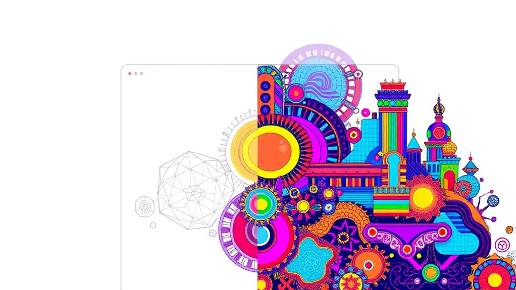
Have you ever wondered whether a simple, clean interface or a bold, feature-rich design provides a better user experience? The debate between minimalism and maximalism in UX isn’t just about aesthetics; it’s about how design influences user behavior and perception. When you opt for a minimalist approach, you’re aiming to reduce visual clutter, which can markedly enhance user engagement. A cluttered interface overwhelms users, making it difficult to focus on important tasks or find what they need quickly. By stripping away unnecessary elements, you create a clear, streamlined experience that guides users effortlessly through your content. This simplicity encourages users to stay longer and interact more intentionally, as they’re not distracted by extraneous visuals or confusing layouts. Minimalist designs often rely on ample white space, straightforward navigation, and minimal text, fostering an environment where users can concentrate on core functionalities without feeling overwhelmed. Conversely, maximalism embraces richness in visuals, detailed interfaces, and a multitude of features, which can appeal to users seeking an immersive or expressive experience. However, without careful balance, maximalist designs risk overloading users with information, increasing visual clutter, and diminishing user engagement. Too many design elements compete for attention, making it harder for users to focus on what truly matters. The challenge lies in balancing aesthetics and functionality—ensuring that every element serves a purpose, whether to inform, entertain, or guide. In some cases, a bold, feature-rich interface can captivate users and encourage exploration, but only if it’s well-organized and intuitive. As a designer or product owner, you must consider your target audience’s preferences and tasks. If your goal is quick, efficient interactions, minimalism’s clarity typically works best. But if your app or website aims to provide an engaging, sensory experience, maximalist design might be more fitting, provided it’s thoughtfully executed. The key is to strike a harmony where visual appeal doesn’t come at the expense of usability. You want your design to be eye-catching yet easy to navigate. Achieving this balance involves carefully selecting visual elements, prioritizing content, and maintaining consistency. Additionally, incorporating aesthetic wall organization can help in creating functional yet visually appealing spaces that enhance user experience. Ultimately, whether you lean toward minimalism or maximalism, understanding how visual clutter impacts user engagement is vital. A clean, focused interface invites users in, fosters trust, and encourages prolonged interactions, while a cluttered one pushes users away or frustrates them. Your goal should be to craft a user experience that aligns with your brand’s voice and your users’ needs—whether through simplicity or richness—without sacrificing clarity or purpose.

DreamSky Large Digital Clock with Date and Day of Week for Seniors
Digital Clock Large Display Easy to Read: this large digital clock with 7.6 inches big screen clearly displays...
As an affiliate, we earn on qualifying purchases.
Frequently Asked Questions
How Does User Feedback Influence Design Choices Between Minimalism and Maximalism?
User feedback plays a vital role in shaping your design choices between minimalism and maximalism. You should analyze user preferences to determine whether they favor clean, simple interfaces or more feature-rich, detailed layouts. Integrate this feedback to create a balanced experience that meets user needs while maintaining aesthetic appeal. Regularly listening to users helps you refine your design, ensuring it’s both functional and visually engaging, aligning with their expectations.
What Metrics Best Measure Success in Minimalistic Versus Maximalist UX Designs?
Think of success metrics as the heartbeat of your design. For minimalistic UX, focus on engagement metrics like click-through rates and bounce rates, which show how users interact seamlessly. For maximalist designs, assess visual complexity and time-on-page, indicating how well users navigate rich, detailed layouts. These metrics reveal if your design balances aesthetics and function, guiding you to refine either simplicity or richness to meet user needs.
Are There Specific Industries Where Minimalism or Maximalism Perform Better?
In sector-specific design, you’ll find minimalism works best in finance and healthcare, where clarity and professionalism matter most. Maximalism tends to excel in fashion, entertainment, and gaming industries, appealing to vibrant industry aesthetic preferences that emphasize creativity and bold visuals. By understanding your industry’s unique expectations, you can tailor your UX to either simplify or energize, ensuring your design resonates effectively with your target audience.
How Do Cultural Differences Impact Preferences for Minimal or Maximal UX?
Like steering a cultural mosaic, you find that preferences for minimal or maximal UX hinge on cultural aesthetics and design preferences. In some societies, simplicity aligns with clarity, echoing Zen philosophies, while others celebrate vibrant, layered designs reminiscent of bustling markets. Your task is to understand these nuances, tailoring your UX to resonate culturally, ensuring users feel at home whether they prefer sleek minimalism or rich maximalism.
Can a Website Seamlessly Switch Between Minimal and Maximal Design Elements?
Yes, you can create a website that seamlessly shifts between minimal and maximal design elements by maintaining design consistency and clear visual hierarchy. Use adaptable layouts, flexible navigation, and consistent color schemes to guarantee smooth transitions. Prioritize essential content during minimal phases and add visual richness during maximal segments. This approach keeps users engaged and helps balance aesthetics with functionality, regardless of the design style you choose at any moment.

uscce Wooden Digital Alarm Clocks for Bedrooms with 0-100% Dimmable Display
EASY-TO-READ WOODEN DIGITAL CLOCK WITH LARGE NUMBERS: Featuring 1.8-inch big bold numbers, this desk clock is easy to...
As an affiliate, we earn on qualifying purchases.
Conclusion
Ultimately, you find yourself at a crossroads: embrace minimalism’s clean simplicity or indulge in maximalism’s vibrant detail. Both styles serve a purpose—one offers clarity, the other excitement. Striking the right balance means knowing when to pare down and when to add flair. Like a painter choosing between a blank canvas and a bursting palette, your goal is to create an experience that’s both beautiful and functional, seamlessly blending aesthetics with usability.

Peakeep Digital Alarm Clock for Bedrooms Bedside, Loud for Heavy Sleepers
Digital Clock Alarm Clock for Bedrooms: Gathers all features you rely on a clock for your bedroom, such...
As an affiliate, we earn on qualifying purchases.

Peakeep Large Display Digital Alarm Clock for Bedroom with Date Day of Week
Alarm Clock for Bedroom Living Room: Peakeep gathers all features you rely on a clock for your bedroom...
As an affiliate, we earn on qualifying purchases.