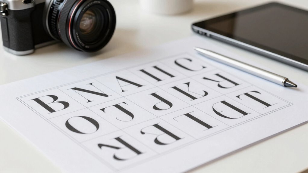

A smarter way to approach typographic grids is to focus on balancing hierarchy and alignment to create clear, organized layouts. Use grid systems to maintain consistent spacing and proportional relationships among elements, guiding your viewers naturally through your content. Adjust font sizes, weights, and spacing to emphasize key points while ensuring readability. When you master these principles, your designs become more cohesive and engaging. Keep exploring to discover even more effective strategies for controlling visual flow.

Get art and craft supplies delivered free — and shop member deals
- Fast, free delivery on millions of items
- Access to Prime Big Deal Days deals on October 6–7
- Prime Video, Amazon Music and more included
Key Takeaways
- Understand and adapt grid systems to fit the specific content and hierarchy needs of your project.
- Use baseline grids to align text consistently, enhancing readability and visual flow.
- Balance typography hierarchy with grid structure to emphasize key information effectively.
- Experiment with font sizes, weights, and spacing within the grid to create a cohesive and dynamic layout.
- Incorporate color temperature adjustments to achieve visual harmony and reinforce hierarchy.
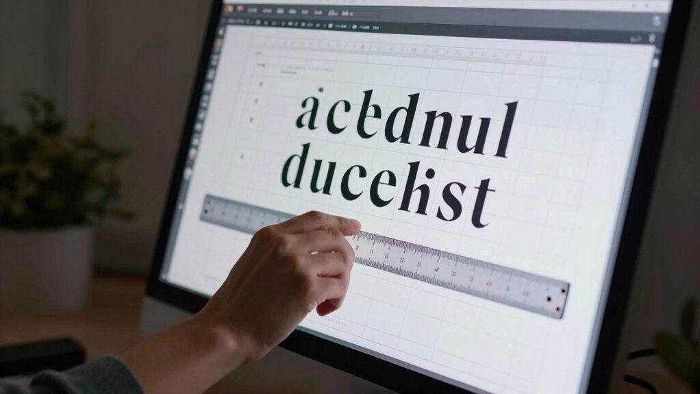
Typography isn’t just about choosing the right fonts; it’s also about how you organize your content for clarity and visual harmony. When you design with a focus on typography hierarchy, you guide your readers seamlessly through your content, emphasizing key points and creating a natural flow. A well-defined hierarchy ensures that headings, subheadings, and body text each stand out appropriately, making your message easy to scan and understand. It’s about making intentional choices—using size, weight, and spacing—to direct attention where it’s needed most.
Grid alignment plays an essential role in achieving this consistency. When you align your text elements to a grid, you create a structured framework that lends order and balance to your design. This grid acts as an invisible backbone, helping you maintain even margins, consistent spacing, and proportional relationships among elements. This consistency doesn’t just look good; it enhances readability and makes your content feel unified. Whether you’re working on a website, a printed piece, or a presentation, grid alignment helps you keep everything in harmony, so your audience isn’t distracted by uneven or chaotic layouts. Incorporating typographic grid principles into your workflow can significantly improve your overall design cohesion.
Using a typographic grid effectively involves more than just lining up text blocks. It requires understanding how to adapt the grid to fit your specific content. For example, you might choose a baseline grid to align your lines of text, ensuring that spacing remains uniform across multiple columns or pages. This consistency helps the eye move smoothly from one section to the next, reinforcing your visual hierarchy. When your typography follows a clear grid alignment, your audience subconsciously recognizes the organization, which makes your message more engaging and easier to digest. Additionally, considering color temperature adjustments can help optimize viewing conditions and enhance the overall visual harmony of your design. Developing a visual hierarchy is essential for guiding your audience naturally through your content.
You’ll find that combining typography hierarchy with thoughtful grid alignment streamlines your design process. Instead of guessing or relying solely on instinct, you establish a systematic approach that produces predictable, professional results. This method allows you to experiment confidently with different font sizes, weights, and spacing—knowing that the underlying content organization keeps everything cohesive. Additionally, understanding how typographic consistency impacts perception can help you create more polished and professional designs. As a result, your work feels intentional and polished, avoiding the clutter and inconsistency that can undermine your message.
In the end, approaching typographic grids with a clear understanding of hierarchy and alignment transforms your design from chaotic to compelling. It’s about making smarter choices—deciding how each element interacts within the grid—and guaranteeing your content flows naturally. When you master these principles, your typography becomes a powerful tool to communicate clearly, attract attention, and leave a lasting impression.
As an affiliate, we earn on qualifying purchases.
Frequently Asked Questions
How Do Typographic Grids Influence User Readability?
Typographic grids considerably influence your readability by creating a clear typography hierarchy and establishing a visual rhythm. When you use grids effectively, you guide the reader’s eye smoothly through content, emphasizing important elements and maintaining consistency. This structured approach helps prevent clutter, making text easier to scan and comprehend. Ultimately, grids enhance user experience by organizing information logically, ensuring your message is accessible and engaging.
What Software Tools Are Best for Designing Typographic Grids?
You should try tools like Adobe InDesign, Sketch, or Figma, which excel at designing typographic grids with clear grid alignment options. These programs help you establish a strong typography hierarchy, ensuring your layout guides the reader smoothly. They also allow precise control over spacing and alignment, making it easier to create visually appealing, well-structured designs that enhance readability and overall layout consistency.
How Can Grids Be Adapted for Responsive Web Design?
Imagine designing a website like Airbnb, where flexible layouts adapt seamlessly across devices. To achieve this, you can incorporate grids with fluid typography, allowing text and elements to resize proportionally. Use CSS media queries and flexible units like percentages and viewport widths, ensuring your grid remains responsive. This approach creates a smooth, consistent user experience, regardless of screen size, by making your typographic grids adaptable for all devices.
What Are Common Mistakes When Implementing Typographic Grids?
You often overlook maintaining grid consistency, which disrupts your typography hierarchy and makes content harder to read. Avoid inconsistent spacing, misaligned columns, or unequal margins; these mistakes weaken your design’s clarity. Make certain your typographic grid supports a clear hierarchy, guiding users smoothly through your content. Regularly check alignment and spacing, and adapt your grid to different screen sizes to preserve consistency and enhance overall readability.
How Do Cultural Differences Affect Grid Design Choices?
Cultural cues can considerably color your grid choices, shaping how you balance borders, spacing, and alignment. By respecting cultural symbols and understanding diverse design aesthetics, you create grids that resonate across audiences. You’ll want to tailor your typography and layout to honor visual values, ensuring your design delights, doesn’t disrespect. Recognize that cultural differences demand deliberate, dynamic decisions, allowing your grid to gracefully grow, glow, and genuinely engage varied viewers.
As an affiliate, we earn on qualifying purchases.
Conclusion
By mastering typographic grids, you can elevate your designs with clarity and consistency. Imagine designing a website where text aligns perfectly, guiding the reader effortlessly—like a well-structured magazine layout. When you approach grids thoughtfully, your work becomes more than just visually appealing; it’s functional and engaging. So, next time you plan a project, think of grids as your secret weapon, helping you create a seamless, professional look that captures attention and enhances readability.
font size and weight adjustment tools
As an affiliate, we earn on qualifying purchases.
As an affiliate, we earn on qualifying purchases.
grid alignment software for designers
As an affiliate, we earn on qualifying purchases.
As an affiliate, we earn on qualifying purchases.
Fall Picks
fall essentials
As an affiliate, we earn on qualifying purchases.