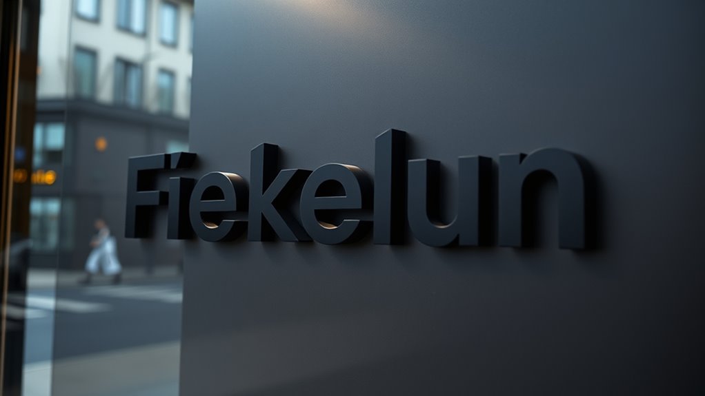
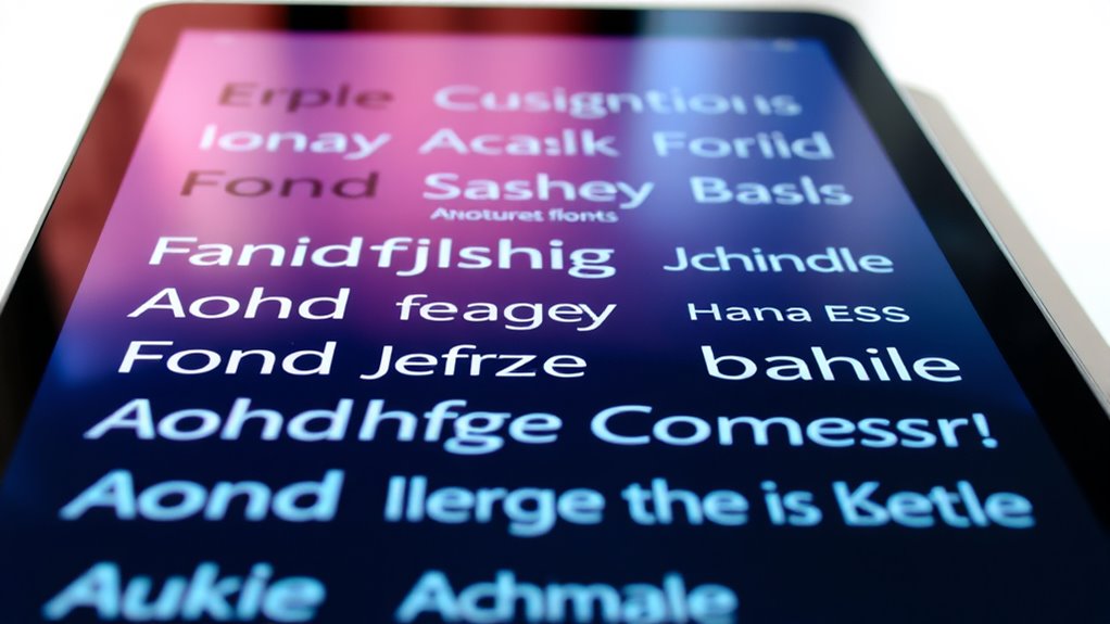
Noticing the evolving trends in expressive typography for 2025 reveals innovative techniques that will redefine visual storytelling and audience engagement.
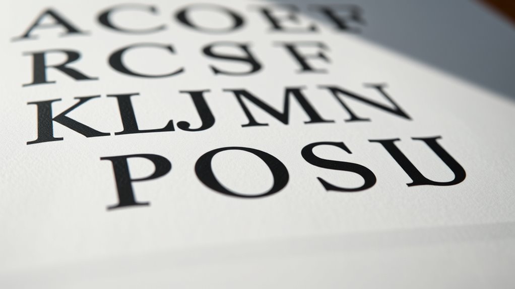
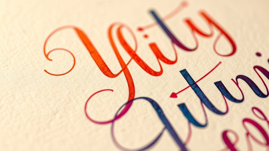
Getting started with hand lettering and custom type design unlocks creative potential—discover how traditional techniques and modern tools can elevate your work.