The overlooked rule behind better emotional design is mastering visual harmony. You might focus on colors, typography, and layout, but without aligning these elements thoughtfully, your audience can feel confusion or disconnection. When visuals work together smoothly, you create a genuine emotional bond that increases trust and comfort. Understanding your audience’s expectations and aligning visuals with your brand values make a big difference. Keep exploring how perfect harmony can elevate your design’s emotional impact.
Key Takeaways
- Consistently aligning visual elements with user expectations enhances emotional connection and trust.
- Deep understanding of target audience’s emotional triggers ensures visuals evoke the intended feelings.
- Maintaining visual harmony across all design components prevents confusion and fosters comfort.
- Prioritizing emotional resonance over purely aesthetic choices creates more meaningful user experiences.
- Recognizing the importance of brand-aligned visuals deepens emotional engagement and loyalty.

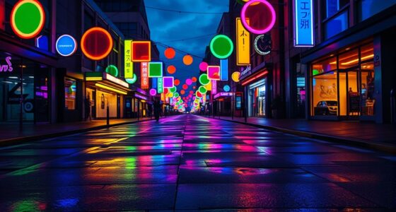
Have you ever wondered what truly makes an emotional design resonate with users? It’s more than just appealing visuals or clever interface elements. At its core, emotional design hinges on creating a connection—an experience that feels genuine and meaningful. This is where understanding the overlooked rule becomes essential: the importance of aligning user experience with visual harmony. When these elements work together seamlessly, users don’t just navigate your product—they feel invested in it.
Think about your own interactions with digital products. When you land on a website or open an app that immediately feels welcoming and intuitive, it’s because the visual harmony has been carefully crafted to evoke trust and comfort. The colors, typography, imagery, and layout aren’t random; they’re intentionally chosen to communicate a specific mood or message. This alignment influences how you perceive the overall experience, making it easier to connect emotionally. If the visuals are chaotic or inconsistent, even a well-designed feature can feel disconnected or confusing, diminishing the emotional impact.
Creating this harmony requires more than aesthetic choices. It demands a deep understanding of your target audience’s expectations and emotional triggers. For example, soft pastel tones might evoke calmness in a wellness app, while bold, vibrant colors could energize users of a fitness platform. When the visual elements complement the user experience, they reinforce each other, guiding users through their journey smoothly and with a sense of purpose. This synergy reduces cognitive load, making your product easier to understand and more pleasant to use. Additionally, consistent use of visual elements can help establish brand recognition and trust over time.
You should also pay attention to how these visual cues influence user emotions. Subtle details, like rounded corners or gentle shadows, can make interfaces feel more approachable. Clear visual hierarchy directs attention, helping users find what they need without frustration. When the visual harmony is disrupted—say, with mismatched fonts or clashing colors—it can evoke negative feelings, such as confusion or annoyance, which hinder emotional engagement. Incorporating visual consistency can significantly enhance user trust and overall satisfaction. Furthermore, ensuring that visual elements adhere to design principles rooted in understanding user behavior supports creating emotionally resonant experiences. Recognizing how visual harmony impacts emotional responses can guide designers to craft more engaging interfaces.
Furthermore, aligning visual elements with the overarching message of your brand or mission can deepen users’ emotional connection, especially when the brand’s purpose aligns with values like sustainability or impact, as emphasized in climate/impact investing. This connection can foster loyalty and a sense of shared purpose, making users more likely to engage positively with your product or service.
Ultimately, the overlooked rule behind better emotional design is that user experience and visual harmony must work hand in hand. When you prioritize this alignment, your designs don’t just function—they connect. Users don’t just click; they feel understood and valued. This emotional resonance turns casual users into loyal advocates, proving that the key to impactful design isn’t just in what you create, but how well every element complements the whole.

The Emotional Palette – Color and Feeling in Art
As an affiliate, we earn on qualifying purchases.
As an affiliate, we earn on qualifying purchases.
Frequently Asked Questions
How Does Emotional Design Influence User Trust?
Emotional design considerably boosts user trust by fostering user empathy and creating an aesthetic appeal. When you design with empathy, you show users you understand their needs, making interactions feel personal and trustworthy. An aesthetically appealing interface captures attention and evokes positive feelings, encouraging users to feel more comfortable and confident. Ultimately, emotional design builds a stronger emotional connection, making users more likely to trust and stay loyal to your product or service.
Can Emotional Design Improve Product Longevity?
Think of your product as a loyal companion—emotional design can make it last. Yes, it improves product longevity by fostering a strong bond. You achieve this through aesthetic consistency, which creates familiarity, and personalization strategies that make users feel valued. When users connect emotionally, they’re more likely to stick with your product over time, turning fleeting interest into lasting loyalty. Emotional design isn’t just about looks; it’s about building enduring relationships.
What Role Does Cultural Context Play in Emotional Design?
Cultural context shapes emotional design by influencing how cultural nuances and emotional symbolism are perceived. You need to take into account these factors because what evokes positive feelings in one culture might not in another. When designing, you actively incorporate cultural insights to ensure your product resonates universally. This approach helps create stronger emotional connections, making users feel understood and valued across diverse cultural backgrounds.
How to Measure Emotional Response Effectively?
Think of measuring emotional responses like catching whispers from your audience. Use feedback mechanisms such as surveys, interviews, and behavioral observations alongside physiological metrics like heart rate and skin conductance. These tools help you gauge genuine feelings, revealing what truly resonates. Combining subjective feedback with objective data creates a clear picture of emotional impact, guiding you to refine your design for deeper, more authentic emotional connections.
Are There Common Pitfalls in Emotional Design?
Yes, common pitfalls in emotional design include neglecting color psychology and failing to prioritize user empathy. You might choose colors that evoke unintended feelings or overlook the emotional needs of your users, leading to disconnect and frustration. To avoid this, you should deeply understand your audience’s emotional responses and craft designs that resonate emotionally. Focusing on these aspects helps create more engaging, empathetic experiences that foster positive emotional connections.

AMERICAN LUXURY GIFTS Consistency Is Key Modern Minimalist Typography Wall Decor – Office Gym Living Room Inspirational Art – 10×8 Unframed Print
Inspiring Daily Motivation: Elevate your space with this "Consistency Is Key" minimalist typography wall art, designed to boost…
As an affiliate, we earn on qualifying purchases.
As an affiliate, we earn on qualifying purchases.
Conclusion
You might think that great emotional design is about fancy visuals or clever interactions, but it’s the overlooked rule—simplicity—that truly transforms your experience. Just like a quiet moment in a bustling city calms your mind, simplicity in design creates clarity amid chaos. When you strip away the unnecessary, you invite genuine connection and trust. So, remember: sometimes, less truly is more, and simplicity is the secret to emotionally resonant design that sticks with your users long after they’ve left.

Mcbazel 3 Pieces Artist Color Mixing Guides Wheel, Paint Mixing Learning Art Teaching Tool & Theory Chart for Painting, Makeup, Tattoo Design – Large & Pocket Sizes for Studio & Class (3 Sizes)
Master Color Theory Visually – This dual-sided artist color wheel makes understanding color theory effortless. The front is…
As an affiliate, we earn on qualifying purchases.
As an affiliate, we earn on qualifying purchases.

Brand Kit Starter: Build a Visual Identity That Books Clients: A Complete Guide to Creating a Professional Brand That Converts
As an affiliate, we earn on qualifying purchases.
As an affiliate, we earn on qualifying purchases.