
The quickest way to weaken your editorial layout is neglecting consistent spacing, alignment, and typography. When you ignore these fundamental elements, your design can look disorganized and unprofessional, causing confusion or distraction for your audience. Small inconsistencies in margins, font choices, or image placement might seem minor but quickly diminish visual harmony and credibility. To keep your layout sharp and engaging, paying close attention to these details is essential—there’s more to learn if you keep exploring.
Key Takeaways
- Ignoring consistent spacing and alignment creates a disorganized and unprofessional appearance.
- Using inconsistent typography causes visual confusion and disrupts flow.
- Misaligned or unevenly placed images break visual harmony and distract readers.
- Overlooking small details and inconsistencies accumulates, weakening overall layout quality.
- Poor content organization and neglecting quality control undermine clarity and design coherence.

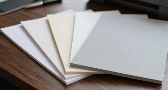
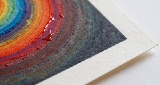
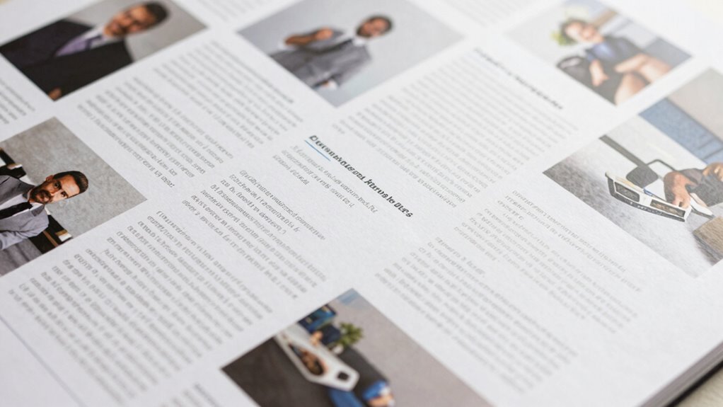
A common mistake that quickly weakens editorial layouts is neglecting consistent spacing and alignment. When you overlook these fundamental elements, your design starts to look disorganized and unprofessional, distracting readers from the content itself. One of the key factors that influence a polished layout is typography consistency. If your fonts vary in size, style, or weight without a clear purpose, your page becomes visually confusing. Consistent typography creates a harmonious flow, guiding the reader effortlessly through your articles. It establishes a visual rhythm that makes the content more accessible and engaging. Always choose a limited set of typefaces and stick to them throughout your layout. Use consistent line spacing and paragraph styles to avoid a chaotic appearance. When fonts clash or change arbitrarily, it diminishes the layout’s credibility and hampers readability. Additionally, paying attention to typography consistency helps reinforce your overall design’s professionalism. Proper spacing between elements like headings, paragraphs, and images also plays a vital role in enhancing readability and aesthetic appeal. A well-structured layout ensures that each element has enough room to breathe, preventing clutter and confusion. Equally important is image alignment. Misaligned images can break the visual harmony of your editorial, making the entire layout appear unbalanced. It’s imperative that images align precisely with your text blocks, whether you’re using left, right, or center alignment. Consistent image placement not only improves aesthetics but also helps convey your message clearly. When images are uneven or improperly aligned, they draw unnecessary attention and can disrupt the reader’s flow. Pay attention to margins, padding, and baseline alignment to maintain a clean, structured look. If you’re working with multiple images, ensure they follow a uniform style or grid system. This creates a sense of order and professionalism, reinforcing your overall design. Small inconsistencies in visual harmony can undermine the overall impact of your layout. Neglecting these details—typography consistency and image alignment—may seem minor at first, but they have a significant impact on your editorial’s effectiveness. Small inconsistencies can quickly add up, making your layout appear cluttered and poorly curated. When you focus on maintaining a cohesive typographic style and precise image placement, your layout will look more intentional and refined. It signals to your audience that you pay attention to detail, increasing their trust and engagement. Properly managing content organization and visual elements ensures your message is communicated clearly and professionally. Incorporating quality control during the design process can help identify and correct these small issues before publication. Ultimately, these small but essential elements serve as the backbone of a strong editorial design. By giving them proper attention, you guarantee your layout communicates clearly, looks professional, and holds the reader’s interest from start to finish.

Point 2 Point Mk2 Equidistant Measuring, Marking, Layout Tool – With Center Point Finder
EQUAL SPACING LAYOUT: Instantly divides a run into equal spacings for screws, nails, hooks, dowels, pins and fixings,…
As an affiliate, we earn on qualifying purchases.
As an affiliate, we earn on qualifying purchases.
Frequently Asked Questions
How Does Color Choice Impact Layout Durability?
Color choice considerably impacts layout durability by influencing readability and visual harmony. You should use color psychology to select hues that evoke the right emotions and reinforce your message, ensuring your layout remains engaging over time. Additionally, optimize contrast to make text and images stand out clearly, preventing visual fatigue. Proper contrast and thoughtful color selection help your layout stay attractive and functional, reducing the risk of it appearing outdated or cluttered quickly.
What Tools Are Best for Testing Layout Strength?
You should use tools like Adobe InDesign or Sketch to test your layout strength, focusing on typography consistency and grid alignment. These tools allow you to check if your fonts are uniform and your grid is properly aligned, preventing layout issues. Additionally, using grid overlays and style checkers helps identify inconsistencies early, ensuring your editorial layout remains strong and visually appealing throughout the design process.
How Often Should Layouts Be Re-Evaluated?
You should re-evaluate your layouts with the changing seasons of content and user feedback, ideally every few months. Think of layout consistency and visual hierarchy as a garden needing regular tending—shaping and pruning keep it vibrant. By revisiting your designs often, you catch imbalance early, ensuring your editorial remains engaging and clear. This rhythm keeps your layout fresh, aligned, and powerful, preventing it from wilting under neglect.
Can User Feedback Improve Layout Longevity?
Yes, user feedback can definitely improve layout longevity. By analyzing user engagement data and feedback, you identify what works and what doesn’t, allowing you to make targeted adjustments. Regular feedback analysis keeps your layout aligned with user preferences, ensuring it remains effective and engaging over time. This proactive approach helps avoid rapid decline in usability, making your editorial design more resilient and adaptable to evolving audience needs.
What Are Common Signs of a Weak Editorial Layout?
You notice your magazine’s headlines look inconsistent and images seem off-center—that’s a sign of a weak editorial layout. Poor typography consistency and misaligned images can make your pages feel chaotic and unprofessional. If readers struggle to follow the flow or your design feels disjointed, it’s time to revisit your layout. These signs indicate your design isn’t supporting your content, risking audience disengagement.

Graphic Art of Tattoo Lettering: A Visual Guide to Contemporary Styles and Designs
As an affiliate, we earn on qualifying purchases.
As an affiliate, we earn on qualifying purchases.
Conclusion
Think of your editorial layout as a well-tended garden. When you ignore the weeds—those small, overlooked mistakes—your vibrant design can quickly become overrun and lose its charm. Stay vigilant, prune away inconsistencies, and nurture your layout with intention. Otherwise, unchecked errors will spread like weeds, choking the beauty from your work. Keep your garden neat, and your editorial landscape will flourish, enthralling every reader who steps into it.
Vowlove T-Shirt Ruler for Precise Alignment, Center & Left Chest Placement Tool for Shirt Making, Compatible with Cricut, Heat Press, HTV, Vinyl, DTF, Sublimation
Game Changer For Shirt Making: Make placing your HTV and sublimation easier & more consistent. Simply line it…
As an affiliate, we earn on qualifying purchases.
As an affiliate, we earn on qualifying purchases.

2 x Grid Type Lettersize 'Freehand Designer' Sheets.
Enables drawing of horizontal and vertical straight lines freehand
As an affiliate, we earn on qualifying purchases.
As an affiliate, we earn on qualifying purchases.