By approaching typography as illustration, you can craft expressive lettering that conveys mood, meaning, and emotion beyond just words. Manipulating letterforms—like exaggerating strokes or adjusting anatomy—helps turn typography into a visual story. Using shape, style, and space, you create symbols and motifs that deepen your message. This approach transforms your designs into memorable, impactful visuals. Keep exploring these techniques, and you’ll discover even more ways to make your typography truly expressive.
Key Takeaways
- Treat letterforms as visual symbols to convey mood, emotion, and storytelling beyond mere text.
- Manipulate structural elements like strokes and serifs to create expressive, illustrative typography.
- Use shape, style, and composition to embed symbolism, reinforcing the message visually.
- Integrate visual motifs and negative space within letters to add depth and iconography.
- Approach typography as an art form that combines readability with emotive, memorable illustration.

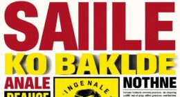
Typography isn’t just about choosing the right font; it can also serve as a powerful form of visual storytelling. When you approach typography as an illustration, you’re tapping into the expressive potential of letterforms to convey mood, meaning, and emotion beyond mere words. Understanding letterform anatomy becomes essential here, as it allows you to manipulate each element—strokes, counters, serifs, and ascenders—to craft a visual narrative that resonates with viewers. By emphasizing certain features or exaggerating specific parts of a letter, you can turn a simple character into a symbol that communicates more than its literal sound. For instance, a thick, bold stroke might evoke strength or stability, while delicate, flowing lines can suggest elegance or fragility. These subtle choices contribute to the overall message you aim to portray.
In this context, typographic symbolism plays a crucial role. Every shape and style you select carries inherent meaning and associations, which you can use intentionally to reinforce your message. For example, rounded, friendly letterforms often symbolize approachability and warmth, whereas sharp, angular designs might evoke tension or urgency. By combining different typographic elements, you create a visual language that enhances storytelling without needing additional imagery. You’re basically designing a visual vocabulary where each letter or style acts as a symbol, adding layers of meaning to your work.
When you think of typography as illustration, you’re also considering how letterforms interact with space and composition. The arrangement, size, and hierarchy of your letters influence how your message is perceived. You might stretch or compress characters to emphasize particular ideas, or incorporate visual motifs within the letterforms themselves to add depth. For example, integrating illustrative details into the negative space of a letter can transform it into a pictogram or icon, blurring the line between text and image. This approach invites viewers to interpret the typography on multiple levels, engaging their imagination and emotional response. Additionally, understanding typographic hierarchy helps in guiding viewers through the visual story effectively.
Ultimately, viewing typography through an illustrative lens empowers you to craft designs that are not only informative but also evocative and memorable. It’s about more than readability; it’s about storytelling through visual cues, symbolism, and creative manipulation of letterforms. When you master the nuances of letterform anatomy and typographic symbolism, you release a versatile toolkit for expressive, illustrative typography that captivates and communicates with impact.
Top picks for "typography illustration expressive"
Open Amazon search results for this keyword.
As an affiliate, we earn on qualifying purchases.
Frequently Asked Questions
How Does Typography Influence Emotional Response in Design?
Typography shapes the emotional response in design by creating a strong visual impact and fostering emotional resonance. When you choose expressive lettering, you evoke feelings such as urgency, joy, or nostalgia, guiding viewers’ perceptions. The style, size, and arrangement of type influence how your message is received, making your design more memorable and emotionally compelling. So, your typography choices directly connect with your audience’s feelings, enhancing overall communication.
What Tools Are Best for Creating Expressive Lettering?
You should use hand lettering and digital brushes to create expressive lettering effectively. Hand lettering allows you to add personal flair and unique character, while digital brushes give you flexibility and precision. Tools like Adobe Illustrator, Procreate, and Photoshop offer a variety of brushes that mimic traditional media, making it easier to craft dynamic, expressive styles. Combining these methods helps you bring emotion and personality into your lettering designs seamlessly.
Can Typography as Illustration Enhance Brand Storytelling?
Yes, typography as art can substantially enhance your brand storytelling by adding visual depth and emotional impact. When you use expressive lettering, you showcase font personality, making your message more memorable and engaging. This approach allows you to convey your brand’s tone and values creatively, capturing your audience’s attention. By integrating typography as illustration, you create a compelling narrative that resonates, strengthening your overall brand identity.
How Do Cultural Differences Affect Typographic Expression?
You should consider how cultural symbolism influences typographic expression, as it shapes the meaning and emotional impact of your design. Regional aesthetics often dictate font styles, colors, and layouts, making your work resonate more deeply with local audiences. When you adapt typography to reflect cultural nuances, you create a more authentic and engaging visual story, ensuring your message aligns with the audience’s cultural context and enhances overall communication.
What Are Common Pitfalls in Expressive Lettering Design?
You should watch out for common pitfalls in expressive lettering design, like neglecting readability or overusing stylistic elements, which can lead to expressive mistakes. Avoid cluttering your lettering with too many decorative details, as it distracts from the message. It’s easy to fall into lettering pitfalls like inconsistent spacing or exaggerated forms that hinder clarity. Keep your design balanced, purposeful, and always prioritize legibility to guarantee your expressive work communicates effectively.
Conclusion
As you explore typography as illustration, you realize it’s more than just words—it’s a visual journey that whispers stories through expressive strokes. Each letter holds secrets waiting to be uncovered, inviting you to see beyond the surface. The boundaries between text and image blur, hinting at endless possibilities. Now, imagine what you could create if you let your imagination run wild—what stories will your typography tell next? The future of expressive lettering is in your hands.