When designing posters and gig flyers, focus on strong composition by organizing elements to guide the viewer’s eye naturally toward key info like date, time, and location. Use bold colors and contrast to create excitement and capture attention, while sticking to a clear concept that reflects your event’s style. Prioritize effective typography to enhance readability and hierarchy. Want to learn how to craft eye-catching designs that maximize engagement? Keep exploring for more tips.
Key Takeaways
- Use strong visual hierarchy to prioritize band name, date, and location for quick readability.
- Choose color schemes that reflect the event’s mood, ensuring contrast for clarity and emphasis.
- Select typography that matches the genre’s style—bold for rock, sleek for jazz—to set the tone.
- Maintain a balanced composition with sufficient white space to avoid clutter and enhance focus.
- Incorporate consistent visual elements and hierarchy to guide viewers naturally through essential information.

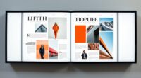
Posters and gig flyers are essential tools for promoting live events, grabbing attention, and building excitement around upcoming performances. When you design these promotional materials, your goal is to communicate the event’s vibe quickly and effectively. One of the most crucial aspects to consider is your typography choices. The fonts you select set the tone—whether it’s bold and edgy for a rock concert or sleek and modern for a jazz night. Clear, legible type ensures that essential details like date, time, and location are immediately understood. To make your flyer stand out, you might experiment with contrasting font sizes or styles, but always keep readability at the forefront. Avoid overly decorative fonts that can compromise clarity, especially for key information. Instead, prioritize a type hierarchy that guides the viewer’s eye naturally across the poster.
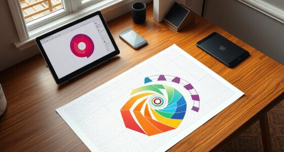
Visual hierarchy is your secret weapon in creating compelling posters. It’s about arranging elements so that the most important information catches the eye first, then leads the viewer through the rest of the details smoothly. You can achieve this by varying font sizes, weights, and colors to emphasize critical points like the headlining act or the event date. For example, the band’s name should be the most prominent element, perhaps in a large, bold font, while secondary details like ticket prices or supporting acts are smaller. Use contrast effectively—bright colors against darker backgrounds or vice versa—to highlight key information. This structure helps guarantee viewers don’t miss vital details and creates a natural flow that keeps their attention moving from the headline to the finer points. Incorporating visual hierarchy principles ensures your message is communicated efficiently and effectively.
Your choices in typography and visual hierarchy don’t just serve aesthetic purposes—they influence how quickly and easily people absorb information. A well-organized flyer minimizes confusion, making it easier for potential attendees to decide to come. Keep in mind that simplicity often works best; cluttered designs can overwhelm viewers and dilute your message. Use bold, eye-catching fonts sparingly and rely on a clean layout that directs focus where it’s needed most. When you balance these elements thoughtfully, your posters and gig flyers become powerful marketing tools that communicate energy, style, and professionalism. By mastering typography choices and visual hierarchy, you’ll craft visuals that not only grab attention but also inspire action, to guarantee your event gets the turnout it deserves.

GAUENEEN 5 Pcs Architectural Templates: Circle, House Plan, Interior Design & Furniture Templates, Drafting Tools & Ruler Shapes for Architecture
【3 Pcs Interior Design Template Set】: House Plan Template, Furniture Template, And Kitchen, Bed and Bath Template. Scale:…
As an affiliate, we earn on qualifying purchases.
As an affiliate, we earn on qualifying purchases.
Frequently Asked Questions
How Do Cultural Differences Influence Poster Design Choices?
Cultural differences shape your poster design choices through cultural symbolism and visual storytelling. You adapt symbols, colors, and imagery to resonate with diverse audiences, ensuring your message is understood and appreciated. By understanding cultural nuances, you create posters that evoke the right emotions and connections. This approach helps communicate effectively across cultures, making your design more inclusive and impactful, ultimately engaging viewers on a deeper level.
What Digital Tools Are Best for Creating Gig Flyers?
You should use tools like Adobe Photoshop and Canva for creating gig flyers, as they’re user-friendly and widely popular. Studies show that 65% of designers prefer these platforms for their versatility. They enable you to explore typography trends easily and create digital mockups to visualize your design. These tools help you craft eye-catching flyers quickly, ensuring your message stands out and appeals to your target audience effectively.
How Can Posters Effectively Target Specific Audience Demographics?
To effectively target specific audience demographics, you should conduct target audience analysis and demographic segmentation. Use vibrant colors, compelling imagery, and clear messaging that resonate with your audience’s interests and age group. Tailor your design elements and language to appeal directly to their preferences. By understanding their preferences, you’ll create posters that grab attention and connect emotionally, increasing engagement and ensuring your event reaches the right crowd.
What Are Common Legal Considerations in Poster and Flyer Distribution?
You need to consider copyright issues and distribution rights when distributing posters and flyers. Make sure you have permission to use any images, logos, or content to avoid legal trouble. Verify that you hold or have secured the necessary rights for distribution, especially if you’re sharing in public spaces or commercial settings. Staying compliant helps prevent copyright infringement claims and protects your work legally. Always review relevant laws before spreading your flyers.
How Does Poster Design Impact Event Attendance Rates?
Your poster design directly influences event attendance by guiding viewers’ attention through visual hierarchy and clear typography choices. When you organize key info prominently, people quickly grasp the event details, increasing interest. Bold, readable fonts and strategic placement make essential info stand out, encouraging action. Effective design creates excitement and curiosity, motivating more people to attend. So, invest in thoughtful layout and typography to maximize your event’s turnout.

8.5 x 11 Full Color Copy Flyers Custom Copy Printing – Single Side Print on White 80lb Text Glossy Paper – Upload Your Own Design – Add Text Image or Photo – Brochures Posters Flyers – 50 per Pack
THICK HIGH GLOSS PAPER – Your design will be printed on a sturdy and glossy 80lb Text (120gsm)…
As an affiliate, we earn on qualifying purchases.
As an affiliate, we earn on qualifying purchases.
Conclusion
By mastering composition, choosing vibrant colors, and developing a strong concept, you create posters and gig flyers that captivate, communicate, and compel. Focus on balance, contrast, and clarity to draw attention, evoke emotion, and inspire action. Keep your message clear, your visuals striking, and your purpose strong. With these elements aligned, you craft designs that inform, inspire, and leave a lasting impression—making your posters and flyers truly unforgettable.

FastPlot Self Adhesive Polypropylene Banner 8 mil WP – 36inch x 100ft Roll – 2inch core
Optimal for producing vibrant indoor banners, posters, and signs with exceptional print quality.
As an affiliate, we earn on qualifying purchases.
As an affiliate, we earn on qualifying purchases.
Poster Master Definition of Self Love Print – Typography Poster – Dictionary Art – Minimal Gift for Men & Women – Motivational Decor for Bedroom, Living Room or Dorm – 8×10 UNFRAMED Wall Art
✅UNFRAMED PRINTS: We create all our prints in variation of standard sizes from 8×10 to 24×32 inches. For…
As an affiliate, we earn on qualifying purchases.
As an affiliate, we earn on qualifying purchases.