To create effective editorial layouts, focus on combining strategic visual organization with clear typography hierarchy and cohesive color schemes. Use visual cues to guide the eye naturally, highlighting key sections with size, weight, and contrasting colors. Organize content for easy scanning, emphasizing readability and aesthetic appeal. When you apply these modern principles, your magazine becomes engaging, professional, and user-friendly. Keep exploring these design ideas to see how they transform your layouts into striking, effective publications.
Key Takeaways
- Utilize visual hierarchy with typography and color to guide reader attention and organize content effectively.
- Apply strategic color schemes to create mood, highlight sections, and reinforce brand identity.
- Balance aesthetics and functionality by combining font styles, sizes, and colors for clear visual flow.
- Design layouts that facilitate easy scanning and quick absorption of information.
- Ensure a cohesive, professional appearance through consistent visual organization principles.
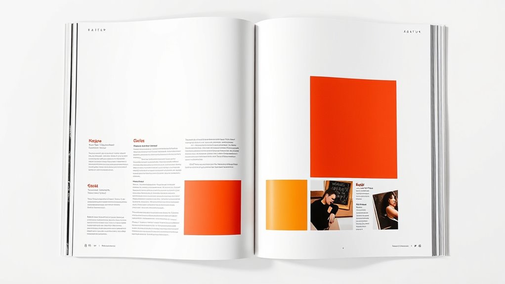
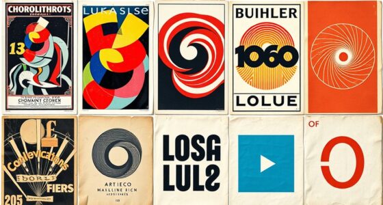
Have you ever wondered how a magazine or newspaper grabs your attention instantly? It’s not just about eye-catching images but also how the content is organized visually. That’s where effective editorial layouts come into play, and understanding the principles behind them can transform your approach to design. One key element is typography hierarchy, which guides your eye through the page effortlessly. You naturally focus on headlines first, then subheadings, and finally the body text. When you use varied font sizes, weights, and styles strategically, you create a clear visual path that makes reading intuitive. For example, a bold, large headline immediately signals importance, while smaller, lighter fonts help differentiate secondary information. This hierarchy prevents your layout from feeling cluttered and ensures your audience quickly grasps the main ideas without confusion.
Color schemes also play a crucial role in modern magazine design. They aren’t just about making the page look pretty—they influence mood, emphasize key sections, and improve readability. When you select a cohesive color palette, you create harmony across your layout, making it more inviting and easier to navigate. Bright, vibrant colors can grab attention and energize the reader, while muted tones foster a sense of calm and sophistication. Using contrasting colors strategically, especially for text and background, enhances legibility and draws focus to important elements like call-to-action buttons or feature stories. Consistent color schemes also reinforce your brand identity, making your publication instantly recognizable to your audience. A well-thought-out palette ensures that the visual experience feels unified and professional, rather than disjointed or chaotic.
Combining typography hierarchy with deliberate color schemes allows you to craft layouts that are both engaging and functional. When headlines pop due to size and color contrast, and supporting text follows a clear visual order, your readers won’t struggle to find what interests them. Instead, they’ll be guided smoothly from one section to the next, absorbing content without feeling overwhelmed. Modern magazine design isn’t just about aesthetics; it’s about usability and clarity. You want your audience to enjoy the reading experience, and that begins with understanding how to effectively organize your content visually. By mastering typography hierarchy and color schemes, you set the foundation for layouts that are not only eye-catching but also easy to read and navigate, ensuring your message hits home every time. Additionally, understanding the importance of content organization can significantly enhance the overall effectiveness of your layouts.

Layout Workbook: A Real-World Guide to Building Pages in Graphic Design
As an affiliate, we earn on qualifying purchases.
As an affiliate, we earn on qualifying purchases.
Frequently Asked Questions
How Do I Choose the Right Typography for My Magazine?
To choose the right typography, start by considering your magazine’s tone and audience. Use font pairing techniques to combine complementary typefaces that create visual interest. Focus on establishing a clear typographic hierarchy, making headings, subheadings, and body text easy to distinguish. Test various fonts to see how they work together, ensuring readability and consistency throughout your layout. This approach helps craft a cohesive, engaging magazine design.
What Are the Latest Trends in Editorial Layout Design?
You’ll notice that 68% of readers spend only seconds on a page, so modern trends focus on strong visual hierarchy and bold color schemes to grab attention immediately. You should use contrasting colors to guide the eye and create focal points, while maintaining clarity and flow. Incorporating whitespace and innovative grid layouts also help improve readability, ensuring your magazine stays engaging and visually appealing in today’s fast-paced digital world.
How Can I Improve Readability in Complex Layouts?
To improve readability in complex layouts, focus on maintaining grid consistency so elements stay organized and predictable. Use strong color contrast between text and backgrounds to make content easier to read. Break up large blocks of text with headings, subheadings, and white space, guiding your reader’s eye naturally. Keep your design balanced and avoid clutter, ensuring your audience quickly grasps the main message without feeling overwhelmed.
What Software Tools Are Best for Creating Magazine Layouts?
Think of creating magazine layouts like building with blocks—you need the right tools. Adobe InDesign is premier for print templates and mastering grid systems, offering precise control. Canva also works for simpler projects with its user-friendly interface. I once designed a magazine using InDesign, and its flexibility made complex layouts manageable. These tools help you craft professional, cohesive designs that captivate readers and make your content stand out.
How Do I Balance Visuals and Text Effectively?
To balance visuals and text effectively, you should use white space strategically to prevent clutter and highlight key elements. Place images thoughtfully, ensuring they complement the text without overpowering it. Use a consistent grid and spacing to create harmony, and leave enough white space around images and text blocks. This approach makes your layout clean, engaging, and easy to read, guiding readers smoothly through your content.

The Font Menu: A Pragmatic Guide to Font Pairings
As an affiliate, we earn on qualifying purchases.
As an affiliate, we earn on qualifying purchases.
Conclusion
By applying these modern magazine design principles, you’ll craft layouts as engaging as a lively conversation. Remember, a well-organized page guides your reader effortlessly, making your message clear and memorable. Think of your layout as a map that leads your audience through your story, keeping them captivated at every turn. With creativity and strategic planning, you can transform ordinary pages into visual journeys that leave a lasting impression.

Jelly Roll Jazz: 9 Jelly Roll Quilt Projects (Landauer) Complete How-To, Illustrations, Patterns, Templates, and Full-Color Assembly Diagrams for 9 Beautiful Quilts Made with Quick & Easy Pre-Cuts
As an affiliate, we earn on qualifying purchases.
As an affiliate, we earn on qualifying purchases.
ALVIN, TD1150, Home Planning and Layout Template, Drawing and Drafting Tool for Artists, Architects, Design and Drafting
BUILDERS TEMPLATE – Architect and Builders architecture drawing template contains drawing symbols for circles, rectangles, lavatory and kitchen…
As an affiliate, we earn on qualifying purchases.
As an affiliate, we earn on qualifying purchases.