Great teams understand that visualizing uncertainty turns vague doubts into clear insights, helping you make smarter decisions and collaborate more effectively. You recognize that visual tools like charts and diagrams highlight potential risks and outcomes, making complex data easier to interpret. By doing so, you reduce misunderstandings and improve risk assessment. This approach fosters shared understanding and proactive planning. Keep exploring, and you’ll discover how mastering this skill can transform your team’s strategy and outcomes.
Key Takeaways
- Great teams recognize that visualizing uncertainty clarifies risks, enabling proactive decision-making and resource allocation.
- They understand that effective visualization reduces misinterpretation and fosters shared understanding among stakeholders.
- They leverage appropriate design techniques, like probability distributions, to make complex data intuitive and impactful.
- They see uncertainty visualization as a strategic tool to navigate complexity and improve risk assessment.
- They prioritize clarity and cognitive considerations to enhance team communication and confidence in decisions.

Have you ever wondered how teams can better navigate the unknowns in their projects? The answer often lies in their ability to visualize uncertainty. When you focus on visualizing uncertainty, you create a clearer picture of potential risks and outcomes, enabling your team to assess risks more effectively. This process of risk assessment isn’t about eliminating all doubts but about understanding them deeply enough to make informed decisions. By mapping out what’s uncertain, you gain decision clarity, which is essential when stakes are high or when you’re dealing with complex problems.
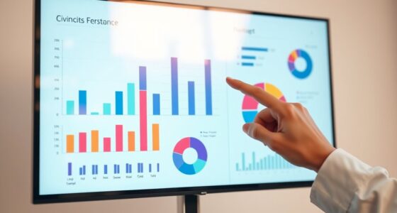
Visualizing uncertainty helps your team see where the biggest vulnerabilities lie. Instead of making assumptions based on guesswork, you can use data, charts, or diagrams that highlight the range of possible outcomes. For example, creating scenario maps or probability distributions offers a visual representation of risks, making abstract doubts more tangible. When everyone on the team understands the scope of uncertainty, it’s easier to prioritize tasks, allocate resources, and develop contingency plans. This shared understanding fosters better decision making because it reduces the cognitive load and prevents surprises later on.
Visualizing risks clarifies vulnerabilities, helping teams prioritize, allocate resources, and develop effective contingency plans.
Moreover, visualizing uncertainty encourages open conversations about risks. When risks are clearly mapped out, team members feel more confident discussing concerns and proposing solutions. It shifts the mindset from reactive problem-solving to proactive planning. You’ll find that decision clarity improves because everyone has a common reference point. Instead of debating based on assumptions or incomplete information, your team can analyze the visualized data and reach consensus faster. This clarity minimizes confusion and helps prevent costly missteps. Additionally, incorporating visualization techniques can further improve how effectively your team interprets complex data and communicates risks. Recognizing the importance of visualization design can make these models even more intuitive and impactful. Incorporating risk communication best practices ensures that visualized data is accessible and meaningful to all stakeholders.
In addition, understanding the contrast ratio of a project’s visualizations can significantly improve how effectively your team perceives and interprets the data. Furthermore, leveraging visualization best practices inspired by cognitive science can help reduce misinterpretations and improve overall understanding.
In essence, great teams understand that visualizing uncertainty isn’t just an analytical exercise; it’s a strategic tool. It transforms abstract doubts into concrete insights, sharpening risk assessment and decision clarity. By making uncertainty visible, you empower your team to navigate complexity with greater confidence and agility, ultimately increasing your chances of success.

Excelonomics: Empowering Decisions, Simplifying Success: Where Excel Meets the Science of Economics (Tools for Economics Analysis)
As an affiliate, we earn on qualifying purchases.
As an affiliate, we earn on qualifying purchases.
Frequently Asked Questions
How Does Uncertainty Visualization Impact Team Decision-Making Speed?
Uncertainty visualization speeds up decision-making because it clarifies risk perception, allowing you to see potential outcomes clearly. When you visualize uncertainties, you can identify biases that might skew judgment, leading to more rational choices. This transparency helps your team act faster and more confidently, reducing hesitation. As a result, you make informed decisions more swiftly, balancing risk awareness with bias mitigation, and ultimately improving your team’s overall effectiveness.
What Are Common Pitfalls When Visualizing Uncertainty?
You might fall into the trap of confusing statistical misconceptions with clear visuals, which can mislead your team. Overcomplicating the graph or hiding uncertainty can backfire, causing confusion instead of clarity. Beware of overly simplistic visuals that ignore important variability. Striking the right balance is essential; if you misunderstand the data’s true uncertainty, your decisions could be based on illusions, risking costly mistakes. Clarity and accuracy must go hand in hand.
How Can Teams Improve Communication Around Uncertain Data?
To improve communication around uncertain data, you should prioritize data transparency by clearly explaining the sources and limitations of your data. Use visualizations that honestly depict uncertainty, fostering trust building among your team and stakeholders. Encourage open discussions about potential risks and assumptions, ensuring everyone understands the context. This approach reduces misunderstandings, builds credibility, and helps your team make better-informed decisions despite inherent uncertainties.
Which Tools Are Best for Visualizing Uncertainty in Collaborative Settings?
To enhance data clarity and visualization accuracy in collaborative settings, you should use tools like Tableau, Power BI, or D3.js. These platforms allow you to clearly visualize uncertainty through error bars, confidence intervals, and probabilistic graphics. They enable your team to interpret data more accurately and make informed decisions. By choosing the right tools, you foster transparent communication, ensuring everyone understands the uncertainty and its implications.
How Do Team Dynamics Influence Understanding of Uncertainty Visuals?
You might think team dynamics don’t impact understanding uncertainty visuals, but they do. When trust is high, team members openly discuss cognitive biases that distort perceptions, leading to clearer comprehension. Conversely, low trust fosters skepticism, causing misinterpretations or dismissals of visual data. Recognizing how trust influences openness helps you facilitate better communication, ensuring everyone accurately interprets uncertainty visuals and makes informed decisions together.

Statistics Formula Posters 6 Pack, Probability and Statistics Reference Wall Charts, Normal Distribution, Mean Median Mode, Standard Deviation, Regression, Correlation & Data Analysis Classroom Decor, Unframed
1. Statistics Formula Posters 6 Pack This 6-pack statistics poster set covers normal distribution, measures of central tendency,…
As an affiliate, we earn on qualifying purchases.
As an affiliate, we earn on qualifying purchases.
Conclusion
By embracing uncertainty through clear visualization, you transform chaos into clarity—turning what seems like insurmountable chaos into a strategic superpower. When your team masters this, you’ll discover insights so profound, they’ll feel like wielding the very secrets of the universe. Remember, understanding and visualizing uncertainty isn’t just a skill; it’s the difference between flying blind and soaring to heights you never thought possible. Embrace it, and watch your team conquer the impossible.

Scientific Visualization: Uncertainty, Multifield, Biomedical, and Scalable Visualization (Mathematics and Visualization)
As an affiliate, we earn on qualifying purchases.
As an affiliate, we earn on qualifying purchases.

Learning to See: Value Stream Mapping to Add Value and Eliminate MUDA
As an affiliate, we earn on qualifying purchases.
As an affiliate, we earn on qualifying purchases.