To effectively communicate error and confidence, focus on clear visualization techniques like error bars, confidence ellipses, or shaded regions that highlight data uncertainty. Use proper labels, scales, and visual cues to distinguish between actual data points and their ranges of variability. Combining multiple visualization methods can also provide a fuller picture of uncertainty. By carefully designing your visuals, you’ll make the data’s true variability transparent—if you want to explore more, keep going for deeper insights.
Key Takeaways
- Use error bars, confidence intervals, and shading techniques to visually represent uncertainty and confidence levels.
- Clearly label visual elements to differentiate between data points, errors, and variability ranges.
- Employ multiple visualization methods (e.g., density plots, ellipses) to illustrate different sources of uncertainty.
- Incorporate transparent overlays and color coding to convey the degree of confidence or data certainty.
- Ensure visual simplicity and clarity to prevent ambiguity and facilitate accurate interpretation of uncertainty.

Have you ever wondered how to better understand the unknowns in data? When you’re working with real-world information, uncertainty is inevitable. To communicate this uncertainty effectively, you need to grasp the concept of probability interpretation. Probability isn’t just about numbers; it’s about what those numbers tell you regarding the likelihood of certain outcomes. For example, a high probability indicates a strong chance that a specific event will occur, while a lower probability suggests more uncertainty. Recognizing this helps you make informed decisions based on data rather than assumptions. Visualizing these probabilities allows you to see the range of possible outcomes clearly, making complex information more accessible. But there’s a challenge: visual ambiguity often clouds how you interpret these visual cues. Visual ambiguity happens when a chart or graph isn’t clear enough, leading to misinterpretation of the data’s uncertainty. A poorly designed confidence interval or error bar can be mistaken for a different measure altogether, causing confusion. To avoid this, you need to choose visualization techniques that reduce ambiguity and enhance clarity. For instance, when you display confidence intervals, ensure they’re labeled distinctly and scaled properly. This way, you can differentiate between actual data points and the range of uncertainty around them. When you use visual tools like error bars, shaded regions, or density plots, you help your audience grasp the probability interpretation behind the data. These visual cues serve as signals, indicating where the data is most and least certain. If you’re dealing with multiple sources of uncertainty, combining different visualization methods can be effective. For example, overlaying a scatter plot with confidence ellipses can give a multidimensional perspective on variability. The key is to keep the visual ambiguity minimal, so viewers aren’t left guessing about what they’re seeing. By doing this, you make the data’s uncertainty transparent, fostering trust and understanding. Remember, clear visualization isn’t just about aesthetics; it’s about communication. When you effectively reduce visual ambiguity and clearly convey probability interpretations, you help your audience see the story behind the data. This transparency allows for better decision-making and a deeper appreciation of what the data truly reveals. Ultimately, mastering these visualization principles transforms complex uncertainty into an accessible, meaningful narrative that guides informed actions. Understanding the role of contrast ratio in visual clarity can further enhance how effectively you communicate data uncertainty.
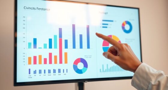
error bar graph maker
As an affiliate, we earn on qualifying purchases.
As an affiliate, we earn on qualifying purchases.
Frequently Asked Questions
How Do Cultural Differences Affect Interpretations of Uncertainty Visuals?
Cultural differences substantially influence how you interpret uncertainty visuals. Your cross-cultural perceptions shape whether you see error bars or confidence intervals as reassuring or confusing. Cultural biases may lead you to trust certain visual cues more than others, affecting your understanding of data reliability. Recognizing these differences helps you communicate uncertainty more effectively, ensuring your visuals resonate across diverse audiences and minimize misinterpretations rooted in cultural perspectives.
What Are the Ethical Considerations in Representing Uncertainty?
When representing uncertainty, you need to consider ethical factors like informed consent and bias mitigation. You should clearly communicate the limitations and potential errors to avoid misleading your audience, ensuring they understand the data’s reliability. Being transparent helps prevent bias, fostering trust and informed decision-making. Always aim for honesty and clarity, so viewers can interpret uncertainty visuals responsibly, respecting ethical standards in data representation.
How Can Uncertainty Visualization Improve Decision-Making in High-Stakes Fields?
Imagine you’re analyzing a medical diagnosis where uncertainty visualization highlights potential error margins. By clearly displaying confidence levels, you help diminish cognitive biases and improve risk perception. This guarantees decision-makers grasp the true likelihood of outcomes, enabling better choices under pressure. As a result, uncertainty visualization enhances decision-making in high-stakes fields by fostering informed, transparent, and risk-aware strategies, ultimately saving lives and resources.
Are There Effective Methods to Teach the Interpretation of Uncertainty Visuals?
You can effectively teach the interpretation of uncertainty visuals through interactive tutorials that engage learners actively. These tutorials help improve your visual literacy by guiding you to understand different visual cues, like error bars or confidence intervals. By practicing with real examples and receiving immediate feedback, you develop a clearer grasp of what the visuals indicate, making you more confident and accurate in interpreting uncertainty in high-stakes decisions.
How Does Technological Advancement Influence the Accuracy of Uncertainty Communication?
You might think technology alone guarantees better uncertainty communication, but it’s really about how you use it. Algorithm evolution and precision tools have markedly improved the accuracy of visualizations, making it easier to understand error margins. These advancements enable you to present clearer, more reliable data, fostering trust and informed decision-making. So, leveraging cutting-edge technology is essential, but your skill in applying these tools determines how effectively uncertainty is communicated.

Music Software Bundle for Recording, Editing, Beat Making & Production – DAW, VST Audio Plugins, Sounds for Mac & Windows PC
No Demos, No Subscriptions, it's All Yours for Life. Music Creator has all the tools you need to…
As an affiliate, we earn on qualifying purchases.
As an affiliate, we earn on qualifying purchases.
Conclusion
Remember, like a lighthouse guiding ships through fog, visualizing uncertainty illuminates the unknown, guiding your audience safely through complex data. Embrace transparency as your beacon, revealing both confidence and doubt. When you clearly communicate errors and confidence, you build trust—your most valuable compass. Keep in mind, the true power lies in honesty’s light, ensuring your message reaches its destination with clarity and integrity, even when the path isn’t perfectly clear.

Information Theory Tools for Visualization (AK Peters Visualization Series)
As an affiliate, we earn on qualifying purchases.
As an affiliate, we earn on qualifying purchases.
error and confidence visualization kit
As an affiliate, we earn on qualifying purchases.
As an affiliate, we earn on qualifying purchases.