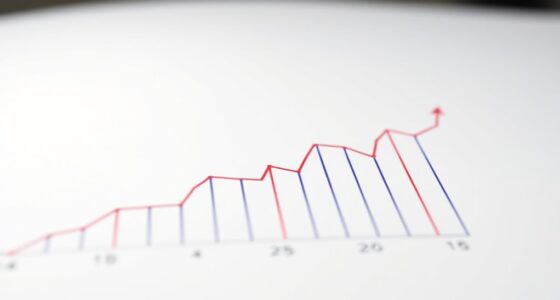

Motion in data visualization uses animation to make patterns, trends, and outliers clearer and more engaging. You can animate progressions, highlight key changes, and guide viewers smoothly through complex data. This approach helps viewers focus on critical insights and builds an intuitive understanding of the story behind the data. By adding motion, your visualizations become more memorable and accessible. Keep exploring to discover how to leverage animation effectively for more compelling data stories.
Key Takeaways
- Animation highlights changes over time, making patterns and trends more visible and understandable.
- Dynamic transitions guide viewers through complex data sequences, revealing insights step-by-step.
- Animated scatter plots and line charts expose clusters, correlations, and outliers effectively.
- Motion directs attention to key data points, emphasizing important patterns and shifts.
- Interactive animations encourage exploration, helping users discover hidden data relationships.

Motion in data visualization transforms static displays into dynamic stories that engage viewers and reveal insights more effectively. When you incorporate movement into your visualizations, you’re not just presenting data—you’re creating an interactive storytelling experience that guides your audience through complex information with clarity. This approach makes it easier for viewers to grasp patterns, trends, and outliers that might be overlooked in static charts. Dynamic dashboards leverage animation to animate transitions, highlight changes over time, and emphasize key data points, making your insights more compelling and accessible.
Using motion helps break down complex data sets into digestible sequences. Instead of overwhelming your audience with raw numbers or static graphs, you can animate different aspects of your data—such as showing how values evolve across periods or how various categories compare over time. This dynamic presentation encourages viewers to follow the story naturally, maintaining their interest and promoting better understanding. For example, animated line charts can illustrate trends more vividly than static ones, allowing viewers to see growth or decline as it unfolds. Similarly, animated scatter plots can reveal clusters or correlations dynamically, making it easier to identify relationships between variables.
Animating data reveals trends and relationships more clearly, making complex information easier to understand.
Incorporating motion into your visualizations also enhances interactive storytelling. When users can manipulate dashboards—scrubbing through time, toggling data layers, or zooming into specific segments—they become active participants in exploring the data. This interactivity keeps viewers engaged longer and helps them uncover insights independently, fostering a deeper connection with the information. Dynamic dashboards, equipped with animated transitions and real-time updates, allow for seamless storytelling that adapts to user input and evolving data streams.
Furthermore, animation can serve as a visual cue that directs attention to particular data points or changes. By smoothly transitioning between views or highlighting specific areas, you guarantee that viewers focus on what matters most at each moment. This technique enhances clarity by avoiding clutter and providing a clear narrative flow. When used thoughtfully, motion becomes a powerful tool for emphasizing key insights and making your data stories more memorable.
Additionally, understanding contrast ratio in your visualizations can improve the perceived clarity and depth of your data representations, making motion and transitions even more effective.

Learn Three.js: Program 3D animations and visualizations for the web with JavaScript and WebGL
As an affiliate, we earn on qualifying purchases.
As an affiliate, we earn on qualifying purchases.
Frequently Asked Questions
How Does Motion Impact Viewer Interpretation of Complex Data?
Motion enhances your visual perception by highlighting patterns and trends that static visuals might miss. It guides your focus smoothly across complex data, making it easier to understand relationships. However, if overused, it can increase your cognitive load, making data harder to interpret. When applied thoughtfully, motion helps you grasp intricate information quickly, turning complex data into clear, engaging insights without overwhelming your cognitive resources.
What Are the Best Practices for Avoiding Animation-Induced Confusion?
To avoid animation-induced confusion, focus on gesture clarity and timing precision. Keep animations simple and purposeful, ensuring each movement clearly emphasizes key data points. Use consistent timing so viewers can easily follow changes without feeling overwhelmed. Avoid rapid or erratic motions. Instead, slow down shifts slightly to enhance understanding, and always align gestures with the data story you want to communicate, helping viewers interpret patterns effortlessly.
Can Motion Help in Real-Time Data Analysis Effectively?
Yes, motion can effectively enhance real-time data analysis by creating interactive storytelling and fostering emotional resonance. When you incorporate animation, you make complex data more engaging, helping viewers quickly grasp patterns and changes. Motion guides attention, emphasizes key insights, and keeps your audience invested. By blending these elements, you turn raw data into a compelling narrative that inspires understanding, making your analysis more impactful and memorable.
How Do Different Animation Styles Influence User Engagement?
Different animation styles considerably influence your engagement by enhancing interactive storytelling and creating emotional resonance. Smooth, fluid animations draw you in, making complex data more approachable, while abrupt or flashy styles can distract or overwhelm. Thoughtful animations help you connect with the story, keeping you interested and emotionally involved. By choosing the right style, you turn data visualization into an engaging experience that captures your attention and deepens your understanding.
Are There Accessibility Considerations When Using Animation in Visualizations?
When using animation in visualizations, you should consider accessibility by guaranteeing screen readers can interpret the data effectively and avoiding excessive motion that may trigger motion sickness. Providing options to pause, stop, or reduce animation helps users with sensitivities. You also ensure that animations don’t hinder understanding for users relying on screen readers, making your visualizations inclusive and accessible for everyone.

Excel BI and Dashboards in 7 Days: Build interactive dashboards for powerful data visualization and insights (English Edition)
As an affiliate, we earn on qualifying purchases.
As an affiliate, we earn on qualifying purchases.
Conclusion
You see, adding motion to data visualization isn’t just about style—it’s a powerful way to reveal hidden patterns. When you animate data, you allow viewers to follow changes over time, making complex insights clearer. This supports the theory that motion enhances understanding by uncovering trends that static visuals might miss. So, by incorporating animation, you actively improve comprehension and engagement, proving that motion truly transforms how we interpret data.

Metalworker's Data Book for Home Machinists: The Essential Reference Guide for Everyone Who Works with Metal (Fox Chapel Publishing) Drill Sizes, Turning Tools, Electrical Components, Threads, & More
As an affiliate, we earn on qualifying purchases.
As an affiliate, we earn on qualifying purchases.
dynamic data visualization projector
As an affiliate, we earn on qualifying purchases.
As an affiliate, we earn on qualifying purchases.