Dashboard labels are essential tools that guide your users through complex data quickly and accurately. Clear labels, color coding, and strategic placement help users interpret information effortlessly, preventing confusion and mistakes. When you prioritize thoughtful labeling, you create a more intuitive and effective interface that enhances decision-making. Many designers overlook this, but if you pay attention to these details, you’ll build dashboards that truly communicate and serve their purpose well. Keep exploring to learn how to master this important aspect.
Key Takeaways
- Clear labels serve as essential signposts, enabling users to interpret complex data quickly and accurately.
- Proper placement and consistent color coding reduce cognitive load and improve dashboard readability.
- Labels guide users through information hierarchy, highlighting key insights and facilitating decision-making.
- Neglecting labels creates barriers to understanding, leading to confusion and misinterpretation of data.
- Thoughtful label design enhances overall usability, making dashboards more intuitive and user-friendly.
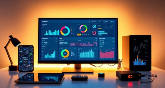
Have you ever wondered why some dashboards feel intuitive while others leave you confused? The answer often lies in the way labels are designed and implemented. Labels aren’t just tags or names—they’re vital tools that guide users through complex data landscapes. When done right, they create a seamless experience; when neglected, they become barriers that hinder understanding. This is where thoughtful label placement and strategic color coding come into play.
Color coding, for example, isn’t just about making things look attractive. It’s a powerful way to encode information visually, helping users quickly differentiate between categories, statuses, or priorities. If labels are paired with the right colors, you can instantly communicate whether a figure is in a good, warning, or critical state. But, it’s essential to use colors consistently and meaningfully. Otherwise, you risk confusing your audience or, worse, creating a misinterpretation that leads to wrong decisions. Think about red for errors or alerts, green for success, or blue for informational data—these conventions are widely understood, so applying them thoughtfully makes your dashboard more intuitive.
Label placement matters just as much. Poorly positioned labels can make a dashboard cluttered or hard to scan. When you place labels too close to other elements or in inconsistent locations, users struggle to associate data points with their descriptions. The goal is to make labels easy to find and read, which often means aligning them logically with the data they describe and maintaining uniform spacing. You should also consider the hierarchy of information—what’s most important should be most prominent, with labels that guide the eye naturally across the layout. Strategic placement reduces cognitive load, allowing users to absorb information effortlessly rather than hunting for explanations.
It’s tempting to focus solely on the data itself, but the clarity of labels can make or break the overall usability of your dashboard. Well-placed labels combined with effective color coding are like signposts—they direct your users, help them interpret data quickly, and prevent confusion. When you pay attention to these details, you turn a cluttered, confusing interface into a smooth, user-friendly experience. Remember, your goal is to communicate, not just display. Labels are your most direct link to that goal, so invest time in designing them thoughtfully. Your users will thank you when they can understand and act on the data without hesitation or frustration.
Understanding visual hierarchy is crucial for effective dashboard design, as it helps prioritize information and guides the viewer’s attention naturally.

10L0L Golf Cart Steering Wheel Stickers & Dashboard Sticker Kit for Club Car Precedent Electric (2004-2011 & 2012-up) OEM 102518001/101621601 / 103783001/101960601
Fitment: Fits for Club Car Precedent electric golf carts only. Includes stickers for 2004-2011 and 2012-up steering wheels,…
As an affiliate, we earn on qualifying purchases.
As an affiliate, we earn on qualifying purchases.
Frequently Asked Questions
How Do Labels Impact User Trust in Dashboards?
Labels impact your trust in dashboards by enhancing visual clarity, making information easier to interpret at a glance. Clear, descriptive labels boost your confidence in the data, reducing confusion and errors. When labels are precise and consistent, you feel more assured about the insights you’re using to make decisions. Good labels act as guides, reinforcing your trust in the dashboard’s accuracy and reliability, which is essential for effective data-driven actions.
What Are Common Mistakes When Labeling Dashboard Elements?
You often fall into the trap of inconsistent labels or unclear terminology, which can confuse users faster than you can say “lost in translation.” Common mistakes include using jargon, vague labels, or inconsistent terminology across elements. To avoid this, prioritize label consistency and clarity—make sure every label accurately describes its data. Clear, uniform labels foster trust, making your dashboard intuitive and easy to navigate, rather than a confusing maze.
How Can Labels Improve Dashboard Accessibility for All Users?
Labels improve dashboard accessibility by making information clear and easy to interpret for all users. You can enhance this through effective color coding, which guides users intuitively, and icon usage, which provides visual cues that transcend language barriers. Proper labels guarantee screen readers and assistive technologies work efficiently, making your dashboard more inclusive. By paying attention to these details, you create a user experience that’s accessible, intuitive, and welcoming for everyone.
Do Label Styles Influence User Decision-Making?
Yes, label styles influence your decision-making by guiding your attention through visual hierarchy and cultural nuances. Clear, consistent fonts and sizes help you quickly interpret data, while culturally aware labels prevent misunderstandings. When labels stand out appropriately, you’re more likely to trust and act on the information. Poorly styled labels can cause confusion or misinterpretation, impacting your overall experience and choices within the dashboard.
How Often Should Dashboard Labels Be Reviewed or Updated?
A stitch in time saves nine — and so does regular review of your dashboard labels. You should refresh labels based on update frequency and the need for label consistency, ideally every three to six months. This keeps your dashboard clear and effective, preventing confusion. Regular reviews ensure labels stay relevant with evolving data and user needs, making your dashboard more intuitive and user-friendly over time.

QR Code Storage Labels – 48 Color Coded Moving & Storage Box Stickers with AI Photo Inventory, Smart Home Organization & Inventory Management System, No App Required, iOS & Android Compatible
TURN ANY BOX INTO A SEARCHABLE INVENTORY SYSTEM – Stick a label, scan with your phone, and instantly…
As an affiliate, we earn on qualifying purchases.
As an affiliate, we earn on qualifying purchases.
Conclusion
Remember, dashboard labels are the compass guiding your users through data’s maze. When labels are clear and precise, they turn confusion into clarity, making your dashboard a trusted navigator. Don’t underestimate their power—these tiny labels hold the key to user confidence and decision-making. Think of them as signposts in a bustling city: well-placed and easy to read, they lead everyone exactly where they need to go. Make your labels count, and watch your dashboard truly shine.

White Vehicle Form Template Sticker,50 Pack Blank Auto Record Sample for Display or Template Use,Writable and Removable Design
Durability and Convenience: Made from high-quality aluminum foil material that resists fading, tearing, and peeling. Designed to stay…
As an affiliate, we earn on qualifying purchases.
As an affiliate, we earn on qualifying purchases.

32 Pcs Cable Labels, Write On Cord Labels Tags for Electronics, Wire Markers Electrical, Reusable Large Size Plastic Label for Charging Cords Management and Identification (8 Colors)
✅【End "Which Cord Is This?" Frustration Forever】Tired of tangled cables and afraid of pulling the wrong plug? Try…
As an affiliate, we earn on qualifying purchases.
As an affiliate, we earn on qualifying purchases.