Homepage clarity is essential because it guides visitors effortlessly to your most important messages and reduces confusion. When you use visual hierarchy effectively—through size, color, and placement—you help visitors quickly find what they need, stay engaged, and trust your site. Clear content organization and visual cues make navigation smooth and intuitive, encouraging users to explore further. If you want to discover how to optimize this process even more, keep exploring the key elements behind a well-designed homepage.
Key Takeaways
- Clear homepage design guides visitors effortlessly to key information, reducing confusion and enhancing user experience.
- Visual hierarchy directs attention efficiently, ensuring important messages are immediately noticeable.
- Simplified content and organization lower cognitive load, enabling quick understanding and decision-making.
- Effective guidance builds trust, encouraging visitors to stay longer and engage more with the site.
- Prioritizing clarity aligns with site goals, increasing conversions and achieving desired user actions.
Have you ever landed on a website and immediately felt confused about what it offers? It’s a frustrating experience that can make you leave almost instantly. That’s why homepage clarity matters more than most designers realize. When you visit a site, your eyes should naturally follow a clear visual hierarchy, guiding you effortlessly to the most important information. If the design doesn’t support this, you might struggle to find what you’re looking for or even understand the site’s purpose. Effective user guidance, embedded through thoughtful layout and design, directs visitors smoothly from one section to the next, making their journey seamless. Additionally, understanding digital concepts can help designers craft more intuitive and engaging experiences. Designers often overlook the importance of establishing a clear visual hierarchy, but it’s essential for user comprehension. Elements like size, color, contrast, and placement work together to emphasize key messages and guide your attention where it needs to go. For example, a bold headline or a brightly colored call-to-action button signals importance, so you know what to focus on first. When this hierarchy is well-defined, you don’t have to guess what’s most important; your eyes naturally follow the intended path. This clarity reduces cognitive load, making it easier for you to process information quickly and decide your next move. User guidance isn’t just about aesthetics; it’s about making the visitor’s experience intuitive. When a homepage is cluttered or poorly organized, you get overwhelmed, and that’s when confusion sets in. But when designers craft a layout with clear pathways—using whitespace, logical grouping, and visual cues—they help you navigate effortlessly. You’ll find the navigation menu, key messages, and calls to action without searching or second-guessing. This kind of guidance builds trust and encourages you to stay longer, explore more, and ultimately convert into a customer or subscriber. The importance of homepage clarity extends beyond just making a good first impression. It’s about respecting your time and intelligence. When a site’s design clearly communicates its purpose and guides you effectively, it shows a respect for your experience. You don’t need to decipher complicated layouts or hunt for information. Recognizing how visual hierarchy influences user understanding can be pivotal in creating effective web design. Well-structured content organization ensures that visitors can easily scan and absorb key messages without feeling overwhelmed. Recognizing how user guidance influences navigation and engagement can significantly improve overall user satisfaction. When designers implement thoughtful visual cues, they enhance the clarity and ease of use, making the site more welcoming. Instead, you feel confident in your journey through the site, which boosts engagement and increases the likelihood of achieving the site’s goals. In the end, you want a homepage that speaks clearly and guides you naturally. When designers prioritize visual hierarchy and user guidance, they create an environment where you can understand and connect with what’s offered without confusion. That’s the true power of homepage clarity.
As an affiliate, we earn on qualifying purchases.
Frequently Asked Questions
How Quickly Should a Homepage Load to Ensure Clarity?
You should aim for your homepage to load within two to three seconds to keep user patience high and guarantee clarity. Fast loading speed is essential because visitors tend to lose interest quickly if pages take too long to appear. By optimizing images and minimizing code, you help users see your content immediately, reducing bounce rates and making certain your message comes across clearly without frustration or confusion.
What Are Common Signs of a Confusing Homepage?
A confusing homepage often shows signs like cluttered layout, inconsistent visual hierarchy, or unclear navigation simplicity. You might struggle to find key information or get overwhelmed by too many options. If the visual hierarchy doesn’t guide your eye smoothly or navigation feels complicated, visitors can become frustrated and leave. Clear, focused design with intuitive navigation and a strong visual hierarchy helps users understand your site instantly and improves overall clarity.
How Does Homepage Clarity Impact Conversion Rates?
Think of your homepage as a store window; if it’s cluttered or unclear, passersby won’t step inside. Clear visual hierarchy guides visitors effortlessly, boosting user engagement and making them more likely to convert. Data shows that a well-structured homepage can increase conversion rates by up to 30%. When your homepage communicates its value instantly, visitors feel confident, leading to higher engagement and more successful outcomes.
Should Homepage Clarity Be Prioritized Over Aesthetic Design?
You should prioritize homepage clarity over aesthetic design because a clear visual hierarchy guides users effortlessly, boosting engagement. When your layout aligns with user intuition, visitors quickly find what they need without confusion. While aesthetics matter, they shouldn’t overshadow clarity. A well-structured homepage ensures users understand your message instantly, increasing conversions and satisfaction. Focus on clarity first, then improve visual appeal to create a seamless, user-friendly experience.
What Tools Can Measure Homepage Clarity Effectively?
You can measure homepage clarity effectively through usability testing and eye tracking. Usability testing reveals how easily visitors find what they need, highlighting clarity issues. Eye tracking shows where users focus and how their gaze moves across your page, indicating which elements draw attention or cause confusion. Combining these tools helps you identify clarity gaps, allowing you to optimize your homepage for better user understanding and engagement.
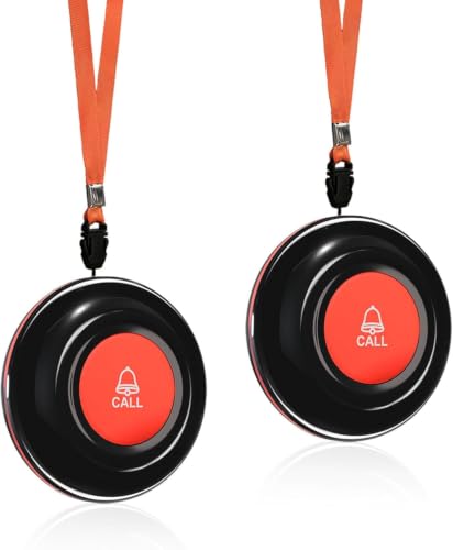
CallToU Wireless Call Buttons for Caregiver Pager and Calling System Waterproof Nurse Alert Call Buttons for Clinic Nurses Station Restaurant Nursing Home(Need to Be Paired with Receiver to Work)
- Requires pairing with receiver: Must pair with receiver to function
- Long-range compatibility: Up to 1000FT with P4 series receiver
- Universal receiver compatibility: Works with various CallToU receivers up to 500FT
As an affiliate, we earn on qualifying purchases.
As an affiliate, we earn on qualifying purchases.
Conclusion
Remember, your homepage is the front door to your digital home. When it’s clear and straightforward, visitors feel welcomed and know exactly where to go. Don’t let confusion be the guest that overstays its welcome. Instead, make your message shine like a lighthouse guiding ships safely to shore. Clarity isn’t just a detail; it’s the beacon that keeps visitors engaged and coming back. Keep it simple, keep it clear, and watch your website thrive.
website navigation menu organizer
As an affiliate, we earn on qualifying purchases.
As an affiliate, we earn on qualifying purchases.
website layout and organization guide
As an affiliate, we earn on qualifying purchases.
As an affiliate, we earn on qualifying purchases.