TL;DR

Get art and craft supplies delivered free with Prime
- Fast, free delivery on millions of items
- Prime Video, Amazon Music and more included
- Member-only deals all year
The ColorChecker, a foundational tool for photographers, celebrates its 50th anniversary this year. Its 24-color grid remains vital for accurate color calibration in digital photography, underscoring its lasting relevance.
The ColorChecker, the iconic 24-square color calibration chart used by photographers worldwide, is celebrating its 50th anniversary this year. Originally introduced in the early 1970s, the chart has become a standard tool for achieving consistent and accurate color reproduction across digital imaging workflows. Its enduring presence underscores its critical role in professional and amateur photography, making it a milestone worth recognizing.
The ColorChecker was first developed in the early 1970s by the company X-Rite, designed to help photographers and videographers calibrate their cameras and monitors for true-to-life color reproduction. Its 24 color patches include a range of skin tones, primary colors, and grays, allowing users to create reliable color profiles for various lighting conditions. Over the decades, the chart has evolved from film-based workflows to digital systems, maintaining its core purpose of ensuring color fidelity.
According to industry sources, the ColorChecker remains a staple in professional studios, photo labs, and even consumer-level editing setups. Despite advances in digital calibration technology, many practitioners continue to rely on the original chart or its digital equivalents for quick, reliable color checks. The 50th anniversary has prompted renewed interest in its history and ongoing relevance, with some celebrating it as a symbol of standardization in digital imaging.
Why the 50th Anniversary Reinforces Its Industry Role
The celebration of the ColorChecker’s 50th anniversary highlights its sustained importance in the digital photography industry. As a universal standard, it provides a consistent reference point for color calibration, which is crucial for professional workflows, product photography, and scientific imaging. Its longevity underscores the need for reliable tools amid rapidly advancing digital technologies, and many industry experts see it as a symbol of stability and accuracy in an evolving field.
Moreover, the chart’s continued use signifies a broader reliance on standardized calibration practices, which help ensure that images look consistent across different devices and platforms. For consumers, this translates into more accurate color representation in photos and videos, enhancing overall visual quality and trust in digital content. The anniversary serves as a reminder of the importance of foundational tools that underpin high-quality imaging.
As an affiliate, we earn on qualifying purchases.
Historical Evolution of the ColorChecker and Its Impact
The original ColorChecker was introduced in the early 1970s, amid a growing need for standardized color reproduction in professional photography and printing. Developed by X-Rite, it quickly became a universal reference for calibration, adopted by studios, labs, and manufacturers worldwide. During the transition from film to digital, the chart’s role expanded, with digital versions and software-based calibration tools emerging to complement the physical card.
Over the years, the ColorChecker has seen various updates, including improved materials and digital integration, but its core design has remained largely unchanged. Its widespread adoption has helped establish consistent color standards across industries, from fashion and advertising to scientific research. The anniversary marks a milestone in its long history and ongoing influence on imaging practices.
Recent coverage interest appears to be spiking, likely driven by industry reflections on its legacy and the increasing importance of color accuracy in digital content creation. However, it is not yet clear whether new versions or innovations inspired by the anniversary are in development or if the focus remains on its historical significance.
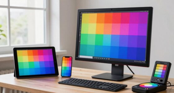
24 color calibration chart for photography
As an affiliate, we earn on qualifying purchases.
As an affiliate, we earn on qualifying purchases.
Unconfirmed Developments and Future Plans for the ColorChecker
It is not yet clear if X-Rite or other manufacturers plan to release new versions or innovations to mark the anniversary. Industry insiders suggest there may be discussions about digital updates or complementary tools, but no official announcements have been made. The extent to which the anniversary will influence future product development remains uncertain.
Additionally, while the chart’s historical significance is undisputed, how it will adapt to emerging technologies like AI-driven color correction or new display standards is still unknown. Experts note that while the physical chart remains relevant, its role in future workflows may evolve.
X-Rite ColorChecker digital version
As an affiliate, we earn on qualifying purchases.
As an affiliate, we earn on qualifying purchases.
Upcoming Events and Potential Innovations Post-Anniversary
In the coming months, industry events and trade shows may feature discussions or presentations related to the ColorChecker and its legacy. Manufacturers could unveil new versions or digital tools that enhance or complement the original chart, especially as the industry emphasizes more precise color management. Researchers and developers are also exploring how to integrate traditional calibration tools with AI and machine learning technologies.
For now, the focus appears to be on celebrating the milestone and reflecting on the chart’s impact. The anniversary may catalyze further innovation or simply reinforce the importance of established standards in a rapidly changing digital landscape.
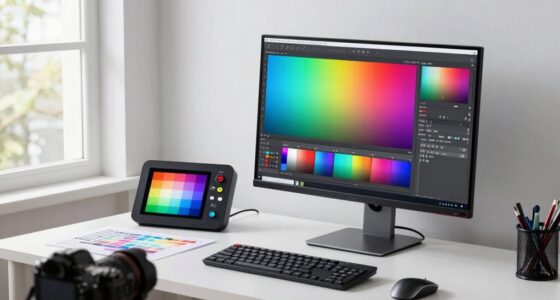
color calibration tools for photographers
As an affiliate, we earn on qualifying purchases.
As an affiliate, we earn on qualifying purchases.
Key Questions
Why is the ColorChecker considered so important in photography?
The ColorChecker provides a standardized set of color patches that help photographers calibrate their cameras and monitors, ensuring consistent, accurate color reproduction across different devices and lighting conditions. Its widespread adoption has made it a fundamental tool in professional imaging.
Has the ColorChecker changed since it was first introduced?
The core design of the 24-color grid has remained largely unchanged since the 1970s, although materials and digital integrations have been updated. No major redesigns have been publicly announced for the anniversary.
Are new versions of the ColorChecker expected to be released?
There are no confirmed plans for new versions or innovations at this time. Industry speculation suggests potential updates, but nothing has been officially announced.
How does the ColorChecker influence digital workflows today?
It remains a key reference for calibration, especially in professional settings. Digital versions and software tools now often complement the physical chart, but many still rely on the original for quick, reliable color checks.
What does the anniversary mean for future color calibration tools?
The milestone underscores the importance of standardization in color management. It may inspire new innovations, but the fundamental role of the ColorChecker as a calibration cornerstone is expected to persist.
Source: hn
Fall Picks
fall essentials
As an affiliate, we earn on qualifying purchases.