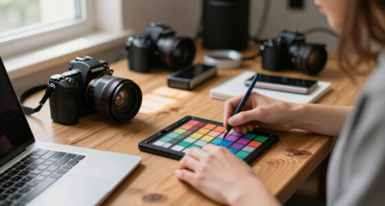
To make temperature contrast work in your projects, you should carefully select warm and cool colors based on the emotional tone you want to evoke. Use lighting strategically—highlight warm objects with cool light for vibrancy, or soften cool tones with warm light for balance. Consider how shadows, reflections, and environment influence perception. When these elements harmonize, you create compelling visuals that deepen emotional impact. Keep exploring these principles to master the art of temperature contrast effectively.

Get art and craft supplies delivered free with Prime
- Fast, free delivery on millions of items
- Prime Video, Amazon Music and more included
- Member-only deals all year
Key Takeaways
- Use complementary warm and cool colors strategically to create deliberate and visually striking contrast.
- Balance warm lighting on cool objects or cool lighting on warm objects to enhance emotional depth.
- Incorporate shadows, reflections, and environmental effects to amplify or soften temperature differences.
- Experiment with lighting angles and intensities to highlight contrast and evoke desired emotional responses.
- Consider scene context and emotional messaging when combining color and lighting for cohesive contrast.

Creating effective temperature contrast in real projects requires more than just placing warm and cool elements side by side; it demands a strategic approach that enhances visual interest and communicates your intended message. To achieve this, you need to carefully consider your color palette and lighting techniques. The colors you choose set the foundation for temperature contrast. Incorporate a well-balanced mix of warm hues—like reds, oranges, and yellows—and cool hues—such as blues, greens, and purples. Instead of randomly scattering these tones, think about the emotional response you want to evoke. Warm colors tend to create a sense of intimacy, energy, or tension, while cool colors often convey calmness, distance, or serenity. By deliberately selecting a cohesive color palette, you guarantee the contrast feels intentional, not accidental.
Strategically select warm and cool colors to evoke specific emotions and create intentional, compelling temperature contrast.
Lighting techniques play a vital role in amplifying temperature contrast. Using light to emphasize warm or cool elements can dramatically impact the overall mood. For instance, positioning warm lighting—think golden or amber tones—on certain objects or areas can draw attention and generate a sense of warmth. Conversely, cool lighting with bluish or icy tones can create a sense of chill or detachment. Experiment with different angles and intensities; a strong backlight can silhouette warm objects against a cooler background, intensifying the contrast. Soft, diffused lighting can smooth out transitions, making the contrast feel more subtle and sophisticated. Incorporating lighting design principles can help you achieve a more harmonious balance between warm and cool elements. Additionally, understanding how lighting interacts with color helps in fine-tuning the overall atmosphere of the project. Recognizing how color temperature influences perception allows you to craft scenes with greater emotional depth.
You should also consider how your lighting interacts with your chosen color palette. A warm-colored object illuminated with cool lighting will appear more vivid and striking, whereas warm lighting on cool-toned elements may soften the contrast. Keep in mind that the environment influences how these elements are perceived. Shadows, reflections, and ambient lighting can either enhance or diminish the temperature differences. For example, a cool-toned background bathed in warm light can create a vibrant, dynamic scene, while the same background with cool lighting may evoke a more tranquil or distant mood. Additionally, understanding the emotional impact of color and lighting combinations helps you craft visuals that resonate more deeply with viewers. Paying attention to these interactions allows you to craft more nuanced and compelling scenes. By mastering these principles, you can elevate your projects from basic contrast to emotionally engaging compositions.
As an affiliate, we earn on qualifying purchases.
Frequently Asked Questions
How Do I Choose the Right Color Palette for Temperature Contrast?
To choose the right color palette for temperature contrast, focus on color harmony by selecting complementary warm and cool tones that balance each other. Consider the mood you want to evoke—warm colors can energize, while cool ones bring calm. Use contrast thoughtfully to enhance the overall mood, making sure the palette supports your project’s emotional impact. Test different combinations to see which best reinforces your intended atmosphere.
What Tools Can Help Measure Temperature Contrast Accurately?
To guarantee your temperature contrast is spot-on, rely on tools like thermal imaging devices and color calibration software. Thermal imaging offers precise, visual insights into temperature differences, helping you fine-tune your project. Pair this with color calibration tools to maintain consistency across displays. These tools subtly elevate your work’s accuracy, allowing you to measure temperature contrast effectively and produce compelling, visually balanced results with confidence.
How Does Lighting Affect Perceived Temperature Contrast?
Lighting profoundly influences perceived temperature contrast by altering colors and their emotional impact. Warm lighting enhances the warmth of colors, making reds and oranges feel more inviting or energetic, while cool lighting emphasizes blues and greens, creating a calming or distant effect. According to color psychology, this emotional impact guides viewers’ perceptions and responses, so you should carefully select lighting to amplify or soften temperature contrasts, ensuring your design evokes the desired mood.
Can Temperature Contrast Be Used Effectively in Small-Scale Projects?
Think of temperature contrast as a spice; even in small projects, it adds flavor. You can use contrasting warm and cool tones to evoke specific emotions, leveraging color psychology to enhance emotional impact. By carefully selecting and balancing these colors, you create focal points that draw attention and set the mood. Small-scale projects benefit just as much, making each detail count and transforming a simple space into an immersive experience.
Are There Industry Standards for Applying Temperature Contrast?
Yes, industry standards for applying temperature contrast exist, guided by color theory and emotional impact. You should consider established principles that balance warm and cool tones to create visual harmony and evoke specific feelings. For example, using warm colors to energize or cool hues for calmness aligns with best practices. Following these standards helps guarantee your project communicates effectively and achieves the desired emotional response.
studio lighting with warm and cool tones
As an affiliate, we earn on qualifying purchases.
As an affiliate, we earn on qualifying purchases.
Conclusion
By embracing temperature contrast, you craft scenes that breathe life, scenes that sparkle and sway like fire and ice in harmony. You carve out depth with warmth and chill, guiding your audience’s eye and emotion with a simple yet powerful technique. When you master this contrast, you create moments that stand out, moments that resonate, moments that linger—like a sunrise and sunset, forever contrasting but beautifully intertwined, forever mesmerizing.
As an affiliate, we earn on qualifying purchases.
reflectors and diffusers for photography
As an affiliate, we earn on qualifying purchases.
As an affiliate, we earn on qualifying purchases.
Fall Picks
fall essentials
As an affiliate, we earn on qualifying purchases.