You might focus on specs like resolution or refresh rate, but color accuracy is more important because it guarantees your visuals are true to life and consistent across devices. Relying solely on specs can be misleading since factory calibration and actual performance vary, risking misrepresented colors. Proper calibration and industry standards help you achieve reliable, professional results. Keep exploring further to see how prioritizing color accuracy can make a real difference in your work.
Key Takeaways
- High specs like resolution or refresh rate don’t guarantee true color reproduction or accuracy.
- Proper calibration aligns monitor output with industry color standards, ensuring reliable and consistent colors.
- Industry standards (sRGB, Adobe RGB, DCI-P3) serve as benchmarks for accurate color display.
- Accurate colors are essential for professional editing, design, and media work, preventing misrepresentation.
- Focus on color fidelity over specs ensures true-to-life visuals and consistent performance across devices.
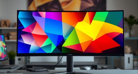
Have you ever chosen a monitor based solely on impressive specs like resolution or refresh rate, only to be disappointed with the actual color display? It’s a common pitfall. High specs might catch your eye, but they don’t guarantee accurate or consistent colors. That’s where color calibration and adherence to industry standards come into play. These factors guarantee what you see on your screen genuinely reflects real-world colors, which is essential whether you’re editing photos, designing graphics, or simply enjoying media. Without proper calibration, even the most advanced monitor can produce colors that seem off or inconsistent, leading to frustrations and subpar results.
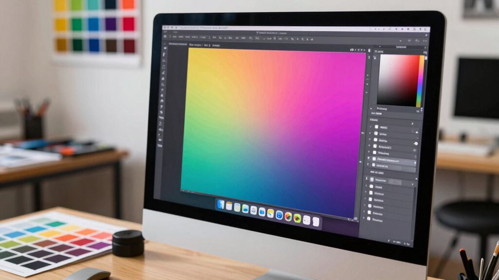
Color calibration is the process of adjusting your monitor’s settings to match a known color profile, making sure the displayed colors are as accurate as possible. It involves fine-tuning parameters like gamma, white point, and color temperature. When done correctly, calibration aligns your monitor’s output with industry standards, such as sRGB, Adobe RGB, or DCI-P3. These standards serve as benchmarks for color accuracy across devices, enabling professionals and enthusiasts alike to work with confidence, knowing their colors will look consistent on other calibrated equipment or when printed. Relying solely on manufacturer specs can be misleading because many monitors are factory-calibrated only roughly, or not at all, and their true color performance can vary considerably.
Choosing a monitor that meets recognized industry standards for color accuracy makes a noticeable difference. It’s not just about having a high-resolution display or a fast refresh rate; it’s about trusting that the colors you see are true to life. When you prioritize color calibration and industry standards, you’re investing in a tool that delivers consistent, reliable visuals. This consistency helps in making precise edits, ensuring your creative work remains true across different devices and mediums. It also prevents your work from looking different on other screens, which can be a disaster in professional settings. Color accuracy is a crucial aspect that often gets overlooked when focusing solely on specs like resolution or refresh rate.
A key part of ensuring optimal color performance is understanding the importance of proper calibration and industry standards, which can significantly impact your workflow and final output. Additionally, becoming familiar with concepts like color profiles and how they influence display accuracy can help you make more informed decisions when selecting or calibrating a monitor. Recognizing the role of industry standards is vital for achieving consistent results across various devices and mediums. In the end, specs like resolution and refresh rate are important, but they shouldn’t overshadow the importance of accurate color display. If you want a monitor that truly supports your creative or professional needs, focus on how well it can reproduce colors accurately according to established standards. Proper color calibration isn’t just a technical step; it’s a crucial part of ensuring that what you see on your screen is what others will see, making your work more precise, consistent, and reliable.
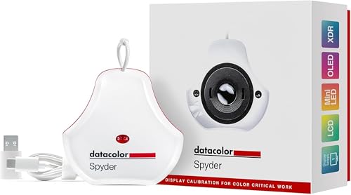
datacolor Spyder – Monitor Calibrator for Graphic Designers, Photographers, and Content Creators, Shows You True Colors, Works on OLED Monitors & LED Screens, Easy-to-Use Color Calibration Tool
Color “Surprises” Are a Thing of the Past: Datacolor’s exclusive DevicePreview TM Beta feature simulates what your photos…
As an affiliate, we earn on qualifying purchases.
As an affiliate, we earn on qualifying purchases.
Frequently Asked Questions
How Does Color Accuracy Impact Professional Photo Editing?
Color accuracy directly impacts your professional photo editing by guaranteeing what you see on your screen matches the final output. Accurate colors help you make precise color grading decisions and ensure your images look consistent across different devices and in print. This minimizes surprises during print matching, saving you time and frustration. When your monitor delivers true colors, your editing process becomes more reliable, producing high-quality, consistent results every time.
Can a Monitor With High Specs Still Have Poor Color Accuracy?
Yes, a monitor with high specs can still have poor color accuracy if it isn’t properly calibrated. You need to perform display calibration regularly to guarantee colors are true to life. Even with a wide color gamut, poor calibration can limit color accuracy. Specs like resolution or refresh rate don’t guarantee accurate colors; proper calibration and a good color gamut are essential for reliable, professional-quality visuals.
What Are the Signs of a Color-Accurate Monitor?
You notice subtle color inconsistencies or your images look off, hinting at a monitor with true color accuracy. Signs include precise, uniform color reproduction, vibrant yet natural hues, and minimal color shifts during display calibration. A color-accurate monitor responds well to color calibration and display calibration tools, ensuring your visuals stay consistent across different projects. These clues reveal you’re working with a monitor designed for true color fidelity, not just impressive specs.
How Often Should I Calibrate My Monitor for Color Accuracy?
You should calibrate your monitor at least once a month to maintain color consistency, especially if you use it for professional work like photo editing or design. Factors like ambient lighting, display age, and usage can affect accuracy, so more frequent calibration might be necessary if you notice color shifts. Regular calibration guarantees your colors stay true, helping you achieve consistent, reliable results over time.
Does Color Accuracy Affect Gaming Performance?
Color accuracy can influence your gaming experience by affecting color consistency and visual clarity. When your monitor’s colors are precise, you’ll see more realistic and vibrant scenes, helping you spot details and react faster. Proper calibration techniques guarantee this accuracy, reducing color distortions. While it may not directly impact your gameplay mechanics, improved color fidelity enhances immersion and visual precision, giving you a subtle but noticeable edge in competitive or visually demanding games.
datacolor Spyder – Monitor Calibrator for Graphic Designers, Photographers, and Content Creators, Shows You True Colors, Works on OLED Monitors & LED Screens, Easy-to-Use Color Calibration Tool
Color “Surprises” Are a Thing of the Past: Datacolor’s exclusive DevicePreview TM Beta feature simulates what your photos…
As an affiliate, we earn on qualifying purchases.
As an affiliate, we earn on qualifying purchases.
Conclusion
Ultimately, focusing on color accuracy guarantees your work looks just as intended, whether you’re editing photos or designing graphics. Imagine creating a stunning logo only to see it appear dull or off on another device—that’s the risk of ignoring color precision. By prioritizing accurate color reproduction over flashy specs, you guarantee your creations look professional everywhere. So, next time you pick a monitor, remember: accurate color matters more than the bells and whistles.

Dell P2214HB Full HD 22 inch LED Backlit Monitor, VGA, Display Port, DVI, 16.7 Million Colors, 178 Degree Viewing Angle, Upto 76/60 Hz Horizontal and Vertical Refresh Rate (Renewed)
✨【Flexible viewing features】 The Dell 22 inch Monitor adjusts to fit your work style, Monitor stand has full…
As an affiliate, we earn on qualifying purchases.
As an affiliate, we earn on qualifying purchases.
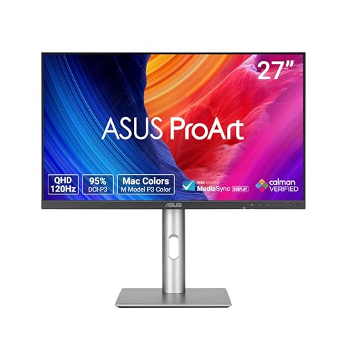
ASUS ProArt Display 27” 1440P Professional Monitor (PA278QGV) – IPS, QHD (2560 x 1440), 95% DCI-P3, Color Accurate, ΔE<2, Calman Verified, 120Hz, HDR-10, Light Sync, Ergonomic, 3 yr Warranty
27-inch QHD (2560 x 1440) display with 178° wide-view IPS panel
As an affiliate, we earn on qualifying purchases.
As an affiliate, we earn on qualifying purchases.