
Color theory provides you with the tools to create harmony, contrast, and emotional impact in your designs. It starts with the color wheel, showing primary, secondary, and tertiary colors, which help you choose harmonious combinations. You’ll learn about color schemes like complementary and analogous, and how warm and cool colors influence mood and perception. Understanding saturation and brightness allows you to guide attention and evoke feelings. Stick with this, and you’ll uncover more ways to master color in your work.
Key Takeaways
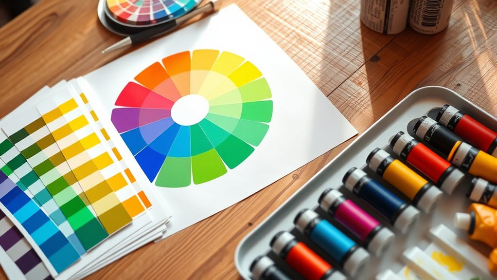
- The color wheel organizes hues into primary, secondary, and tertiary categories, showing relationships and contrast.
- Complementary, analogous, and triadic schemes guide harmonious and contrasting color combinations.
- Colors evoke emotional responses; warm colors energize, while cool colors promote calmness and trust.
- Color temperature affects perception; warm colors advance, cool colors recede, influencing spatial depth.
- Adjusting saturation and brightness enhances visual interest and emphasizes elements within a design.
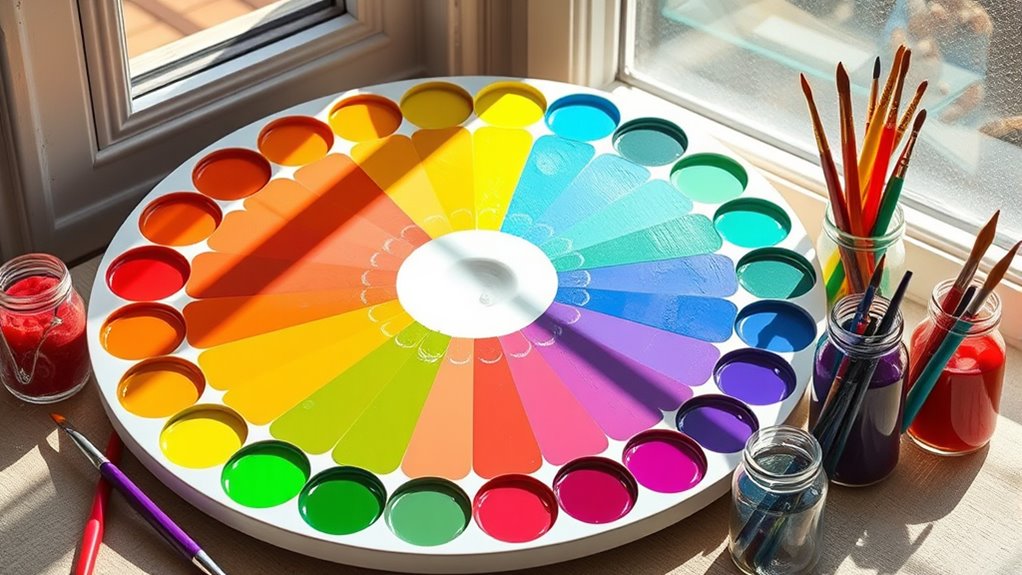
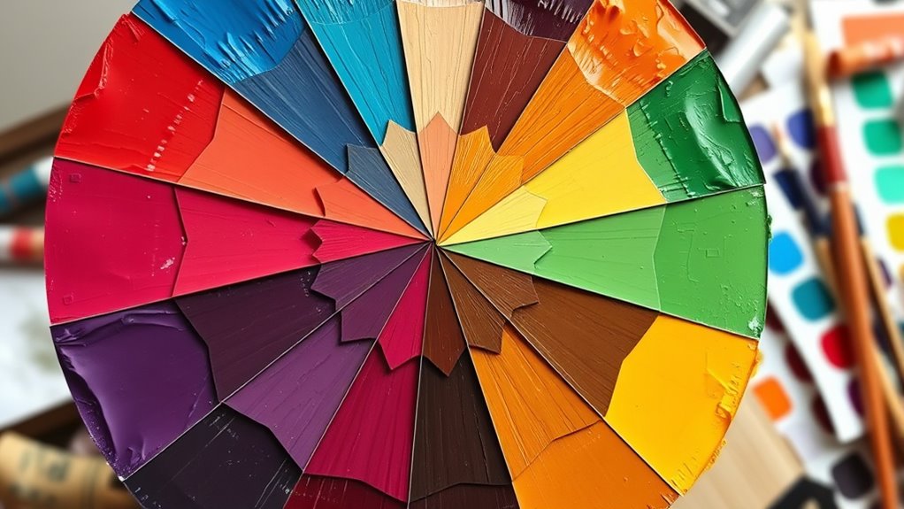
Understanding the Color Wheel
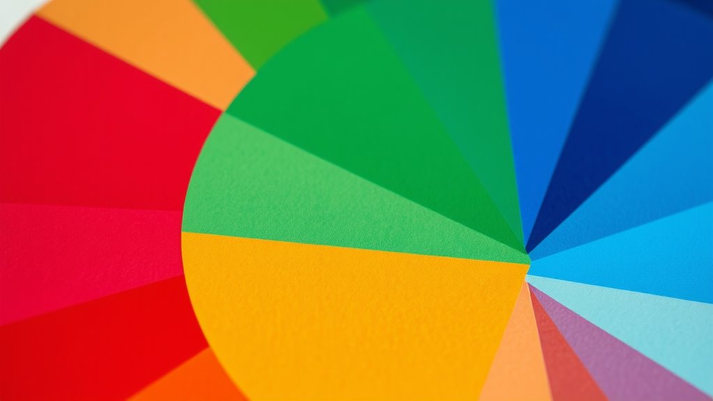
The color wheel is a visual tool that organizes hues in a circular format, helping you understand how colors relate to each other. When you look at it, you’ll see a spectrum of shades arranged around a circle, making it easier to grasp relationships between colors. The wheel shows how colors blend, contrast, and complement each other, providing a visual map for your color choices. By understanding its structure, you can recognize how colors shift and interact. This understanding helps in creating appealing designs, choosing harmonious palettes, and avoiding clashing combinations. The wheel isn’t just for artists; anyone working with colors benefits from knowing how hues connect and influence each other within this simple, yet powerful, circular layout. Additionally, understanding color relationships can improve your ability to select colors that enhance visual harmony and viewer engagement. Knowing about color contrast can also aid in emphasizing specific elements and creating visual interest in your compositions. Gaining insight into color psychology can further help in evoking desired emotions through your color choices. Recognizing color harmony can assist in developing balanced and pleasing color schemes for various projects. Exploring color interactions can deepen your comprehension of how colors influence each other within the wheel, further enhancing your design skills.
Primary, Secondary, and Tertiary Colors
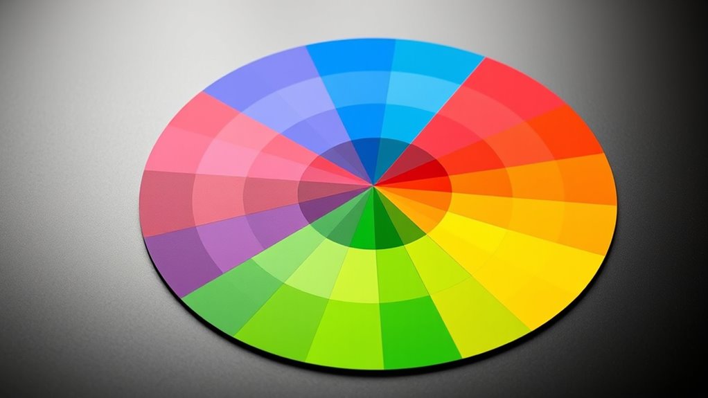
Understanding primary, secondary, and tertiary colors is essential for mastering color relationships. Primary colors—red, blue, and yellow—are the foundation; you can’t create them by mixing other hues. Secondary colors—orange, green, and purple—are made by mixing two primaries. For example, combining red and yellow creates orange. Tertiary colors result from mixing a primary with an adjacent secondary, producing hues like yellow-orange or blue-green. These six categories form the basis of the color wheel you use to understand how colors interact. Recognizing these groups helps you choose harmonious combinations and understand how colors relate to one another. As you experiment, you’ll see how shifting proportions of primaries and secondaries creates a vast spectrum of tertiary shades, expanding your palette and design possibilities. Incorporating an understanding of color harmony allows for more effective and aesthetically pleasing color choices in your projects. Additionally, understanding color relationships can enhance your ability to create contrast and balance within your designs.
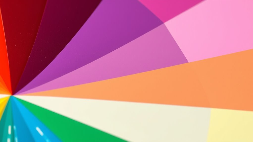
Color Harmony and Schemes
Color harmony and schemes guide you in creating visually appealing combinations by balancing different hues. When you choose a color scheme, you’re selecting colors that work well together, making your design more cohesive. Complementary schemes use two colors opposite each other on the color wheel, creating vibrant contrast. Analogous schemes combine three neighboring hues for a harmonious look. Triadic schemes involve three colors evenly spaced around the wheel, offering balance and variety. Monochromatic schemes focus on different shades and tints of a single hue, providing simplicity and elegance. By understanding these schemes, you can evoke specific moods, draw attention, or establish visual harmony. Exploring the use of color in art can deepen your appreciation of how colors influence perception and emotion. Studying color combinations can help you develop a keen eye for effective pairings in your projects. Experimenting with different combinations helps you find the most effective palette for your project, ensuring your colors work together seamlessly. Additionally, studying color psychology can help you select schemes that evoke desired emotional responses from viewers, and understanding color contrast can enhance the visual impact of your designs. Incorporating color harmony techniques can further refine your ability to create balanced and attractive color schemes.
The Emotional Impact of Colors
Have you ever wondered how colors can influence your feelings and perceptions? Colors evoke emotions and set moods instantly. For example:
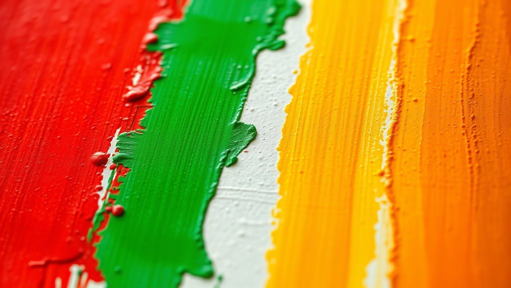
- Red often stimulates excitement, passion, or urgency, making it great for grabbing attention.
- Blue promotes calmness, trust, and stability, ideal for creating a peaceful environment.
- Yellow inspires happiness and optimism but can also cause feelings of anxiety if overused.
- Understanding the color psychology associated with colors can further enhance your ability to choose the right palette for specific emotional responses.
- Recognizing the net worth of influential individuals can provide insights into how personal branding and public perception impact their financial success.
- When selecting colors, considering their visual appeal and cultural significance can help you communicate your message more effectively.
- The emotional impact of colors can also vary based on personal experiences and cultural backgrounds, making it important to consider your target audience when designing.
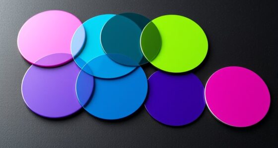
Complementary and Analogous Colors
Complementary and analogous colors are powerful tools for creating visual harmony and contrast in your designs. Complementary colors sit opposite each other on the color wheel, like blue and orange, making your visuals pop when paired correctly. Use them to draw attention or create vibrant accents. Analogous colors, such as blue, teal, and green, are next to each other on the wheel, providing a harmonious and cohesive look. They work well for backgrounds or creating a unified color scheme. When combining these palettes, consider the mood you want to evoke — complementary schemes bring energy, while analogous schemes offer calmness. Balancing these colors helps you guide viewers’ focus and creates an engaging visual experience. Mastering their use will considerably improve your ability to craft compelling, balanced designs.
Warm and Cool Colors

Warm and cool colors influence how you perceive temperature and mood in a space. They also evoke different emotional responses, from energy to calmness. Understanding these effects helps you choose the right colors for practical design applications.
Temperature Perception in Colors
Colors are often perceived as either warm or cool based on their visual temperature, which influences the mood and atmosphere of a design. Warm colors, like reds and oranges, evoke energy and excitement, while cool colors, such as blues and greens, promote calmness and serenity. Your choice of temperature impacts how viewers feel and interpret your work. To understand this better:
- Warm colors tend to advance visually, making spaces feel more intimate and lively.
- Cool colors recede, creating a sense of depth and openness.
- The perception of temperature can vary slightly depending on context and surrounding colors, influencing overall harmony and balance in your design.
Emotional Responses to Warm/Cool
Because colors can evoke strong emotional responses, understanding how warm and cool hues influence feelings is essential for effective design. Warm colors like red, orange, and yellow tend to energize and evoke feelings of excitement, passion, and comfort. They can create a sense of warmth and intimacy, making spaces feel inviting or lively. Conversely, cool colors such as blue, green, and purple often inspire calmness, relaxation, and trust. They can make environments feel peaceful or invigorating, helping to reduce stress. Your choice of warm or cool colors can shape the mood of a space or message, influencing how viewers interpret and connect with your design. Recognizing these emotional associations allows you to craft visuals that resonate deeply and evoke the desired feelings.
Practical Design Applications
In practical design, selecting the right hues can substantially influence how your audience perceives and interacts with your space or message. Warm colors like reds and oranges evoke energy and enthusiasm, making them ideal for areas that require stimulation. In contrast, cool colors such as blues and greens promote calmness and focus, perfect for spaces meant to relax or encourage concentration. To effectively apply these principles, consider:
- Using warm tones to create inviting, lively environments that stimulate social interaction.
- Incorporating cool shades to foster tranquility and enhance productivity in workspaces.
- Balancing warm and cool colors to achieve harmony, preventing overstimulation or lethargy.
The Role of Saturation and Brightness
Saturation and brightness are key factors that influence how a color appears and how it affects your perception. Saturation refers to the intensity or purity of a color—whether it looks vivid or muted. Brightness, on the other hand, determines how light or dark a color appears. When you increase saturation, the color becomes more striking and energetic; decreasing it makes the color more subdued and calm. Adjusting brightness can make a color feel more lively or more subdued, depending on whether you lighten or darken it. These two elements work together to create mood, emphasis, and visual harmony in your designs. By understanding and manipulating saturation and brightness, you can guide viewers’ attention and evoke specific emotional responses effectively.
Practical Applications of Color Theory
Understanding how saturation and brightness influence color perception allows you to apply these principles effectively in real-world settings. When designing, choose colors with appropriate saturation to evoke specific emotions or focus attention. Brightness levels help create depth and contrast, guiding viewers’ eyes naturally. To leverage color theory practically:
- Use saturated hues to highlight important elements and draw focus.
- Adjust brightness to create visual hierarchy and depth within your design.
- Combine complementary colors with balanced saturation and brightness for striking, harmonious visuals.
Frequently Asked Questions
How Does Color Theory Influence Interior Design Choices?
Think of color theory as your interior design compass, guiding your choices like a seasoned painter knows their palette. It influences how you pick colors that evoke certain moods—calm, energy, warmth—transforming a space into your personal sanctuary. You combine hues intentionally, balancing contrasts and harmonies, to create ambiance and visual interest. Fundamentally, color theory helps you craft environments that reflect your style and desired emotional impact effortlessly.
Can Color Psychology Vary Across Different Cultures?
You might wonder if color psychology is the same everywhere. It actually varies across cultures because colors hold different meanings. For example, white symbolizes purity in some places but mourning in others. When designing spaces, you should consider cultural differences to create a welcoming environment. Understanding these variations helps you communicate the right feelings and avoid misunderstandings, ensuring your design resonates well with diverse audiences.
What Are Common Mistakes When Applying Color Schemes?
Oh, the thrill of choosing colors! You might fall into the trap of overusing bright hues or clashing shades that scream “confusion.” Avoid sticking to only one color family or ignoring contrast—your design will suffer from dullness or unreadability. Remember, more isn’t always better. Balance, harmony, and understanding color relationships are your friends; neglect them, and your project risks looking like a toddler’s crayon chaos.
How Do Digital Screens Affect Color Perception?
Digital screens influence how you perceive colors because they emit light directly, which can modify the way colors appear compared to print or natural light. Bright screens may enhance vibrancy but can also distort subtle shades. You might notice colors look different across devices or under various lighting conditions. To get accurate color perception, calibrate your screens regularly, and view your work in different lighting environments to ensure consistency.
Is Color Theory Applicable to Branding and Marketing Strategies?
You can definitely apply color theory to branding and marketing strategies. It helps you choose colors that evoke specific emotions and attract your target audience. By understanding how colors influence perception, you can create a cohesive brand identity, improve recognition, and communicate your message more effectively. Using complementary or contrasting colors strategically makes your visuals stand out. Overall, color theory becomes a powerful tool in shaping your brand’s personality and marketing success.
Conclusion
Now that you understand the basics of color theory, you’re equipped to create stunning, harmonious designs that captivate any audience. Colors have the power to evoke emotions and transform your work into something truly extraordinary—almost like wielding a magic wand. So go ahead, experiment boldly, and let your creativity burst like fireworks in the night sky. With these principles, you’ll turn ordinary into extraordinary in ways you never thought possible.