
To verify consistent, accurate colors across your devices and printed media, you need proper color management. This involves calibrating your monitors and printers regularly using specialized tools, embedding color profiles into your files, and using soft-proofing techniques. Keeping your devices calibrated helps prevent color shifts and ensures your digital designs match the final print results. If you want to learn more about maintaining perfect color consistency, there’s much more to discover.
Key Takeaways
- Calibrate monitors and printers regularly to ensure accurate color representation across devices.
- Use ICC profiles tailored to each device to maintain consistent color interpretation.
- Soft-proof images to preview print output and adjust colors before finalizing.
- Embed standardized color profiles in digital files for reliable reproduction across platforms.
- Consistent calibration minimizes color discrepancies, reducing reprints and improving overall workflow efficiency.
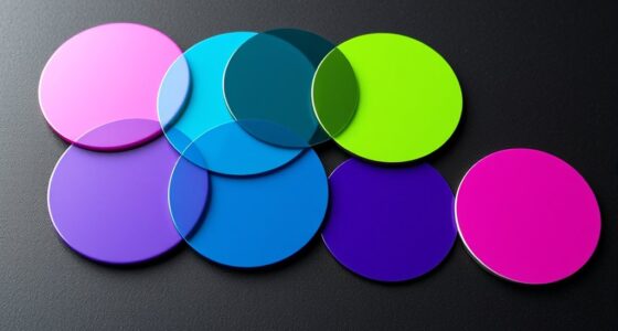
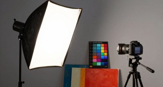
Color management guarantees that your colors stay consistent and accurate across different devices and print outputs. When you’re working with images, designs, or photographs, maintaining color integrity is essential to ensure your final product matches your original vision. To achieve this, understanding calibration techniques becomes crucial. Calibration involves adjusting your monitors, printers, and other devices to a known standard, so they interpret and reproduce colors uniformly. For example, calibrating your monitor ensures that what you see on screen reflects the true colors, reducing discrepancies when you move between devices or send files to print. Likewise, printer calibration aligns ink output with digital data, preventing colors from appearing dull or overly saturated in the final print. Using calibration tools like colorimeters or spectrophotometers can make this process more precise, giving you reliable benchmarks to maintain color consistency across various outputs. Regular calibration routines are essential for maintaining color fidelity over time, especially as devices age or settings change.
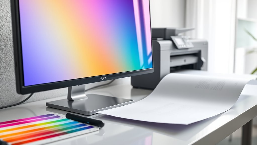
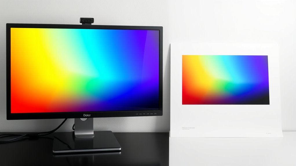
Color consistency is at the heart of effective color management. When you don’t calibrate your devices regularly, colors can shift, leading to mismatched results that frustrate clients or diminish your artwork’s impact. Consistent calibration routines help you identify and correct deviations early, keeping your workflow predictable. For instance, if you notice that your printed colors differ from what you see on your calibrated monitor, you can adjust your printer settings or refine your color profiles to restore harmony. This consistency extends beyond individual devices; by embedding standardized color profiles into your digital files, you ensure that every device in your workflow interprets color data the same way. As a result, whether you’re viewing images on a high-end monitor, printing on a professional press, or sharing files digitally, the colors remain faithful and uniform.
To maximize color consistency, adopting proper calibration techniques is essential. Regular calibration, at least once a month or whenever you notice color shifts, keeps your devices functioning at their best. Creating and embedding ICC profiles tailored to your specific hardware helps your software understand how to handle colors correctly. Additionally, using calibrated monitors during editing sessions allows you to make color decisions with confidence, knowing that what you’re seeing is accurate. When preparing images for print, always check your color profiles and soft-proof your work to anticipate how it will appear in print. By integrating these calibration techniques into your workflow, you reduce surprises and costly reprints, ensuring your colors stay true from digital creation to final output. This disciplined approach to calibration and color management ultimately leads to more professional results and a more efficient process, saving you time and resources.

Calibrite Display Pro HL Monitor Calibration Colorimeter for LCD Mini LED and OLED Displays, Measure up to 3000 Nits, PROFILER Software, USB C with Adapter, Validation/Color Uniformity Tools
SPECIFICATIONS: HL high luminance sensor colorimeter measures up to 3000 nits, calibrates and profiles LCD mini LED OLED…
As an affiliate, we earn on qualifying purchases.
As an affiliate, we earn on qualifying purchases.
Frequently Asked Questions
How Do I Calibrate My Monitor for Accurate Color?
To calibrate your monitor for accurate color, start by using a calibration tool or software designed for monitor calibration. Follow the prompts to adjust brightness, contrast, and color settings. Make certain you’re in a neutral lighting environment, and let the calibration process run to establish proper color accuracy. Regular calibration ensures your monitor maintains consistent color performance, which is vital for producing accurate and vibrant work.
What Are the Best Color Profiles for Different Devices?
You should choose color profiles based on your device’s purpose and workflow. For monitors, sRGB or Adobe RGB are popular, depending on your needs. For printing, use device profiling to create custom profiles that match your printer and paper type. Always select the appropriate color space for your project, ensuring consistent color reproduction across devices. Proper device profiling and accurate color space selection help maintain color fidelity.
How Can I Ensure Consistent Colors in Multi-Device Workflows?
To guarantee consistent colors in your multi-device workflow, you should establish a solid color management process. Use standardized color profiles across all devices, calibrate monitors regularly, and incorporate color checks at each stage. Maintain a consistent color workflow by documenting your settings and using ICC profiles. This approach helps you achieve reliable color consistency, reducing surprises and ensuring your final output looks the same regardless of the device you’re working on.
What Software Tools Are Recommended for Color Management?
Think of software tools as your color symphony conductors. You should explore programs like X-Rite i1Profiler and DisplayCAL, which excel at color calibration and profiling. These tools fine-tune your devices, turning inconsistent hues into harmonious colors. With precise calibration and detailed profiling, you create a seamless flow of colors across screens and printers, ensuring your work remains vibrant and consistent, no matter where it’s viewed or printed.
How Does Lighting Affect Color Accuracy in Print and Display?
Lighting substantially impacts color accuracy in print and display because ambient lighting and viewing conditions alter how you perceive colors. Bright or uneven lighting can wash out or distort colors, making them appear different from their true shades. To guarantee consistent color, you should view prints and screens under controlled, neutral lighting conditions, ideally with consistent ambient light, so your perception remains accurate regardless of where or when you view your work.
Calibrite Display Pro HL Monitor Calibration Colorimeter for LCD Mini LED and OLED Displays, Measure up to 3000 Nits, PROFILER Software, USB C with Adapter, Validation/Color Uniformity Tools
SPECIFICATIONS: HL high luminance sensor colorimeter measures up to 3000 nits, calibrates and profiles LCD mini LED OLED…
As an affiliate, we earn on qualifying purchases.
As an affiliate, we earn on qualifying purchases.
Conclusion
Think of color management as the conductor of an orchestra, guaranteeing every device and print harmonizes perfectly. When you master this process, your images stay true, vibrant, and consistent across all mediums. It’s like guiding a symphony where every instrument plays in tune, creating a seamless visual experience. By paying attention to calibration and profiles, you ensure your colors remain a beautiful melody, no matter where or how they’re displayed.
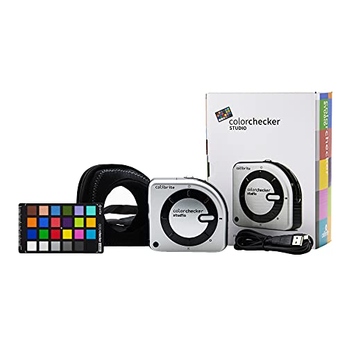
Calibrite ColorChecker Studio Spectrophotometer for Complete Color Management for Display, Projector, Printer and Scanner Profiling Software, w/ColorChecker Classic Mini for Custom Camera Profiling
SPECIFICATIONS: All in one spectrophotometer for camera to print color control, supports monitor display and projector profiling plus…
As an affiliate, we earn on qualifying purchases.
As an affiliate, we earn on qualifying purchases.
ICC profile creation software
As an affiliate, we earn on qualifying purchases.
As an affiliate, we earn on qualifying purchases.