To effectively guide user attention and establish hierarchy, you should use color strategically. Choose contrasting hues for key elements like buttons or headlines to make them stand out. Use bright colors to draw focus and muted tones for backgrounds to reduce distraction. Pairing colors based on psychological impact can evoke emotions that support your goals. Mastering these techniques guarantees your design communicates clearly, leading your audience naturally toward what matters most—continue exploring to open even more tips.
Key Takeaways
- Use contrasting colors to make key elements like buttons and headlines stand out and attract user attention.
- Apply color psychology to evoke specific emotions that align with your content’s hierarchy and purpose.
- Pair bright, bold hues with muted backgrounds to naturally direct focus toward important features.
- Utilize color variation to establish a visual hierarchy, guiding users through content in order of importance.
- Leverage color cues to highlight calls-to-action and secondary information, creating a clear navigational flow.

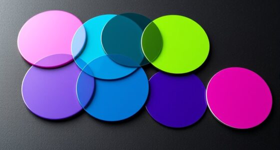
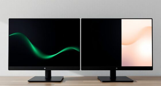
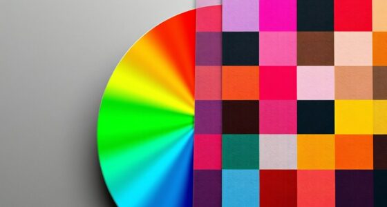
Color is a powerful tool that designers use to direct user attention and establish visual hierarchy. By choosing the right hues and applying them thoughtfully, you can guide users seamlessly through your content, highlighting what matters most. One of the key techniques in this process is leveraging visual contrast. When you create strong contrasts between colors, such as pairing a bright color against a muted background, you draw the eye naturally to the area of highest contrast. This technique helps prioritize elements like call-to-action buttons, headlines, or important notifications. Visual contrast isn’t just about brightness; it also involves differences in hue, saturation, and size. For instance, a dark blue button on a white background will stand out more than a similar button in a shade close to the background, making it clear where users should focus their attention. Additionally, understanding how individual responses to color vary can help tailor designs to diverse audiences, enhancing overall effectiveness.
In addition to contrast, understanding color psychology enhances your ability to influence user perception and behavior. Different colors evoke specific emotional responses and associations, which can be harnessed to reinforce your message. For example, red often signals urgency or excitement, making it ideal for limited-time offers or checkout buttons. Blue tends to evoke trust and calmness, making it suitable for financial services or professional websites. Green communicates growth and health, perfect for eco-friendly brands or wellness-related content. When you align color choices with the psychological impact they have on users, you create a more intuitive and emotionally resonant experience. This alignment helps establish a clear hierarchy, as users instinctively know which elements are most important without needing explicit instructions.
Furthermore, combining visual contrast with color psychology allows you to craft a cohesive visual language that intuitively guides users. For example, you might use a contrasting color to make a primary action stand out while choosing colors that evoke trust or excitement based on the context. The strategic use of color contrast also helps break up clutter, making your design more digestible and accessible. When users land on your page, their eyes are naturally drawn to contrasting elements first, which you can then steer towards secondary features through color cues. This layered approach ensures that your hierarchy remains clear and user-friendly, reducing confusion and increasing engagement. Recognizing individual differences in responses to color can also help in supporting diverse emotional needs, ensuring your design resonates well with various user groups.
Ultimately, mastering the use of visual contrast and color psychology empowers you to shape user interactions intentionally. You don’t just decorate; you communicate. By thoughtfully applying these principles, you create a visual flow that naturally guides users toward desired actions, making your design more effective and compelling.

90 Pieces Big Bright Craft Buttons Plastic Assorted Vivid Button Colors Geometric Shaped Buttons Colorful Large Beads Button Lacing Threading for Arts DIY Crafts Projects
What You Get: 90 pcs of large plastic buttons in different colors and shapes, 7 pcs threading ropes…
As an affiliate, we earn on qualifying purchases.
As an affiliate, we earn on qualifying purchases.
Frequently Asked Questions
How Does Cultural Perception Affect Color Choices in UI Design?
Cultural perception markedly influences your color choices in UI design because you need to take into account cultural symbolism and regional preferences. For example, red might symbolize luck in China but danger in Western countries. By understanding these cultural differences, you can select colors that resonate positively with your target audience, improving user engagement and avoiding misunderstandings. Adapting your color palette based on regional preferences ensures your design communicates effectively across diverse cultures.
Can Color Use Influence User Emotions or Behaviors Intentionally?
Yes, color can influence your emotions and behaviors intentionally. By selecting specific colors, you trigger emotional responses—like red sparking excitement or urgency—and guide user actions through behavioral influence. You can design interfaces that evoke feelings, motivate clicks, or calm users, making your visual choices powerful tools to shape user experience and behavior deliberately. Use color strategically to connect emotionally and influence decisions effectively.
What Are Common Color Pitfalls That Hinder User Experience?
You should avoid common color pitfalls like poor contrast, which makes text hard to read and frustrates users. Overusing bright colors can overwhelm or distract, reducing usability and causing fatigue. Additionally, relying on color alone to convey information can alienate color-blind users. To enhance user experience, choose high-contrast palettes, use colors sparingly, and guarantee accessibility, making your design more inclusive and easier to navigate.
How Should Color Schemes Adapt for Color-Blind Users?
You should use accessible palettes that include high contrast between colors, making sure that users with color blindness can distinguish elements clearly. Opt for contrast optimization by combining color with patterns or labels, ensuring information isn’t conveyed by color alone. Test your schemes with tools like color blindness simulators to confirm accessibility. By doing so, you create an inclusive experience that guides all users effectively without relying solely on color differences.
Are There Specific Colors That Universally Attract Attention?
You’ll find that attention-grabbing hues like red, yellow, and orange are universally effective due to their strong color psychology. These colors naturally attract your attention quickly, making them ideal for important buttons or alerts. While cultural differences can influence perception, these hues generally serve as effective tools to guide user focus and create visual hierarchy, ensuring your message stands out clearly without overwhelming your audience.

Color Psychology: A Guide to Choosing the Right Colors in Design Concepts
As an affiliate, we earn on qualifying purchases.
As an affiliate, we earn on qualifying purchases.
Conclusion
By strategically using color, you can effortlessly guide users through your content, making important information impossible to miss—like a lighthouse in a storm. When you master color hierarchy, your design becomes a magnetic force that captures attention instantly, turning casual browsers into engaged visitors. Remember, a well-chosen color palette isn’t just decoration; it’s the secret weapon that transforms your interface into an intuitive, compelling experience that stands out in a sea of chaos.
Act boldly Voice Recording Button 8 Colors, Dog Buttons for Communication Pet Training Buzzer, 30 Second Record & Playback, Funny Gift for Classroom Home Red Blue Orange Rose Purpe Green Yellow Pink
30-Second Clear Voice Recording Button: Capture up to 30 seconds of crisp audio with this portable voice recorder!…
As an affiliate, we earn on qualifying purchases.
As an affiliate, we earn on qualifying purchases.

Html5 and Css3 (Visual Quickstart Guides)
As an affiliate, we earn on qualifying purchases.
As an affiliate, we earn on qualifying purchases.