
Using contrast effectively makes your content easier to see and more accessible for everyone. By choosing colors with enough luminance and hue difference, you guarantee good readability and help users with visual impairments. High contrast creates clear boundaries and guides the eye naturally. Tools like contrast ratio calculators can help you test your designs and meet accessibility standards. Keep exploring to discover how mastering contrast can transform your communication and reach a wider audience.
Key Takeaways
- Use high contrast ratios, such as 4.5:1 for regular text, to ensure readability for all users.
- Choose contrasting colors for text and background based on luminance differences to maximize clarity.
- Utilize online contrast ratio tools to verify color combinations meet accessibility standards like WCAG.
- Apply sufficient contrast not only to text but also to interactive elements to improve navigation.
- Incorporate contrast in textures, size, and spacing to enhance overall visual hierarchy and accessibility.

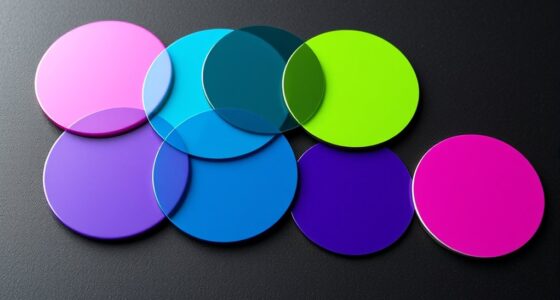
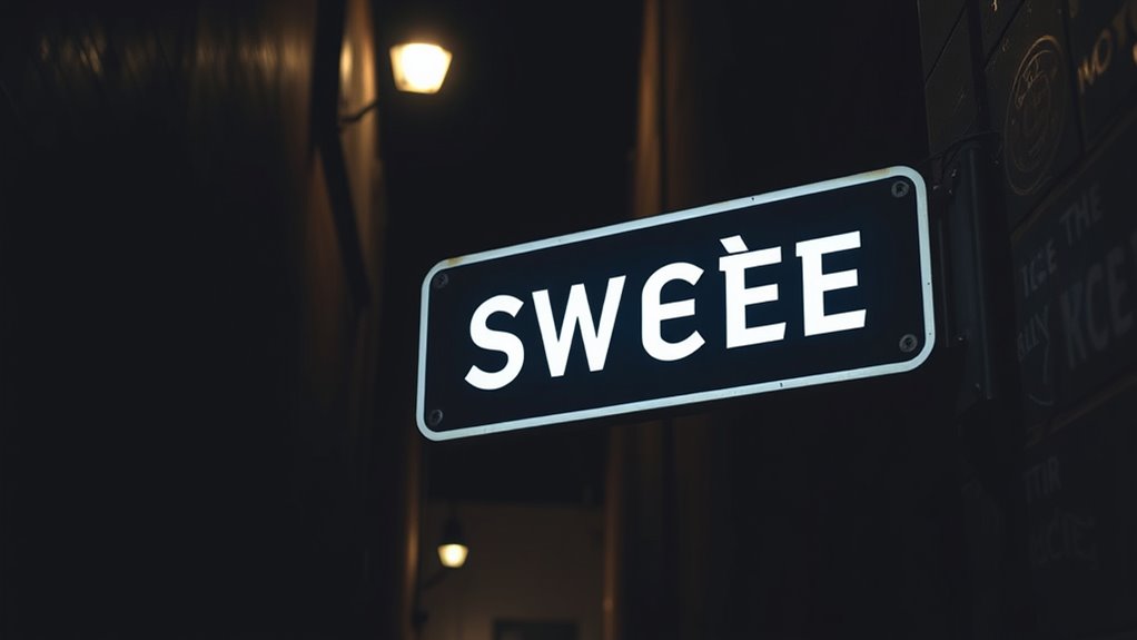
Good contrast between text and background is vital for making content easy to read and accessible to everyone. When you focus on color contrast, you ensure that your content stands out clearly, reducing eye strain and making it easier for users to process information quickly. This is especially important for individuals with visual impairments or color vision deficiencies, as poor contrast can render your content unreadable or frustrating to navigate. By paying attention to the difference in luminance and hue between your text and background, you create a visual hierarchy that guides your audience’s eyes naturally and effortlessly.
Prioritize strong color contrast to enhance readability and accessibility for all users.
Understanding the importance of color contrast helps you design with accessibility in mind. For example, if your background is light, your text should be dark enough to stand out. Conversely, a dark background calls for lighter text. This simple principle enhances visual accessibility, allowing people with different visual abilities to engage with your content without difficulty. It’s not just about aesthetics; it’s about making sure your message reaches everyone equally. When contrast levels are too low, users may struggle to read your content, leading to frustration and disengagement. Conversely, high contrast helps establish clear boundaries between elements, making your website or document more intuitive to navigate. Additionally, incorporating appropriate color contrast can also improve overall usability and user satisfaction.
You can use online tools or contrast ratio calculators to evaluate whether your chosen color combinations meet accessibility standards, typically aiming for a minimum contrast ratio of 4.5:1 for regular text and 3:1 for large text. These tools help you make informed decisions, avoiding guesswork and ensuring compliance with accessibility guidelines like WCAG. When you leverage color contrast effectively, you’re not just improving readability; you’re demonstrating a commitment to inclusivity. This can boost your site’s reach and reputation, making your content welcoming to a broader audience.
Remember that contrast isn’t only about color; it also involves texture, size, and spacing. However, color contrast remains one of the most straightforward and impactful ways to enhance visual accessibility. So, take the time to choose your colors wisely, test your designs, and prioritize clarity. By doing so, you help create a user experience that’s accessible, engaging, and easy for everyone to enjoy. Ultimately, good contrast isn’t just a design choice; it’s a fundamental aspect of effective communication that makes your content more inclusive and functional for all users.
Frequently Asked Questions
How Do Contrast Ratios Affect Different Types of Visual Impairments?
Contrast ratios greatly impact those with color vision deficiencies and contrast sensitivity issues. Higher contrast makes text and images easier to distinguish for users with color blindness, helping them see differences clearly. If contrast is too low, people with contrast sensitivity problems struggle to differentiate content, reducing accessibility. By ensuring strong contrast ratios, you make your visuals more inclusive, allowing all users to access and understand your information more easily.
What Tools Are Best for Testing Color Contrast on Websites?
You should use tools like contrast ratio calculators to measure your website’s color contrast. These tools help guarantee your design meets accessibility standards. Additionally, try color blind simulations to see how your site appears to users with different impairments. Combining these tools allows you to identify and fix contrast issues quickly, making your website more accessible for everyone. Regular testing keeps your site compliant and user-friendly.
Can High Contrast Designs Impact User Experience Negatively?
High contrast designs can sometimes cause visual fatigue, making your users squint or feel overwhelmed. You might think they’re improving readability, but overly stark contrasts can clash with aesthetic considerations, creating a jarring experience. Imagine a website that feels sharp and uninviting instead of sleek and accessible. Striking the right balance guarantees your design remains engaging without sacrificing comfort, keeping users engaged while avoiding negative impacts on their experience.
How Do Contrast Standards Vary Across International Accessibility Guidelines?
You’ll find that color contrast standards differ across international guidelines, impacting how you design for accessibility. For instance, WCAG 2.1 emphasizes a minimum contrast ratio of 4.5:1 for normal text, while other guidelines like ADA or EN 301 549 may have slightly varied requirements. To guarantee your design meets global accessibility standards, you should consistently refer to international guidelines and test your color contrast thoroughly.
Are There Specific Color Combinations to Avoid for Better Accessibility?
You should prevent color combinations that cause color clash, like red and green or blue and yellow, as they hinder readability and accessibility. These combinations disrupt aesthetic balance and can confuse users with visual impairments. Instead, opt for high contrast pairs like black and white or dark blue and light yellow. Prioritizing these choices ensures your content is clear, inclusive, and visually balanced for everyone.
Conclusion
By mastering contrast, you make your content clearer and more accessible—think of it as giving your readers a trusty torch in the dark. Don’t forget, even in this digital age, a little old-school wisdom like good contrast can be your secret weapon. So, keep experimenting, stay mindful of your audience, and remember: clarity isn’t just for the Gutenberg press; it’s for everyone, everywhere. Now, go forth and make your content as sharp as a knight’s sword!