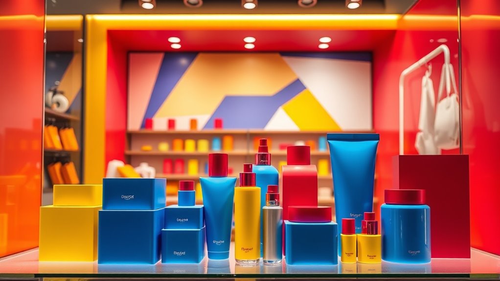
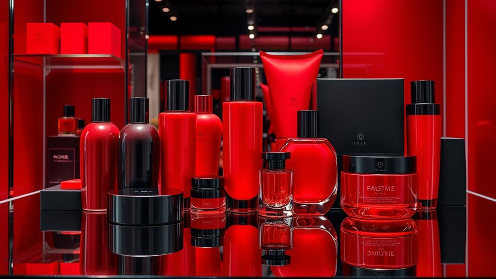
Aligning hues with your brand personality is vital to creating a strong visual identity that resonates with your audience. By choosing colors based on their psychological impact—trustworthy blues, energetic reds, or fresh greens—you communicate your brand’s core values and evoke specific emotions. Consistent use of these hues reinforces recognition, builds loyalty, and sets you apart from competitors. If you keep exploring, you’ll discover how strategic color choices can transform your brand’s perception and influence customer connections.
Key Takeaways
- Select colors that reflect your brand’s core values and personality to create a cohesive visual identity.
- Use color psychology to evoke desired emotions and influence consumer perceptions strategically.
- Maintain consistency across all branding elements to reinforce recognition and trust.
- Align color choices with your target audience’s preferences and cultural associations for better engagement.
- Regularly evaluate and adapt your color palette to ensure it continues to support your evolving brand message.

Have you ever wondered how colors influence your perception of a brand? It’s not just about picking your favorite shade; it’s about understanding how color psychology shapes your feelings and decisions. When a company chooses specific hues, they’re tapping into subconscious associations that can evoke emotions like trust, excitement, or safety. For example, blue often suggests professionalism and reliability, while red can evoke passion and urgency. By strategically selecting colors, brands can communicate their personality instantly without saying a word. This is why brand consistency in color usage is so vital. When you see a brand’s logo, packaging, or website, the colors should reinforce the same message and personality every time. Consistent use of color helps in building recognition and trust, making it easier for you to identify the brand amid competitors. If a brand suddenly shifts its color palette, it might create confusion or even diminish its credibility, as your subconscious expects a certain visual cue to signal the brand’s core values. Moreover, understanding how color psychology influences perception allows brands to craft a cohesive visual identity that aligns with their personality. For instance, a luxury brand might lean toward gold, black, or deep hues to convey elegance and exclusivity, while a health-centered brand might choose green to symbolize freshness or growth. When these colors are used consistently, they reinforce the brand’s message and make your association with it more immediate and instinctive. As a consumer, you’re more likely to trust a brand that maintains consistent visual cues because it feels familiar and dependable. For businesses, maintaining this consistency doesn’t just mean using the same colors; it’s about ensuring those hues match the brand’s core values and personality across all platforms. A mismatch can create a disconnect, making it harder for you to connect emotionally with the brand. Ultimately, mastering the relationship between color psychology and brand consistency helps companies stand out and foster loyalty. When you recognize a brand’s colors and associate them with their personality, it’s because the company has deliberately crafted a visual identity that resonates with you on a subconscious level. This alignment strengthens your perception of the brand and influences your decision-making process. So, next time you notice how a brand’s colors seem to encapsulate its essence, remember that behind the scenes, thoughtful psychology and consistent branding are working together to shape your experience.

Palette Scout: Create Beautiful Color Harmonies with 180 Color Palette Cards. Choosing Tints, Tones & Shades from The Color Wheel, Makes Color Theory Fun & Intuitive
A Fun Way To Learn About Color – Palette Scout uses a unique method of repeating shapes around…
As an affiliate, we earn on qualifying purchases.
As an affiliate, we earn on qualifying purchases.
Frequently Asked Questions
How Do Cultural Differences Influence Color Perception in Branding?
Cultural differences greatly influence how you perceive colors in branding, as cultural symbolism shapes regional preferences. You might associate red with luck in China, while in Western cultures, it can signify passion or urgency. These regional preferences mean you need to take into account cultural symbolism when choosing colors, ensuring your brand resonates positively across diverse markets. Understanding these differences helps you craft more effective, culturally sensitive branding strategies.
Can Color Choices Impact Consumer Trust and Loyalty?
Color choices directly impact consumer trust and loyalty by triggering psychological effects and emotional responses. When you select colors that resonate with your brand personality, you foster positive feelings and build a stronger emotional connection. This enhances trust, making customers more likely to stay loyal. By understanding how different hues influence perceptions, you can craft a visual identity that consistently evokes confidence and commitment from your target audience.
What Are Emerging Color Trends for Branding in 2024?
Bright, bold hues are making waves in 2024 branding trends, capturing attention and conveying energy. You’ll see a shift towards muted tones with rich undertones, emphasizing color psychology to evoke trust and sophistication. Building a cohesive brand color palette is key, helping your brand stand out and resonate emotionally. Stay ahead by blending vibrant and earthy shades, proving that sometimes, a splash of color can speak louder than words.
How Does Color Accessibility Affect Brand Design?
Color accessibility impacts your brand design by ensuring all users can easily read and interact with your content. You need to prioritize color contrast, making sure it meets accessibility guidelines like WCAG standards. This not only broadens your audience but also demonstrates inclusivity. When you choose accessible color schemes, your brand appears thoughtful and professional, enhancing trust and engagement with everyone, regardless of visual ability.
Are There Specific Colors Better Suited for Digital Versus Print Branding?
Think of your brand as a chameleon—adapting to its environment. For digital branding, opt for vibrant, high-contrast colors that pop on screens, aligning with color psychology to evoke emotions. In print, softer, more subdued hues work better, maintaining brand consistency across mediums. You should choose colors that resonate with your audience and guarantee your branding remains coherent whether online or offline.

Color Psychology: Profit From The Psychology of Color: Discover the Meaning and Effects of Color (Business Psychology Books)
As an affiliate, we earn on qualifying purchases.
As an affiliate, we earn on qualifying purchases.
Conclusion
Remember, your brand’s brilliance begins with bold, balanced hues that beautifully embody your personality. By blending colors thoughtfully, you’re not just branding; you’re building a beacon that beckons your audience, boosts recognition, and boosts trust. So, choose colors consciously, create cohesion confidently, and craft a compelling character that consistently connects. Let your hues harness harmony, highlighting your brand’s heart and helping your business truly stand out in a sea of sameness.

DGK Color Tools DKK 5" x 7" Set of 2 White Balance and Color Calibration Charts with 12% and 18% Gray – Includes Frame Stand and User Guide
SUPERIOR ACCURACY – Ensures precise color calibration with two 5×7" DKK charts, providing a reliable reference for consistent…
As an affiliate, we earn on qualifying purchases.
As an affiliate, we earn on qualifying purchases.

Brand Kit Starter: Build a Visual Identity That Books Clients: A Complete Guide to Creating a Professional Brand That Converts
As an affiliate, we earn on qualifying purchases.
As an affiliate, we earn on qualifying purchases.


