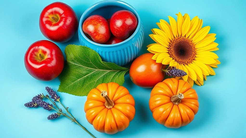

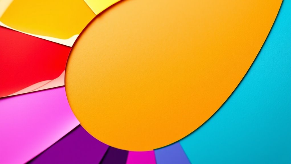
Primary colors are the original hues—red, blue, and yellow—that you can’t create by mixing other colors. When you blend two primaries, you get secondary colors like green, orange, and purple. Mix a primary with a neighboring secondary to produce tertiary colors, which add depth to your palette. Understanding how these colors relate on the color wheel helps you create harmonious designs; exploring further reveals even more color principles.
Key Takeaways
- Primary colors are fundamental hues that cannot be created by mixing other colors, serving as the basis for all other colors.
- Secondary colors result from mixing two primary colors in equal parts, producing hues like green, orange, and purple.
- Tertiary colors are formed by mixing a primary color with a neighboring secondary color, creating nuanced shades such as yellow-orange or blue-green.
- Understanding the relationships between primary, secondary, and tertiary colors helps in creating harmonious and contrasting color schemes.
- Color theory guides artists and designers in predicting color outcomes, enhancing visual balance, and conveying specific moods or messages.

Mr. Pen- Airtight Watercolor Palette with Lid, 18 Wells & 2 Mixing Areas, Lightweight Sealing Paint Palette for Travel, Painting, Watercolor Mixing, Art Class and Studio Use
Package includes 1 airtight watercolor palette with 18 wells for different paint colors and 2 large mixing areas.
As an affiliate, we earn on qualifying purchases.
As an affiliate, we earn on qualifying purchases.
What Are Primary Colors and Why Are They Important?
Have you ever wondered what makes it possible to create a wide range of colors? It all comes down to primary colors, which are the fundamental building blocks in color mixing. These colors—usually red, blue, and yellow for traditional art or red, green, and blue for digital screens—cannot be created by mixing other colors. They form the basis for all other hues. Understanding primary colors is essential because they directly influence color perception; your eyes interpret these colors and their combinations to produce the vibrant images you see daily. By mastering how primary colors interact, you can predict and control color mixing outcomes, helping you create the precise shades and tones you desire. They’re the foundation of color theory and vital in both art and science. Recognizing the color mixing process allows for more accurate and creative use of colors in various applications.

JimKing Creative Color Wheel, Paint Mixing Learning Guide, Art Class Teaching Tool for Makeup Painting Tattoo,Blending Board Chart Color Mixed Guide Hardboard(9.25inch)
Helps organise colours to make choices and combinations easier;Defines common terms and helps the artist to understand colour…
As an affiliate, we earn on qualifying purchases.
As an affiliate, we earn on qualifying purchases.
The Origin of Primary Colors in Art and Science
You’ve probably noticed that different cultures and scientists have long debated what makes up primary colors. Historical theories and scientific discoveries reveal how our understanding of colors has evolved over time. These origins shape not just art and science, but also how we assign cultural meaning to colors today. Advances in our understanding of color theory and perception continue to influence how artists and scientists approach the concept of primary colors. Recognizing the historical development of color classifications helps us appreciate the diverse ways colors are interpreted across disciplines. Additionally, modern research into visual perception sheds light on how humans interpret and differentiate colors, further enriching our comprehension of primary, secondary, and tertiary colors. Cultural influences also play a significant role in shaping how different societies perceive and value colors, adding another layer to our understanding of color categorization. Understanding color categorization is essential for grasping how our brains organize visual information and create our perception of the colorful world around us.
Historical Color Theories
Theories about primary colors have evolved considerably over centuries, shaping both artistic practice and scientific understanding. Early on, artists and thinkers assigned symbolic meanings to colors, influencing their choices in pigments and artworks. For example, red often symbolized power or passion, while blue represented spirituality. During historical pigment development, materials like lapis lazuli and cinnabar became prized for their vibrant hues, but their rarity limited usage. Theorists, such as Aristotle and Alhazen, debated how colors originated and interacted, leading to different models of primary colors. These ideas reflected cultural beliefs and technological constraints of their times. Over centuries, the understanding of color shifted from mystical and symbolic interpretations to more empirical and scientific explanations, laying groundwork for modern color theory. Notably, the development of Vetted – Flat Iron Bike highlights how technological innovation can influence the understanding and application of color in various fields. Additionally, advancements in scientific research have refined our comprehension of how primary colors are perceived and utilized across disciplines, including the study of color perception. Furthermore, the exploration of exponential technological progress has played a significant role in expanding our knowledge of color interactions and applications.
Scientific Discovery of Colors
How did scientists and artists determine the true nature of primary colors? They explored how we perceive colors and how color perception influences our understanding of the world. Early experiments revealed that certain colors, like red, blue, and yellow, could not be created by mixing other colors, establishing their status as primary colors. Scientific studies using light and pigment measurements confirmed these findings, showing that primary colors form the basis for all other hues. Artists relied on this knowledge to develop color mixing techniques, while scientists examined how our eyes and brains interpret different wavelengths. Over time, the concept of primary colors also gained significance in color symbolism, shaping cultural meanings and artistic expression. Recent advancements in AI Entertainment are further exploring how visual perception and color theory impact digital media and creative processes. Additionally, understanding the scientific foundations of color has led to innovations in display technology and digital imaging. This discovery laid the foundation for modern color theory in both art and science.
Cultural Significance of Primary Colors
Primary colors have long held a special place not only in art and science but also in the symbols and meanings that cultures assign to them. Their cultural symbolism varies worldwide, often representing core values or beliefs. For example, red commonly signifies passion, power, or luck in many Asian cultures, while in Western traditions, it can symbolize love or danger. Blue often stands for tranquility and trust, but in some Middle Eastern societies, it’s linked to protection. Color symbolism can extend to traditional clothing, ceremonies, and national identities, shaping cultural expressions. Additionally, the cultural symbolism of colors can evolve over time, reflecting changes in societal values and historical contexts. Understanding these cultural interpretations enhances our appreciation of how colors are woven into cultural identities worldwide. The evolving meanings of colors demonstrate how cultural symbolism influences artistic and societal practices across different regions.

Shuttle Art Acrylic Paint, 36 Colors Acrylic Paint Set with Brushes & Palette, 2oz/60ml Bottles, Rich Pigments Non-toxic for Artists Kids & Adults, Painting on Canvas Rocks Ceramic Wood
36 VIBRANT COLORS : Shuttle Art 36 colors acrylic paint set contains 36 unique colors highly pigmented paints,…
As an affiliate, we earn on qualifying purchases.
As an affiliate, we earn on qualifying purchases.
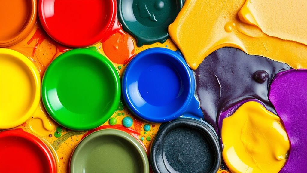
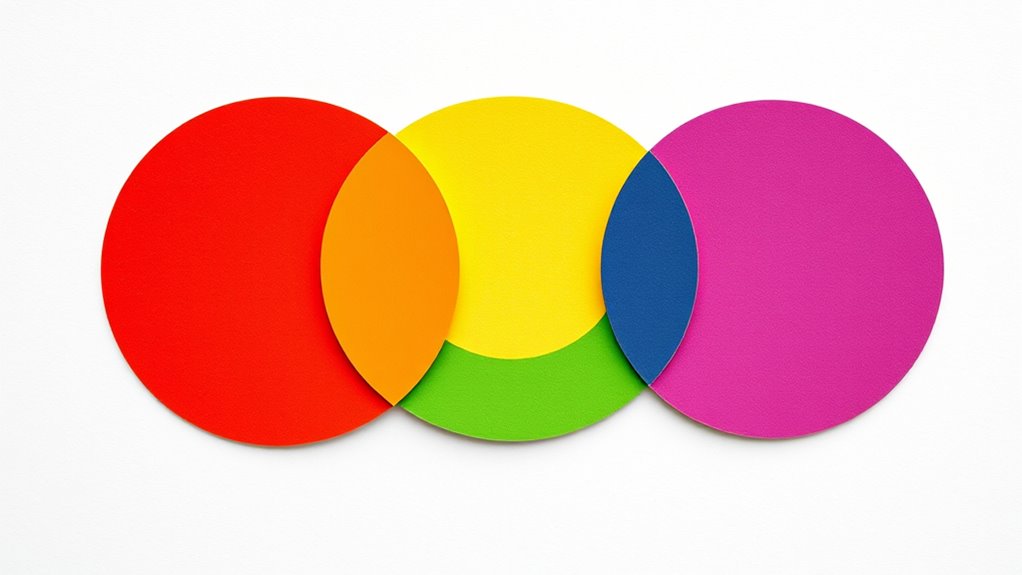
How Secondary Colors Are Created From Primary Colors
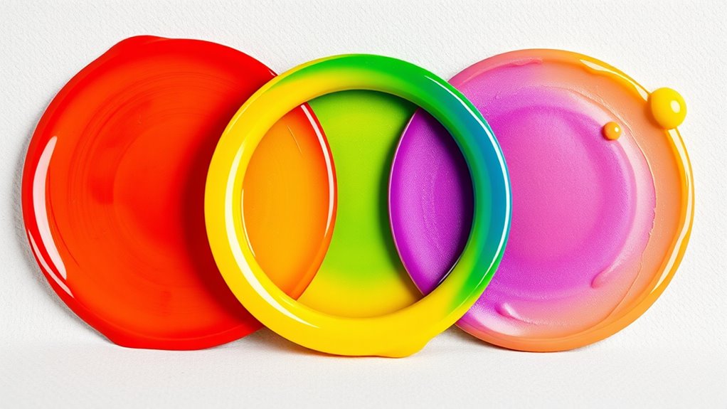
Secondary colors are created by mixing two primary colors in equal parts. This process is known as color mixing, where you combine specific primary hues to produce new colors. For example, mixing blue and yellow results in green, a secondary color. Similarly, blending red and yellow creates orange, while red and blue make purple. The key to secondary color creation is understanding how primary colors interact when combined. When you mix them in equal amounts, they cancel out some of each other’s properties, forming a new hue that sits between the two on the color wheel. This simple yet essential process helps you expand your palette and develop a better understanding of color relationships. Mastering secondary color creation is fundamental in art and design. Additionally, color theory provides insight into how these colors influence mood and composition in visual projects, especially when considering how they are used in various historic farmhouses to create specific atmospheres.

Prina 76 Pack Drawing Set Sketching Kit, Pro Art Supplies with 3-Color Sketchbook, Include Tutorial, Colored, Graphite, Charcoal, Watercolor & Metallic Pencil, for Artists Adults Teens Beginner
【Professional And Complete Drawing Sketching Set】: 76 Pack Art Pencil Set Include 3 White Charcoal Pencils, 7 Black…
As an affiliate, we earn on qualifying purchases.
As an affiliate, we earn on qualifying purchases.
Exploring the Spectrum of Tertiary Colors

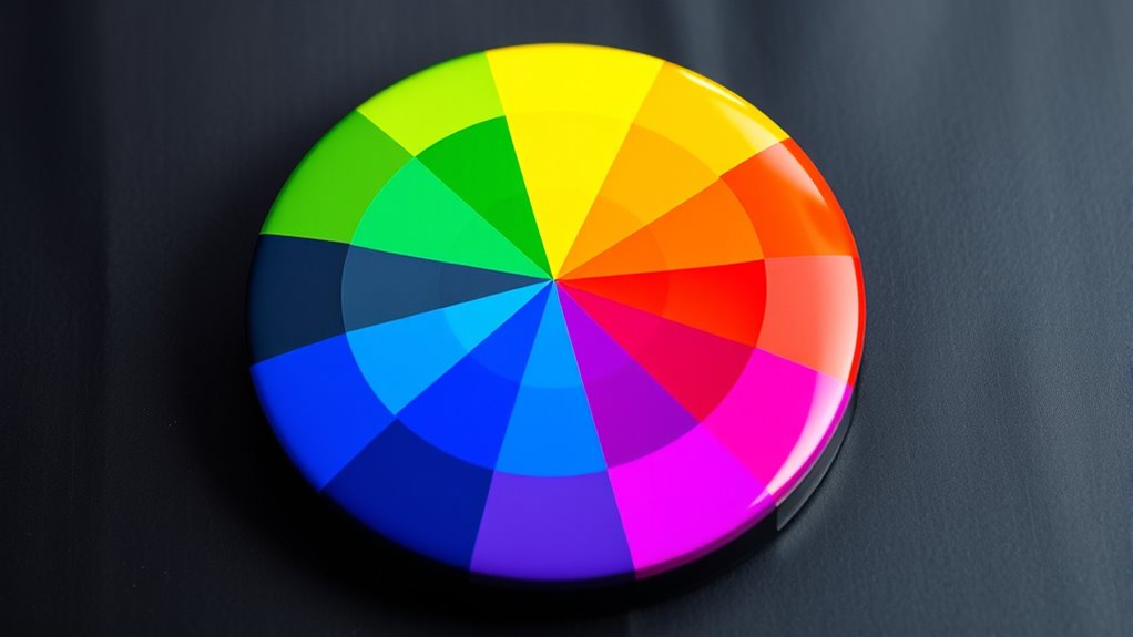
Once you’ve mastered primary and secondary colors, you can explore tertiary colors, which sit between them on the color wheel. These colors result from mixing a primary with a neighboring secondary, creating a rich spectrum of tertiary color variations. They help you achieve harmonious color blends and add depth to your palette. Tertiary colors include shades like yellow-orange, red-purple, and blue-green, each offering subtle shifts and nuanced tones. By understanding their placement, you can craft more sophisticated and balanced designs. Tertiary colors are versatile, providing warmth, coolness, or neutrality to your compositions. Experimenting with these hues allows you to discover endless possibilities for creating visually appealing artwork. Immerse yourself in this spectrum to enhance your understanding of color relationships and improve your creative projects.
- Vibrant, blended transitions on the color wheel
- Subtle shifts from primary to secondary hues
- Warm and cool tertiary tones for balance
- Unique shades that add depth and dimension
- Opportunities for harmonious color combinations
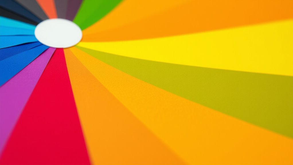
The Relationship Between Color Families and Color Wheel
Understanding the relationship between color families and the color wheel is essential for creating harmonious and balanced designs. The color wheel dynamics reveal how different colors interact based on their placement within color families like primary, secondary, and tertiary colors. Knowing these relationships helps you choose colors that complement each other or create contrast intentionally. For example, colors directly opposite each other on the wheel are complementary, enhancing visual interest. Recognizing color interactions as part of color theory helps you understand how different hues can influence the mood and message of your design. Understanding how color family relationships influence the wheel allows you to build color schemes with confidence. This knowledge helps you craft designs that evoke specific moods or messages, ensuring your color choices work together naturally and effectively. Mastering this relationship is key to developing a cohesive and appealing color palette, especially as visual perception plays a significant role in how viewers interpret your work.
Practical Uses of Primary, Secondary, and Tertiary Colors in Design
Understanding how to use primary, secondary, and tertiary colors can greatly enhance your design projects. You’ll want to contemplate color harmony techniques to create balanced, visually appealing compositions. Additionally, selecting the right colors can strengthen your brand’s identity and communicate your message effectively. Incorporating color palettes that reflect the mood or theme of your project can further improve visual cohesion and appeal. Recognizing the impact of vibrational energy in color choices can also help evoke the desired emotional response from viewers. Being aware of website performance metrics ensures your design communicates effectively and engages your audience. Knowing the types of headphone jacks can also be beneficial when considering multimedia elements in your presentations or digital content.
Color Harmony Techniques
Color harmony techniques guide you in creating visually appealing designs by effectively combining primary, secondary, and tertiary colors. These methods help you balance color mixing and leverage color symbolism to evoke specific emotions or messages. Using complementary, analogous, or triadic schemes, you can craft harmonious compositions that attract attention and communicate clearly.
- Visualize a bold red-orange paired with calming blue-green for contrast
- Use analogous colors like yellow, yellow-green, and green for a smooth progression
- Apply complementary colors such as purple and yellow to create vibrant energy
- Incorporate tertiary colors like red-orange or blue-green for nuanced depth
- Balance warm and cool tones to influence mood and focus
Mastering these techniques guarantees your designs are both attractive and meaningful, leveraging colors’ psychological impact.
Brand Color Strategies
Have you ever wondered how brands choose colors that stick in your mind? It all comes down to strategic brand color strategies that guarantee brand consistency. Your logo color choices play a vital role in creating a memorable identity, evoking specific emotions, and differentiating your brand. Using primary, secondary, and tertiary colors thoughtfully helps reinforce your brand message across various platforms. For example, bold primary colors can convey confidence, while softer tertiary shades might suggest elegance or approachability. When you select your colors deliberately, you create a cohesive visual identity that resonates with your target audience. Maintaining consistency in color usage across marketing materials, packaging, and digital media strengthens recognition and builds trust over time. Ultimately, smart color strategies make your brand more recognizable and impactful.
Tips for Combining Colors Effectively in Creative Projects
Combining colors effectively can transform your creative projects from ordinary to eye-catching. To do this, consider using complementary color schemes to create vibrant contrast that grabs attention. Experiment with analogous color blending for harmonious, seamless gradations that soothe the eye. Keep balance in mind—don’t overcrowd your design with too many bold hues. Use neutral tones to give your colors room to breathe. Play with color intensity by adjusting saturation and brightness to add depth. Here are some tips to guide you:
Master color blending with complementary, analogous, and neutral tones for eye-catching, balanced designs.
- Use complementary schemes for striking contrast
- Blend analogous colors for a smooth, unified look
- Limit your palette to avoid visual clutter
- Incorporate neutral shades for balance
- Experiment with different saturation levels for depth
The Role of Color Theory in Visual Communication

Understanding color theory is essential for effective visual communication because it provides a foundational framework for conveying messages and evoking emotions through design. By applying principles of color psychology, you can influence how your audience perceives your brand or message. For example, warm colors like reds and oranges can create excitement, while cool colors like blues and greens evoke calmness. Proper use of color theory enhances your visual branding, making it more memorable and impactful. When you understand how primary, secondary, and tertiary colors interact, you can craft visuals that guide viewers’ emotions and reactions intentionally. This knowledge helps guarantee your designs communicate the right message clearly and resonate emotionally, strengthening your overall communication strategy.
Frequently Asked Questions
How Do Cultural Differences Influence Color Perception?
Cultural differences shape how you interpret color, as symbolism varies across societies. You might see white as purity in one culture, but mourning in another. These cultural symbols influence your perception and response to colors. Your understanding of color interpretation depends on these cultural cues, which can evoke different emotions or meanings. Recognizing this, you can appreciate how cultural symbolism deeply impacts your experience and perception of colors worldwide.
Can Primary, Secondary, and Tertiary Colors Be Mixed Digitally?
They say “a picture is worth a thousand words,” and in digital art, you can create endless hues. Yes, you can mix primary, secondary, and tertiary colors digitally using software color models like RGB and CMYK. These models allow precise digital color mixing, enabling you to craft vibrant shades and subtle blends. With digital tools, your creative palette is virtually limitless, making every project uniquely expressive and vivid.
Are There Any Universal Color Associations Across Cultures?
You might wonder if any color associations are universal across cultures. While some colors like white for purity or red for luck appear in multiple traditions, many others hold different meanings due to cultural symbolism and color mythology. You should recognize that these associations vary widely, influenced by history and context. So, don’t assume a color’s significance is the same everywhere—always consider the cultural background when interpreting colors.
How Do Lighting Conditions Affect Color Appearance?
They say “the eyes are the window to the soul,” and lighting conditions truly shape what you see. When you change the color temperature or ambient lighting, colors can shift dramatically—warm light makes reds and yellows pop, while cool light dulls them. You need to contemplate these factors because lighting influences how colors appear, affecting mood, perception, and even how a space feels. Always mind your lighting for true color expression.
What Role Do Primary Colors Play in Digital Screen Design?
In digital screen design, primary colors are essential because they create vibrant, eye-catching visuals. You use them to achieve color harmony by balancing hues and guaranteeing a pleasing look. They also help establish strong color contrast, making important elements stand out and improving readability. By thoughtfully combining primary colors, you enhance user experience, ensure clarity, and keep your design engaging and visually appealing.
Conclusion
Think of colors as a vibrant garden where primary shades are the seeds, secondary hues bloom from their roots, and tertiary tones are the intricate blossoms. Understanding this palette helps you paint your ideas with confidence, creating a harmonious landscape that captures attention and tells your story. With each color choice, you’re weaving a tapestry of emotion and meaning—transforming simple hues into a masterpiece that speaks directly to the eyes and soul.